
Cover
DemonSaintDante on July 1, 2007
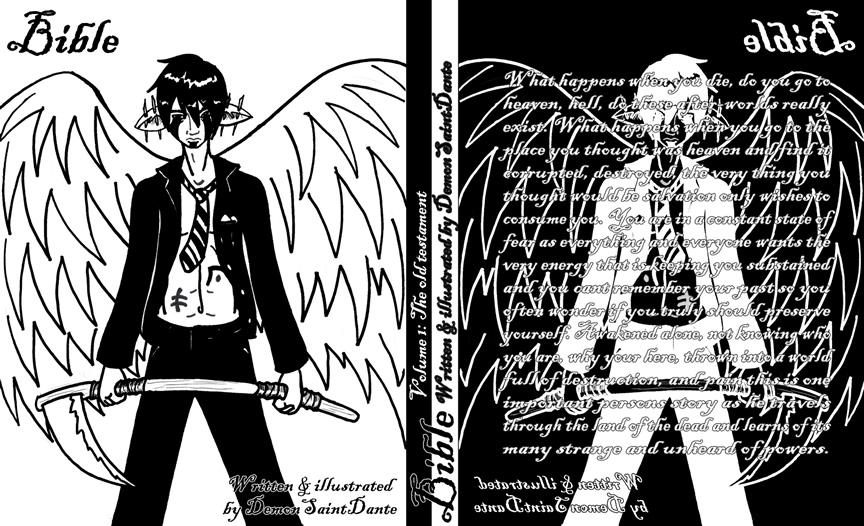
This is the first page of a comic i hope to keep up for a while. I plan on having it update every Tuesday and Thursday some come by the 3rd (tommorrow) to get a big update of 10 pages.


DemonSaintDante on July 1, 2007
This is the first page of a comic i hope to keep up for a while. I plan on having it update every Tuesday and Thursday some come by the 3rd (tommorrow) to get a big update of 10 pages.


silentshadow at 6:52PM, July 8, 2007
color inversion looks awesome on it... Miruku's right though, hard to read ^^
Miruku at 9:47PM, July 2, 2007
Looks pretty good! Just thought I'd mention, though, that the text is pretty hard to, well, not so much read as look at with the background like that, even though it's outlined. It'd be easier if one of the white parts (either the background or the letters) were gray or something along those lines. It's the white on white that's getting to my eyes.