
2
Jonko on June 9, 2007
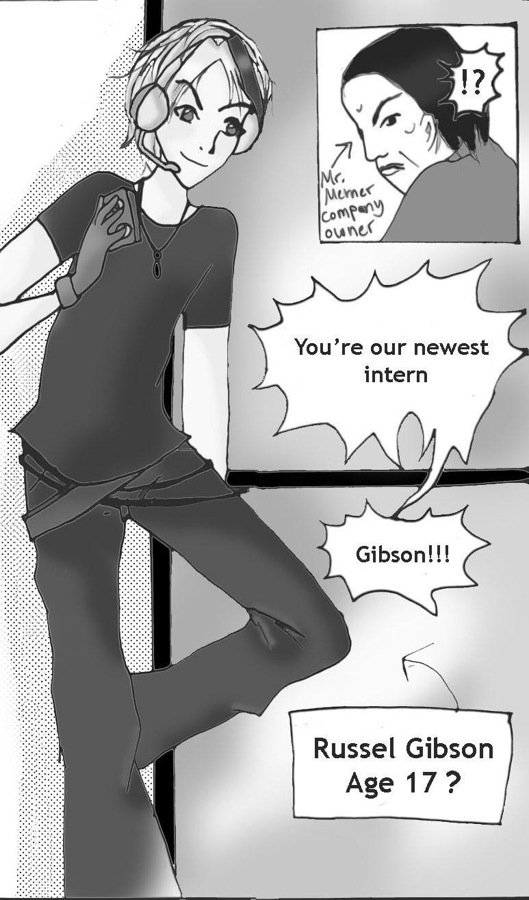
yay for page 2!!! this is my main character. It's so cool that he's finally gonna be seen by people!!! The thing next to him is supposed to be a window… I wonder if you can tell??? hehe.


Jonko on June 9, 2007
yay for page 2!!! this is my main character. It's so cool that he's finally gonna be seen by people!!! The thing next to him is supposed to be a window… I wonder if you can tell??? hehe.


CatCatDragoo at 5:43PM, May 17, 2009
*gasp* *0*
Jonko at 3:07PM, June 11, 2007
yay got my first crit! Thanks everyone. I'm still working on getting used to this, but I'll get better I promise!!! >o
theorah at 9:15AM, June 11, 2007
well, I was reccomended this comic by Kristin =3 So far, the cover is great and very eye ctaching. Youve been working on the story since 2001, so the aspect I look for most in a comic I'm sure will be really good (the best comics are the ones with the good stories, doesnt matter how good the art is) As for the artwork, the inking style is lovely! The panel pacing is really nice and spread out, you make good emphasis where it is needed too, keep up the good work! I do have one crit, though, (but just ignore if you dont want crit) is the white spaces between lines and the tone.. What art programme do you use? I think the lovely inking would stand out more if you got rid of the white space around the lines and tone. All you need to do to get rid of it is use layers or make your line work completly black and white so that you can fill in the spaces but not worry about having that little bit of space between the line and the space. Anyway! Apart from that I like what I see, I will fave for sure! ^_^
Aisu at 3:52AM, June 11, 2007
thief?
Kristen Gudsnuk at 11:05PM, June 10, 2007
YAY awesomeness!! ^^ ooh how'd you do the toning?? it looks very cool!! omg this is looking so great!! hehe and your avatar... you and your apples... *dramatic sigh* hehe