


The Cull - Page 24
Singring on Aug. 10, 2014
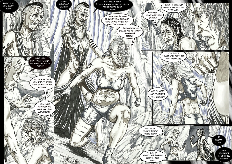
The situation is clearly escalating - and hopefully, the tension is ratcheting up as well. How will this butting oif heads be resolved? With two women trained to kill, there really is only one way, is there?
If all you have is a hammer - everything problem will look like a nail…
I had fun doing this page. Initially, the centre panel was supposed to be a horizontal shot, but I quickly realized that that would make for a very static and dull page - so instead I chose a ‘dutch angle’ (a tilted horizon). Together with the wild mix of angles in the other panels, I hope it makes for a nicely dramatic page.
Another technical note: The last panel is really too small and takes the tension out of the page a bit (at least I feel so). Really, I should have pushed in closer there, but initially I felt that would be difficult to accomplish without using another profile shot - which I wanted to avoid as it would be too similar to the top right panel. One of the things you only realize when you see the full composition…I think I need to spend a bit more time on my thumbnails.


Singring at 1:20PM, Aug. 17, 2014
@Kim: Well-spotted! I purposefully included a panel where those were visible, because they may play a prominent role at some point (not that I want to give anything away!)
Singring at 1:19PM, Aug. 17, 2014
Thanks for the comments - sorry it takes me so long to respond, almost as long as finishing a page! @fallopian: You've go it regarding the clothes. At least that's the idea. I know it probably wouldn't work in reality, but it's an interesting design that is at least somewhat unique. More importantly, it illustrates the culture of The Hive and the society around it - animal bones, leather etc. are all used both for utility and for decoration, as indications of allegiance or significance, as they still are today in parts of Africa, Asia and South America. Glad you like the page...interesting point about the panel borders. Quite early on I decided I didn't want to use many stylistic design elements, like sound effects, jagged panel borders etc. I wanted content of the panels themselves to do that. I'm slowly softening to the idea, however, as I can see instances where it would definitely add to the dynamics without seeming out of place. Thanks for rekindling that idea.
fallopiancrusader at 8:39PM, Aug. 11, 2014
Great designs on their costumes, by the way. If I'm understanding it correctly, their clothes are staying in place because they have been pinned to their flesh, right?
KimLuster at 4:57PM, Aug. 10, 2014
Not taking it for granted, but I've just come to expect each page to be stunning. I love the detail you put into these things, like the tiny spikes protruding from "Mama's" knuckes in middle-right panel. This confrontation has been building nicely - can't wait till next page!
fallopiancrusader at 3:46PM, Aug. 10, 2014
Boy, you could cut the emotional tension on this page with a knife! In terms of conveying tension, another technique that I've seen used in comics is to skew the panel borders as the story gets more intense, and have them go straight up and down at calmer moments. Katsuhiro Otomo did that a lot in "Akira" back in the 90's. About your comments on the previous page: I definitely use a lot of photo reference. Some of it from the web, but a lot just by using a mirror and a camera. I lay out poses by eye, but all the little details like wrinkles, drapery, and odd lighting effects are referenced. I feel that if I am using references for my art, I am always learning how to draw just a little bit better every time that I draw. I referred to Guido Crepax mostly in terms of the mannerisms and proportions that he uses for his characters. Your rendering style is definitely very different.