


Page 1
Kristen Gudsnuk on March 6, 2009
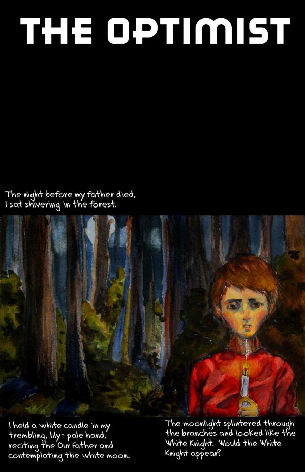
Hi everyone and welcome to my new comic, The Optimist. It'll be a relatively short run– I'm expecting somewhere in the ballpark of 30-40 pages. I'm hoping to DO something with it, someday. But not yet. Right now, it is for your enjoyment– and most of all, your CRITIQUE. Yes, please! I'd like to hear not just, “OMG Kristen you are such a genius, wow, what beautiful drawings and what an ear for the music of dialogue!” no. well… maybe.
Anyway, here's my first page. I'm not sure if it's too internal monologue-heavy, and my computer's broken and so I can't use any fonts that aren't already in my school library's computer. So the font… I'd like your opinion on the font.
Also, I drew with pencil, colored it in and then took a photo of it. Should I ink after I paint? Does it lack firm lines? I can still go back in and fix this guy up. Since this is going to be short, I'm going to try to make it “worth it”– make all the pages right.
Since this is the intro, it has more text than the ensuing pages will.
I painted this with watercolors. Page 2 coming soon, with a cameo appearance by MIKHAIL GORBACHEV HIMSELF!
Thanks!


tommym at 1:54PM, Sept. 23, 2009
Dear Kristen, I go after story/plot mostly but do appreacate nice Art work. Tommy
Lilac at 8:37AM, July 25, 2009
^^; I don't really have any critique to give. I love the linelessness of the page and how you use colors to express the mood. I think I would've left out 'lily-pale' in the dialogue, but that's just me. Plus I think you were trying to set up the theme for this White Knight character.
threeeyeswurm at 12:05AM, April 21, 2009
This is very nice. I like the painting of his face the most. As for critique, since you asked for it, I would have liked to see him actually sitting and seem more like he's feeling a bit cold, giving an impression of shivering. Right now his posture doesn't look like he is shivering or sitting. I am also not sure about having him looking straight at the reader... It creates a sense of relationship between the reader and the character... is this what you wanted?
JillyFoo at 10:57PM, March 21, 2009
Ok this is interesting. Fave for now read later.
Jonko at 6:00AM, March 10, 2009
Omg it looks really cool now!!!
Kristen Gudsnuk at 12:40AM, March 10, 2009
thanks for your honesty :] I fixed it (I hope). It was bothering me, too (the font--) and now I'm happy with it.
angry_black_guy at 11:41AM, March 9, 2009
The lettering is hurting you. It's too large and clashes with the art. If you don't want to hand letter, I recommend painting some caption boxes, scanning them, letter on them and paste them into the comic itself. The stark white floating text against beautiful paints makes it look like someone opened a photo in Microsoft Paint and typed over it. You're starting off on the right track but having a wall of text fighting your images will hurt your story telling. Good to see other people working with traditional media.
JillyFoo at 12:05PM, March 8, 2009
OMFG!!! You're back!!! Does a dance.*
Kristen Gudsnuk at 11:37AM, March 8, 2009
Usedbooks: I looked at his stuff-- it looks like a good method to try out! thanks for the warm welcome, peipei! Erika: yaaay!!! we may be an ocean apart, but we still have the internet
Jonko at 10:41AM, March 8, 2009
I can't believe you took this with your camera and managed to make it so beautiful, good job! Lets see if I can say anything more than "OMG Kristen you are such a genius, wow, what beautiful drawings and what an ear for the music of dialogue!" The one thing I'll say is that there is a LOT going on on this page, and considering that it's the very first I feel it could almost even be two different pages... If the first panel stood by itself the entire comic can begin with this sense of eerie mystery that will make you want to read more! Can't wait to see where you take this!
Peipei at 5:24AM, March 8, 2009
Hi!!! It's good to have you back! Woohoo! And your work is looking awesome :3. *Throws a party* ^^
usedbooks at 8:42PM, March 7, 2009
[url=http://www.drunkduck.com/Locoma/index.php?p=344952]Locoma[/url] does some pretty cool layouts without panel borders. Maybe that sort of thing would work for your style. (A lot of his comic is in watercolors, but he used different media too.)
usedbooks at 8:25PM, March 7, 2009
[quote]actually, I added those lines in photoshop and thought they looked funny-- underneath them are pencil lines, and also the natural dark lines that come with watercolor edges. perhaps that would make the page look more cohesive?[/quote] That could work. Maybe you could come up with some way to digitally make them look more "natural" (like brush strokes) or remove the black borders and make the panels sort of blur together on the edges? -- The monologue suggests that the first panel is real while the other two are part of the narrator's imagination, so maybe you could blend/blur the edges of the bottom panels a little but keep the first panel as is. (Also, props again on the painting. I try to play with paints every now and then, but I'm all thumbs, so anyone who can paint always has me awestruck.)
Kristen Gudsnuk at 8:03PM, March 7, 2009
Thanks, usedbooks! It's nice to be back. I wasn't crazy about the font, either-- I prefer ones like Anime Ace or Digital Strip, but I have to take what I'm given. I actually like your idea of making it three pages quite a bit-- it would be hard, and possibly involve the cropping of my painstakingly wrought trees in panel one-- unless I could photoshop some way around it (all-black panel with the narration inside?) but maybe. My only concern is that the drawings won't hold their own if they're too big-- this whole page is drawn on small paper-- 7x9 or something like that. It's funny how you mention style, because I think this drawing style is my natural style-- it's what comes out most naturally, and necessitates the least amount of erasing. lol. actually, I added those lines in photoshop and thought they looked funny-- underneath them are pencil lines, and also the natural dark lines that come with watercolor edges. perhaps that would make the page look more cohesive?
usedbooks at 1:46PM, March 7, 2009
Nice to see you back. I thought you vanished forever, sucked into the internet to never be seen again (so many are, you know...) I love your painting, so yay! It has good textures and style. I especially like the howling dog. More defined outlines would give it more of a comic/professional feel, but I also like it the way it is, because it has a lot of character and mood. The layout is kind of non-cohesive. The pictures/colors/etc are just too distinct from each other, so there's not as much artistic flow as their could be. Since this is the intro, you might even consider separating them into three pages. It might seem drawn out for a webcomic, but in print, it would work well. Either that or do something dynamic with the gutters to help blend the images somehow. The monologue, however, flows very nicely. Oh, and the font is dull. (Hey you asked!) I like fonts that look like handwriting, maybe something a little bit flowing to go with the style of the paints. Sorry for all that, but you asked for critique. ~_^ Looks like a promising story, and I'll follow it to see your pretty painting, flowing diction, and how you develop this particular style.