


05 - Bad Thing
Inkmonkey on July 30, 2006
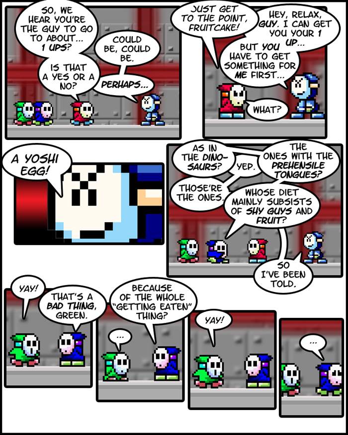
Is it just me, or does Green's happy face look a bit like the Scream face?
I didn't give myself as much room for adding text bubbles this time, partly as an experiment in word layout. A lot of sprite comics make the mistake of color coding word balloons or text to convey who is talking. I'm sure a lot of people would have made red's text actually red, and there's a problem with that. It makes it appear as though everything Red says is especially angry (not that he doesn't tend to be angry in the first place…). The reason professional comics don't color code text is because doing so implies some sort of special inflection in the voice of whoever gets the special letters. You have to reserve those sort of things for special moments, or specific characters. Take, for example, Ghost Rider; his text is often done with scratchy, white letters over a black word balloon. This gives the impression of darkness and a harshness to his voice, which makes him special. Red, however, is not special enough to warrant a special color for everything he says.
A similar problem also arises with some colors that just don't show up very well. I don't know how many spriters just don't realize that we can't see bright yellow over a white balloon, or grey, or light blue. This isn't a problem exclusive to sprite comics, but it seems to come up in that medium most often, for whatever reason.


JuhFreak at 6:02PM, Aug. 2, 2006
Yes, thank you for the layout that fits our screen!
lefarce at 2:46PM, July 31, 2006
I dunno, I like the witty humor. Personally it makes it feel less like a real sprite comic, which is good. If this followed sprite comics perfectly, then it would only fall into traps, and thus, become very mundane to read. It's the smart writing that keeps this alive, not the quality of the sprites. Sure, they're good and all, but I've seend shy guy's a million times. If the writing weren't as witty and so un-sprite-like as it is, I wouldn't care who wrote it, because I wouldn't be reading it.
Inkmonkey at 11:35AM, July 31, 2006
Yeah, I try to make all my own backgrounds. I find that the sprites stand out against them a lot better than they do against actual sprite backgrounds. I do try and copy existing backgrounds from the games, though. Like, the above background can be seen in Mario Bros. 2. It's one of those tower levels with the little electric balls that crawl along the ground.
Toadman at 10:59AM, July 31, 2006
Yeah, green's happy face does remind me of the guy in Scream. I really like your work here. This is one of the few sprite comics that actually make me laugh. That makes...five. Ish. Did you make that background? If so, nice job.
Inkmonkey at 10:23AM, July 31, 2006
Oh, and as for Green's shoe color; the original sprite had darker shoes there before I recolored it, so I assumed it was supposed to be in shadow or something. I really hadn't given it much thought, now that you mention it.
Inkmonkey at 10:22AM, July 31, 2006
Actually, Blue is supposed to be a bit "Frasier-esque". I'm trying to keep him from being quite as sarcastic, though.
Xergrim at 10:02AM, July 31, 2006
Did Green's shoes change color for a reason in the third from the last panel? Green here, well I have to admit I didn't like him in this strip. I'm probably alone in this view, and I admit I'm probably jaded by seeing so many idiots in other comics. But Green was just a bit too predictable for my tastes this strip. Since you're shooting for humor, maybe it couldn't hurt to have some exaggeration going on? This Yoshi could very well eat them. Is it going to look unusally deadly to the little guys, when in reality the Yoshi just hatched and is a little baby? This whole strip sounded like an episode of "Fraiser" to me. :P
LowResAtari at 9:03AM, July 31, 2006
I agree with the fact that's green's "happiness" face looks a lot like the guy from Scream... What is that guy's name again? o_O Panel 4 is cramped up a bit with text, but that's not quite a bad thing, because you managed to get it organized correctly... so you shouldn't worry too much about it ^_^
randomlogic at 1:17AM, July 31, 2006
Very good, very funny, though I have to say the sorta maze of work bubbles in the 4th panel completely confuzed me in my current half-asleep state
lefarce at 11:14PM, July 30, 2006
This is 5 work again. I dont' say that because it's you, nor am I biased in any way. It's just that this comic is superb. The sprite placement is spot on, as it the quality. You can obviously tell that your using photoshop,gimp, or something of the like. Your writing is fantastic, the comic made me "lol", and this issue set up a beefy amount of storyline despite only being a single page. Most comics take forever to establish something, but this manages to set a plot that can last issues apon issues in a matter of minutes with out it seeming rushed. I have to agree though, there wasn't allot of room. I like it yet I don't. I pulls the eyes off of the artwork a bit too much due to how much larger the text buubles and text are compaired to the sprites. Then again, it doesn't conflict too much.