


The Second One
Mr E on Feb. 27, 2007
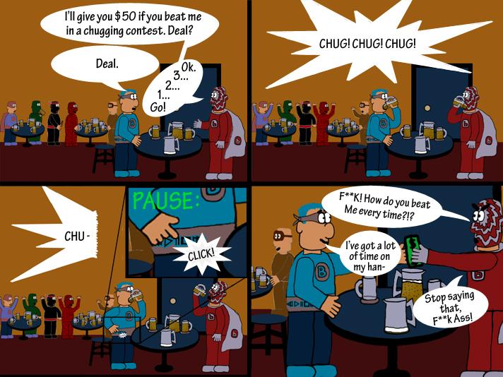
Thanks to everybody who gave any comments/suggestions. I would love the same amount of support for this one, hopefully I made something you'll all enjoy. I've got more projects in the works, and any tips for where to go next would be much appreciated.


krulz133 at 11:58AM, March 1, 2007
Definitely nice stuff :D Pretty good job with the colour and background details too :D Definitely worth keeping up for a year at least ;)
mapaghimagsik at 7:44AM, March 1, 2007
Nice Stuff! I like that they are simply named letters.
dracco at 3:00AM, March 1, 2007
Heheh! Great work!
boobies123 at 2:48AM, March 1, 2007
Thanks 4 comment G. can't wait4 your next comic. watch out for this guy folks!
Jenshin at 7:48PM, Feb. 28, 2007
Super heroes who like beer, eh? Nice. Good work! You really make an attempt to have each panel looking great. There's nothing I can really offer for suggestions.
Antionestrife at 10:37AM, Feb. 28, 2007
Yes! A superhero bar, it's never been done except maybe on robot chicken. Funny stuff, try to get a advatar though.
Rydel6 at 7:28AM, Feb. 28, 2007
Cheater!
F_Allen at 2:52AM, Feb. 28, 2007
thats really good. Your comic is original. i like the b man's mask, it looks like his wife might of knitted i for him which is a nice touch just the sort of local hero u see in a pub.
spiketherogue at 1:06AM, Feb. 28, 2007
LOL very nice. I love the concept of just a Superhero bar. Great idea.
Dark Chamber at 12:57AM, Feb. 28, 2007
great looking page funny comic
Eviltwinpixie at 12:39AM, Feb. 28, 2007
I like your cartoony style a lot! It's early days yet- heaven knows, no one could tell much about my comic from the first two strips... especially since I didn't draw one of them. ;) BUt I agree with Resalan- more heavily defined panels would make things much clearer. Great work, and definitely a promising start :)
xResalanx at 11:55PM, Feb. 27, 2007
Hahah, pretty funny. XD ALthough I'd suggest maybe letting your panels distinguish from one anothera bit more, maybe use lighter colors for the backgrounds and such so the black that separates the panels is a little more evident? I dunno. xD Don't listen to me, lawl.
JoeyOtaka at 11:52PM, Feb. 27, 2007
lmao, it looks like a cross between a convention and a pub... THE PUB CONVENTION! WHOOT! XD!
Cyberlink at 11:04PM, Feb. 27, 2007
Excellent work. I'll say only one thing and thats to avoid covering characters as much as can(Panel 3, the black line) I can understand this one, because theres hardly a choice, just don't make it a habit. Other than that your comic rocks, maybe YOU should give ME advice! XD *Favorites*