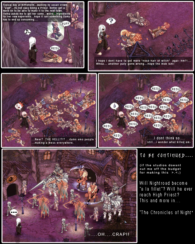
Your sprite editing work is actually pretty awesome, the screens are well taken and the story looks intriguing. :O But you asked for design advice, so here goes.
I'd try to keep an even amount of space between comic panels, just for that nice neat look of consistency. The skinny sliver of space can look good, and so can a larger space (as seen in my comic), just try to keep it consistent. Screenshots /can/ be resized a bit (as long as you're not changing the size by much) without too much noticable blurrage.
And I'd try to have a bit of a border of blank black space (doesn't necessarily need to be big) around the whole comic, 'cause that kinda frames it and brings out the entirety of the comic page. And I'd keep a consistent amount of space around paragraphs of text, as well.
It really does look awesome, and all I really have to suggest is setting up silly little standards that'll give your comic a consistent look.
And I love the "RESU" and "BUFF" emotes... having been a priest myself, I have to say... so true. ._.;


evildawn at 11:09AM, Aug. 21, 2006
A great disservice was done to the English language this day...
Faenor at 4:30PM, April 3, 2006
joi ^^ more sprite comics from Guilty Gears. Awsome
Rui at 12:01PM, March 17, 2006
Ah more ragnarok sprite comics XD
lothar at 4:05AM, March 11, 2006
that game sucks ! i played it for a week straight and it is soooo BORING !!!
ZoeStead at 5:01AM, March 10, 2006
Guys with white hair are always cool :@D
alchemicallyyours at 7:02PM, March 7, 2006
Your sprite editing work is actually pretty awesome, the screens are well taken and the story looks intriguing. :O But you asked for design advice, so here goes. I'd try to keep an even amount of space between comic panels, just for that nice neat look of consistency. The skinny sliver of space can look good, and so can a larger space (as seen in my comic), just try to keep it consistent. Screenshots /can/ be resized a bit (as long as you're not changing the size by much) without too much noticable blurrage. And I'd try to have a bit of a border of blank black space (doesn't necessarily need to be big) around the whole comic, 'cause that kinda frames it and brings out the entirety of the comic page. And I'd keep a consistent amount of space around paragraphs of text, as well. It really does look awesome, and all I really have to suggest is setting up silly little standards that'll give your comic a consistent look. And I love the "RESU" and "BUFF" emotes... having been a priest myself, I have to say... so true. ._.;
Kerotaku at 7:00PM, March 7, 2006
ack...typo on paty...should be party >.