

Meet, Greet, Show and Sell*
Compliment the Comic Belonging to the Person Above You!!
Fitz
at 4:42PM, April 19, 2010
(online)
posts: 270
joined: 7-6-2007
Since the first time that I came across BloodHound, Midge has progressed from awesome to amazing. The new version's looking great so far. It's got action, thrill - and great colors!

last edited on July 14, 2011 12:29PM
Dave7
at 5:42PM, April 19, 2010
(online)
posts: 500
joined: 9-6-2007
Chomp's jokes are short, simple, and to-the-point. But they're done in a way that really works, which is hard to do with “bite-sized” humor (or at least done well). I especially like the pages parodying the Red Hot Chili Peppers.
Post your concerns about the preview page! Support raw html! http://getsatisfaction.com/drunkduck/topics
]http://getsatisfaction.com/drunkduck/topics
“That is not dead can eternal lie,
And with strange aeons death may die.”
~H.P. Lovecraft

]http://getsatisfaction.com/drunkduck/topics
“That is not dead can eternal lie,
And with strange aeons death may die.”
~H.P. Lovecraft
last edited on July 14, 2011 12:09PM
Doctor Shadow
at 2:13AM, April 20, 2010
(online)
posts: 904
joined: 1-6-2008
All Saints: I have to say that I love this style, and the shading is excellent. I absolutely love the last few updates too, the action is spot on.
A Ronin writer, a masterless samurai of the written word…
http://www.drunkduck.com/The_Chronicles_of_Wyrden/
Updating: Thursdays. Now in glorious Ink Wash and Water Soluble Pencil! Reva's note: This is not created digitally, it's all hand drawn and inked.
http://www.drunkduck.com/The_Chronicles_of_Wyrden/
Updating: Thursdays. Now in glorious Ink Wash and Water Soluble Pencil! Reva's note: This is not created digitally, it's all hand drawn and inked.
last edited on July 14, 2011 12:13PM
Genejoke
at 7:48AM, May 1, 2010
(online)
posts: 4,207
joined: 4-9-2010
Nice heavy inks, and a great teaser for what is coming next.
http://www.drunkduck.com/Malefic/
Beginning of chapter three.
http://www.drunkduck.com/Malefic/
Beginning of chapter three.
last edited on July 14, 2011 12:33PM
Rainwolf95
at 8:13AM, May 3, 2010
(offline)
posts: 36
joined: 6-17-2009
I love it, the writing is well done, the art is great, everything about it.
http://www.drunkduck.com/Half_as_Bad_as_You/
http://www.drunkduck.com/Half_as_Bad_as_You/
last edited on July 14, 2011 3:00PM
Hunchdebunch
at 6:11AM, May 30, 2010
(online)
posts: 380
joined: 4-22-2009
Half As Bad As You: I like your drawing style, and also the downwards flow of the comic makes it really easy to read :)


last edited on July 14, 2011 12:51PM
Asbin
at 7:23PM, June 16, 2010
(online)
posts: 169
joined: 2-9-2010
Not sure which one i was supposed to check out, so I just picked the door. It's got a ver cheerful environment to it. Maybe a little shading would make it better, but not that much. But all the same, a really enjoyable read

last edited on July 14, 2011 11:02AM
Dave7
at 8:16PM, June 16, 2010
(online)
posts: 500
joined: 9-6-2007
After reading through Project GTH, I can say that since that after finishing the second chapter, you've been steadily improving your art style; giving it a more refined look. And the artwork itself is neither too simplistic nor over-detailed, but seems to have found a rather nice balance in between.
Post your concerns about the preview page! Support raw html! http://getsatisfaction.com/drunkduck/topics
]http://getsatisfaction.com/drunkduck/topics
“That is not dead can eternal lie,
And with strange aeons death may die.”
~H.P. Lovecraft
]http://getsatisfaction.com/drunkduck/topics
“That is not dead can eternal lie,
And with strange aeons death may die.”
~H.P. Lovecraft
last edited on July 14, 2011 12:09PM
Mondo_Funky
at 7:55AM, June 27, 2010
(online)
posts: 121
joined: 9-27-2007
I really like your use of negative space, and I'm a sucker for first-person narration. Nice monster design, too.


last edited on July 14, 2011 2:07PM
tiki_carol
at 8:14PM, July 8, 2010
(online)
posts: 61
joined: 5-12-2010
Mondo_Funky, You are a master of wordsmithmanship. Awesomataz is actually a funny read making me laugh often. Brilliant concept too!

last edited on July 14, 2011 4:30PM
Byth1
at 3:55PM, July 13, 2010
(online)
posts: 175
joined: 9-13-2009
I like the Art in randy, especially the newer pages.
 Updated every friday!
 Updated every monday!
last edited on July 14, 2011 11:35AM
Hunchdebunch
at 8:46AM, July 19, 2010
(online)
posts: 380
joined: 4-22-2009
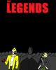
I like the bright colours and the effects in The Legends; especially the water and motion effects! :D
last edited on July 14, 2011 12:51PM
Katch
at 4:35PM, July 20, 2010
(offline)
posts: 810
joined: 12-4-2006
Quest for Zanvadas has a lot of movement in it, i see a real improvement with how you're trying different poses and angles for things. I love the emotion in the last couple pages ^^ good job~!!
Something goes here
last edited on July 14, 2011 1:14PM
VitaminHeart
at 6:21PM, July 24, 2010
(offline)
posts: 6
joined: 5-12-2010
I adore the art style of Revenge Addict, and find the story really intriguing. It's really interesting how it manages to create a character so full of resentment but still make you empathize with them on some level.
last edited on July 14, 2011 4:42PM
Hunchdebunch
at 10:23AM, Aug. 3, 2010
(online)
posts: 380
joined: 4-22-2009
The Gifted War has unusual but creative layouts, and the art style itself is cool too! It's really nice to see something that doesn't conform to everything I expect to see in a comic :)
last edited on July 14, 2011 12:51PM
Ryuthehedgewolf
at 12:44PM, Aug. 3, 2010
(offline)
posts: 1,340
joined: 9-2-2007
Last of the Wilds: has some really nice looking character designs (I might just be saying that because I also draw anthros~), but the poses are really nice, and I respect that.
Quest for Zanvadas: I personally like this comic better. The colors seem a lot brighter, and there's more to it. I also feel a lot more emotion in this one, and I believe with the way you've been doing the pages (the thought bubbles, if they are considered bubbles) just blend perfectly with the mood. The cartoony style and the story make for a nice read. I might just have to keep an eye on this one.
Quest for Zanvadas: I personally like this comic better. The colors seem a lot brighter, and there's more to it. I also feel a lot more emotion in this one, and I believe with the way you've been doing the pages (the thought bubbles, if they are considered bubbles) just blend perfectly with the mood. The cartoony style and the story make for a nice read. I might just have to keep an eye on this one.

last edited on July 14, 2011 3:16PM
Plague Doctor
at 2:36PM, Aug. 8, 2010
(offline)
posts: 186
joined: 6-29-2010
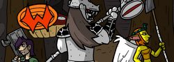
Ryus Crew and Insight-wow…love the grundge-graffiti style you have going in there.
You are very good at coloring and for markers it looks suprisingly clean.
Character design is unique and poses are very dynamic.
And sound effects are nicely lettered and work very effectivly.
For Greater Justice-the art is cute and coloring is clean and pleasent.I liked the close-up of the brown-haired kid.And the humor is really funny
^^ nice work

last edited on July 14, 2011 2:46PM
Abt_Nihil
at 8:19AM, Aug. 11, 2010
(offline)
posts: 1,462
joined: 8-7-2007
“Lazzaro and Mongo” is like a treasure lifted from the collective unconscious of every artist who was productive during the 1920s or 1930s, with a cartoon twist - Floyd Gottfredson comes to mind. If comics were blankets, this is the one I would wrap myself in.


last edited on July 14, 2011 10:44AM
Tantz_Aerine
at 2:01PM, Aug. 11, 2010
(online)
posts: 1,985
joined: 10-11-2006
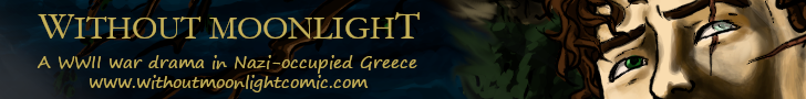
Good gracious! When you say Bombshell you mean it!
I love the warm colours, the breathtaking cityscapes and camera angles, everything works excellently to give it a retro look that just makes the humor stand out all the more :)
All in all, it's got pretty much everything!
Oh, and boobs for the boys. :lol:
—
(please click on Without Moonlight, not Wolf for this one)

last edited on July 14, 2011 4:07PM
Doctor Shadow
at 6:12AM, Aug. 12, 2010
(online)
posts: 904
joined: 1-6-2008
Without Moonlight, I like the shading on the comic here. The story seems pretty cool so far :)
A Ronin writer, a masterless samurai of the written word…
http://www.drunkduck.com/The_Chronicles_of_Wyrden/
Updating: Thursdays. Now in glorious Ink Wash and Water Soluble Pencil! Reva's note: This is not created digitally, it's all hand drawn and inked.
http://www.drunkduck.com/The_Chronicles_of_Wyrden/
Updating: Thursdays. Now in glorious Ink Wash and Water Soluble Pencil! Reva's note: This is not created digitally, it's all hand drawn and inked.
last edited on July 14, 2011 12:13PM
Byth1
at 6:14PM, Aug. 13, 2010
(online)
posts: 175
joined: 9-13-2009
I like how The Chronicles of Wyrden has a very Victorian style to the art and dialog. I'm also a sucker for good pencil art.!
Updated every friday!Updated every monday!
last edited on July 14, 2011 11:35AM
Warpedwenger
at 8:55PM, Aug. 16, 2010
(offline)
posts: 1,776
joined: 4-3-2007
Good drama in the last panel of your current page. It's always good to have something really exciting happen on the last panel so your reader will be left wanting more.
last edited on July 14, 2011 4:47PM
JazylH
at 4:54AM, Aug. 23, 2010
(online)
posts: 133
joined: 7-29-2010
Fruitloop's got me hooked !

Updated Mondays & Fridays
last edited on July 14, 2011 1:07PM
Net
at 9:36AM, Sept. 3, 2010
(online)
posts: 124
joined: 8-19-2006
The artwork in The Beast Legion is quite nice and eye catching. Not *TOO* much is happening on the current page, just a war about to start… I'll have to switch back a few pages to get caught up to what's going on.
Side note: Not sure why, and yours isn't the only comic that does this. But when I go to
http://www.drunkduck.com/The_Beast_Legion/index.php
It shows me the comic where he's sending away the woman and child… and if I click “Latest page”, it goes to the one where he says “Everyone, on my signal!” But then, when I go BACK to the link above, now the page is the same as the one on the “latest page.”
I know it's not a cache issue, because as I've never read this comic before, it'd be impossible for the woman and child page to be in there. :) As I also said, it's not unique to this comic. Anyhoo, I like what I see so far! :D
>Net

Updating monthly since January, 2005!
**now full time on the Duck!**
last edited on July 14, 2011 2:12PM
Doctor Shadow
at 9:02AM, Sept. 6, 2010
(online)
posts: 904
joined: 1-6-2008
Tales of the Traveling Gnome: I've been a fan of this for quite a while, the colour work is excellent, the line work is great, the pacing and story are extremely well done. It's a great comic.
A Ronin writer, a masterless samurai of the written word…
http://www.drunkduck.com/The_Chronicles_of_Wyrden/
Updating: Thursdays. Now in glorious Ink Wash and Water Soluble Pencil! Reva's note: This is not created digitally, it's all hand drawn and inked.
http://www.drunkduck.com/The_Chronicles_of_Wyrden/
Updating: Thursdays. Now in glorious Ink Wash and Water Soluble Pencil! Reva's note: This is not created digitally, it's all hand drawn and inked.
last edited on July 14, 2011 12:13PM
Genejoke
at 2:01PM, Sept. 9, 2010
(online)
posts: 4,207
joined: 4-9-2010
Everyone compliments the hand drawn art, for good reason.
I however will be different and compliment the writing, it's good!
Job done.
Okay that's mean, the writing IS good as I said but what makes it work is the well thought out setting and mysterious characters.
I offer up the hero factor for this one.
I however will be different and compliment the writing, it's good!
Job done.
Okay that's mean, the writing IS good as I said but what makes it work is the well thought out setting and mysterious characters.
I offer up the hero factor for this one.
last edited on July 14, 2011 12:33PM
Dustbunny studios
at 8:29AM, Sept. 29, 2010
(online)
posts: 24
joined: 7-14-2010
@Genejoke:
In Malefic I am loving the giant dragon beasty :D and now that this latest page has caught my attention I defo want to go back and read the whole thing :D
In Malefic I am loving the giant dragon beasty :D and now that this latest page has caught my attention I defo want to go back and read the whole thing :D
Desolate Ceremony:
Desolate: Meaning: alone: solitary, joyless, and without hope. Empty:bare, uninhabited, and deserted
Cermony: Meaning: Ritual for formal occasion: a formal event to celebrate or solemnize something, e.g. a wedding, an official opening, or an anniversary
Desolate Ceremony: A celebration without Hope or Joy, where a world will be caused to be deserted and bare. In other words, an apocalypse.
http://www.drunkduck.com/DesolateCeremony/
last edited on July 14, 2011 12:18PM
bravo1102
at 12:48PM, Sept. 29, 2010
(offline)
posts: 6,093
joined: 1-21-2008
The dulled monochromatic color scheme is effective and I really like the way the panels tumble into one another on the last page. It really invokes the action and emotion of the scene.


last edited on July 14, 2011 11:34AM
emdean
at 3:58PM, Oct. 3, 2010
(offline)
posts: 32
joined: 5-17-2010
ATTACK OF THE ROBOFEMOIDS: seriously funny comic! placement of the figures are right on! my chance for redemption! once again sorry for accidently skipping over you in the other forum.
last edited on July 14, 2011 12:21PM
Tantz_Aerine
at 2:54AM, Oct. 16, 2010
(online)
posts: 1,985
joined: 10-11-2006
For Gladiator School: Interesting colour schemes and a general buoyant feeling comes across to the reader, definitely a comic one can breeze through pleasantly :)
last edited on July 14, 2011 4:07PM


©2011 WOWIO, Inc. All Rights Reserved Mastodon