Due East Forum

History Of The Due East Logo
dueeast at 5:59PM, May 29, 2007
(offline)
posts: 1,104
joined: 5-6-2007

Original logo

I always liked the original logo because it was warm and happy and had all the main characters in it…but we've been using it for 4 years. I started playing around last night on my new laptop (wheeeeeee!) and PSP9 and came up with a 900x600 graphic that included art from the comic and new computer fonts. It took about 3 hours, a lot of layering and so forth, but I got it the way I wanted…

…and then it hit me: everybody looked sad! Carolyn's even crying! So, while I thought it looked really amazing, I was concerned it would depress anyone who saw it – and that kind of defeated my purpose of trying to intrigue and attract new readers for Due East. It just so happened that a lot of good art happened in a really emotional part of the first book.

Here's the full logo I did recently (it gets compressed in the forum, go to http://i90.photobucket.com/albums/k261/irhaven/de_newlogo_2007.jpg to see the full version of the graphic):


With edits, I cropped it down to the version below and I think it contains all the main elements.


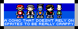
08-11-07 Update: Now we have this logo (below) with brand new art!


Neat, huh? And that is the history of the Due East logo. :)
last edited on July 18, 2011 10:26AM
SilverWordz at 6:47PM, June 18, 2007
(online)
posts: 238
joined: 5-28-2007
I do like the new logo. :)

And actually I really like your sig logo for BTS too. It's a crisp clear color, and a nice clean design. Simple and elegant, and cohesive with the comic.
last edited on July 18, 2011 10:26AM
dueeast at 1:08PM, June 22, 2007
(offline)
posts: 1,104
joined: 5-6-2007
That's very kind. Thank you!
last edited on July 18, 2011 10:26AM
RabbitMaster at 5:07AM, Aug. 30, 2007
(online)
posts: 134
joined: 5-26-2007
Hi, just sticking my head in the door of the forum and looking around as I make my way through book 3 ( I know, I'm behind) I have to say that I really prefer the new logo.

“Perhaps you would care to try your villany on a less defenseless opponent?”–Kung Fu Rabbit
last edited on July 18, 2011 10:26AM
dueeast at 8:58PM, Aug. 30, 2007
(offline)
posts: 1,104
joined: 5-6-2007
Thanks for sticking your head in the door here at the forum. We're glad to have you!

I'm glad you like the new logo, I like it too. :)

RabbitMaster
Hi, just sticking my head in the door of the forum and looking around as I make my way through book 3 ( I know, I'm behind) I have to say that I really prefer the new logo.
last edited on July 18, 2011 10:26AM
full_armor at 12:37PM, Sept. 9, 2007
(offline)
posts: 3
joined: 9-2-2007
RabbitMaster
I have to say that I really prefer the new logo.

Yes, I agree, I like the latest logo as well. It sais a whole lot about where this story's coming from. The kewl thing about this book is that there's still a lot of growth for each char to go through (not to mention the new chars being developed along the way), so new Logo designs may be implemented again after a while. Who knows, though… we'll see! :whistling:
* ^_^*
last edited on July 18, 2011 10:26AM

Forgot Password
©2011 WOWIO, Inc. All Rights Reserved Mastodon