mishi_hime wrote:
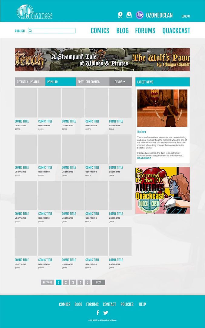
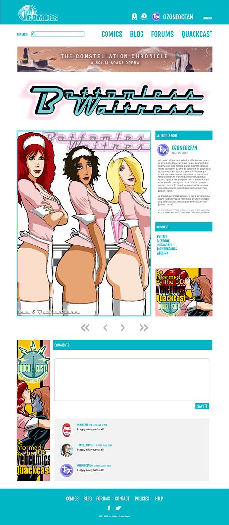
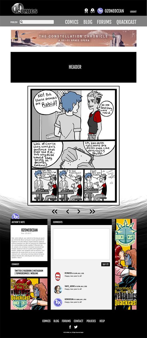
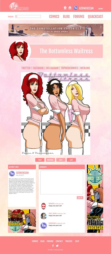
I wish I saw this thread earlier! I'm not a professional web designer but I do know a decent amount of graphic design. I'd be interested in helping the old duck get back on his feet. I'll try my hand at my own mockup and in the meantime, here's some design notes that explains some of my thought process *cough* gripes *cough*. Feedback appreciated.
–
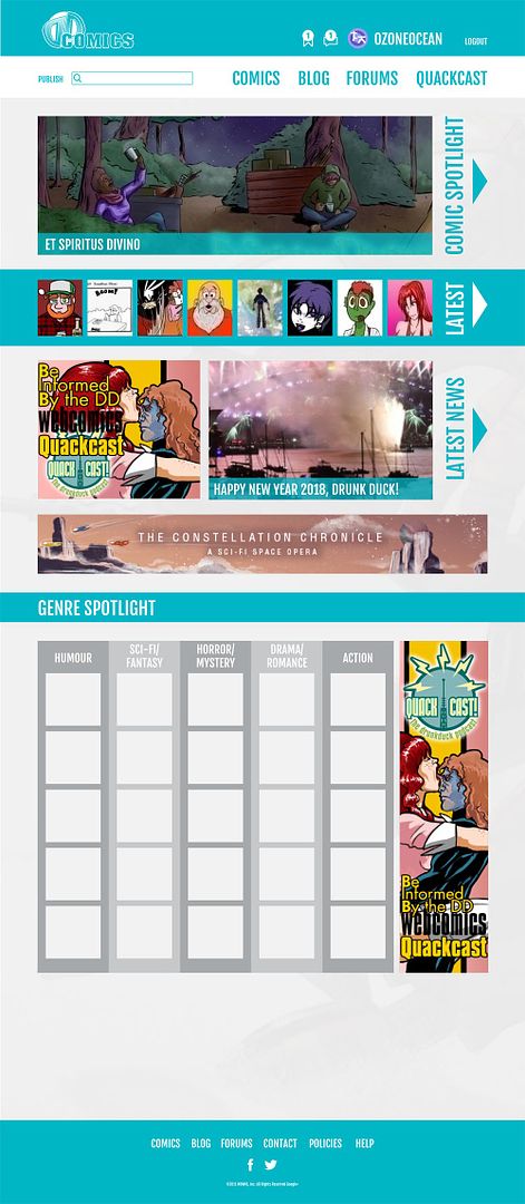
Issue: Too many bright colors (bright yellow, neon green, teal)
Solution: Rebrand the duck color palette. Keep it colorful but easy on the eyes.
Issue: Design feels very dated.
Solution: Limit the number of boxes and borders.
Issue: Design feels very cluttered.
Solution: Add white space / breathing room. Redesign the front page.
Issue: Design reads as kid friendly / aimed at kids
Solution: Decide the target demographic. Limit the amount of colors. Appeal to a wider audience.
Issue: Eye not naturally drawn to content.
Solution: Make content more appealing by enlarging (and adding more) images.
That's pretty solid :)
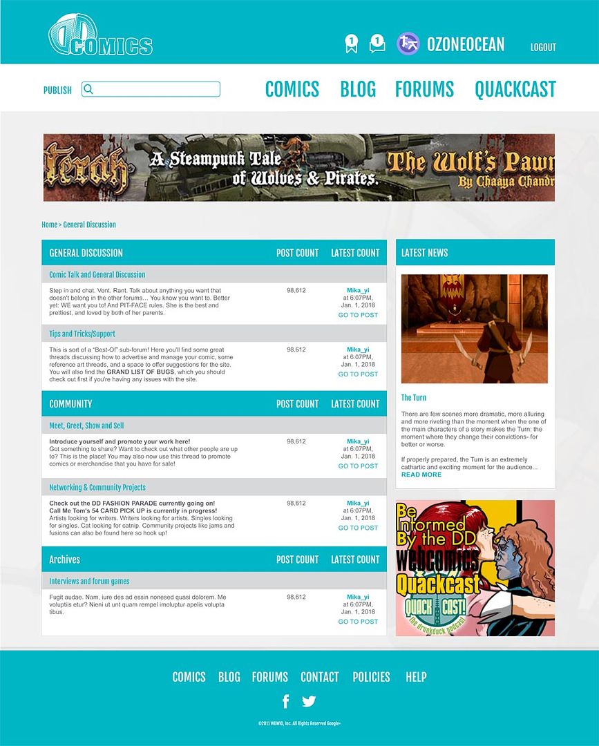
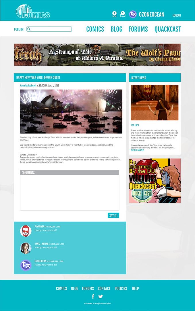
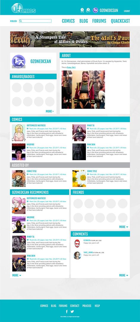
The way we need to approach this is to come up with a look for the main page and then also apply elements to the rest of the pages on the site.
So what works on the front page, like with the control panel placing, the ads, and the top bar links, has to work on other parts of the site too.
Also: a design that's adaptable to different page dimensions.