
It's no exaggeration to say that Drunk Duck AKA The Duck Webcomics, has a bit of an image problem. The trouble with Wowio and the site losing funding back in 2011 etc left us with a bad reputation, we had unfixed bugs, unfinished features, we lost data, and we look a little old hat.
But that doesn't reflect our current state!
DD has been successfully run by its community now for several years without any corporate interference. Our community got together and paid for all the big bugs to be fixed and we even added in a couple of features we'd been wanting.
In fact, with the programming fixes our site works better than it EVER has and in many ways it's more solid than our newer looking rivals, especially since we pay for more expensive site hosting and we have the Rolls Royce of image hosting services, Amazon S3 cloud hosting, with absolute guarantee never to loose your comic data due to crashes or faults. I doubt that a single one of our rivals has as much behind the scenes rock solid reliability as Drunk Duck.
We may look a little fusty, but we're built like a tank. Conversely, those other comic hosts look great, but the reality is that they're often a little cheap and flimsy.
And WE will never try and steal copyright to your comics!! I don't know if you can trust the others out there…
Appearance IS important though and we'll be starting another money raising campaign so we can pay to give ourselves an up-to-date facelift, You can join the discussion about that in the forums here: http://www.theduckwebcomics.com/forum/topic/177679/, and see some of our concept designs for an updated DD bellow.
In the mean time, we need new people coming in to help our site stay viable, to read our comics and to host their own great comics WITH us, so I ask you to please help get the word out. And please tell any lapsed Drunk Duckers to come back and join us, we'd love to see them back here to help make us better than we've ever been before!
Cconcepts for the front page
Updated
From Skreem:
Click to see larger size
From Ironscarf:
Click to see larger size
From Plymayr:
Click to see larger size
From Ozoneocean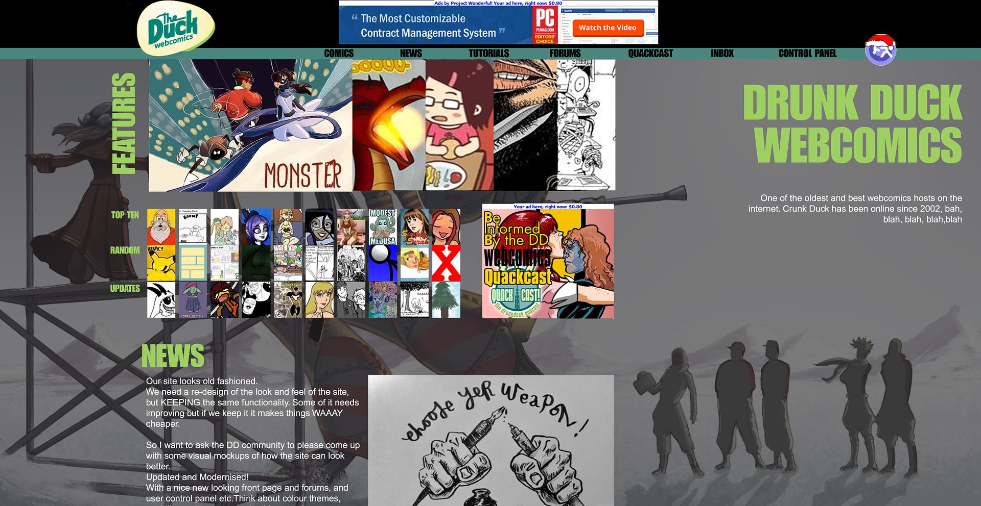
Click to see larger size
From Stinger9:
Click to see larger size

Spreading the word!
Ozoneocean at 12:00AM, June 2, 2017
6 likes!


©2011 WOWIO, Inc. All Rights Reserved Mastodon
Ozoneocean at 8:19PM, June 5, 2017
Glad you're still here Skyangel! ^_^
skyangel at 1:05AM, June 5, 2017
I like both Ironscarf and Ozones approach. Ozones feels to me like it has more room for additional items like maybe editorials, extra links or even ads wheras Ironscarfs is prob best for mobile phones, but I'm always on my laptop so I like a nice open view. Just like to add that I'm so glad I stuck with DD when so many here gave up. It was a really bad time for all of us when the original owners got into a mess, and when we came back with a new but broken site I was even more disheartened but my affection for DD wasn't entirely gone so I kept my hopes up and you guys have done a superb job in bringing this site back to life and I do feel very proud again to be a member.
Ironscarf at 7:59AM, June 3, 2017
Ozone deserves most of the credit for mine since it's just a tweak of his original, but looking at it the darker green, it is a bit similar to that other place. The wide top bar should probably be more of a veridgris.
GuyWithChainsaw at 5:42PM, June 2, 2017
Ironscarf's looks the best I think. Skreem's is good too but "latest updates" doesn't show enough comics in my opinion
cdmalcolm1 at 3:03PM, June 2, 2017
I like ironscarf. Just have the "update", "top ten", & "random" rotate every 10 or 15 seconds. I wish we could customize the homepage when we only log in Much like how we do for our comic editor. Just a thought.
Ozoneocean at 2:55PM, June 2, 2017
It's all concept art though that shows how we can improve things :)
Froggtreecomics at 1:33PM, June 2, 2017
Erm... mine wasn't actually meant to be a completed design but more of an illustration of how I'd prefer the fresh updates images bigger.
Ozoneocean at 11:54AM, June 2, 2017
Thanks for all the helpful comments :) please submit designs to the forum thread. #El Cid definitely need social media buttons somewhere. I don't know about comic fury but lime green as been part of our design since 2010 at least. The grey is just part of an experiment in having a background image with a neutral colour. I think the duck has always been a woman under those feathers... She just had mammalian tits grafted on to show her true colours :D
El Cid at 10:50AM, June 2, 2017
Hmm. I definitely prefer Ironscarf's design. But three things: (1) Where are the social media buttons? (2) Isn't lime green and gray a ComicFury thing? (3) Not Ironscar's, but that promo image up top... when did Duck have a sex change operation?
thunderdavid at 9:38AM, June 2, 2017
I like Skreem's design. Hey, im will send $ to keep this puppy going
Ashley.Grenstone at 7:49AM, June 2, 2017
Can I create my own concept and add it to here when ready?
KimLuster at 7:46AM, June 2, 2017
Ya know, I was initially not very enthusiastic about a change, but... seeing these mockups has certainly created an energizing effect!! Now I really want to see these changes get implemented - it might make ME feel younger too lol!!
PaulEberhardt at 6:14AM, June 2, 2017
I like Ironscarf's idea, too, although the less complicated the background the better. We'll want that thing to load reasonably fast like it currently does. It's the first thing new people are bound to notice, way before everything else.
Udyr at 4:28AM, June 2, 2017
I always recommend this hosting page to people I meet who does comics I still think it's one of the best/nicest communities I've experienced so far, that said using tapastic and smackjeeves too. :)
Niccea at 4:25AM, June 2, 2017
I prefer lime to the current yolk yellow.
stinger9 at 3:13AM, June 2, 2017
Got to say, Ironscarf's is still something of a favourite for me, even if the lime is a little garish for it! But it does have the tabs (That alone makes the site look about 10 years younger!), the larger thumbnails, better utilizing of space. It's a darn good way to look towards!