

Deviant Lynx's Basic Coloring Tutorial on Photoshop/Painter For Beginners and up!
Deviant Lynx at 1:05PM, July 25, 2007
Learn to color and detail you're work from sketch to completed finish!

(5 star average out of 4 votes)


Tools and pallette!!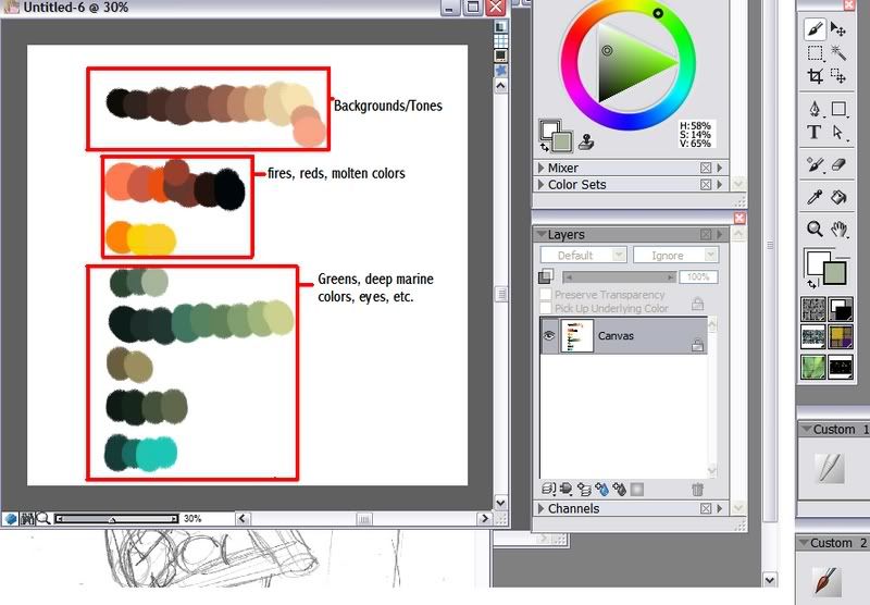
To start, we may want to have a sketch or a blank slate. Always think of the tone or feel to you're drawing. For mines, I placed a sketch for TTR's art collection, a basic haitus sign I suppose. Here we'll be coloring: Brehmon one of TTR's cannon characters.
Sketch!!!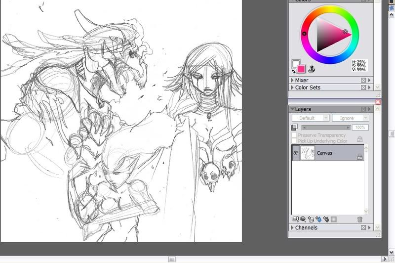
Step One: When drawing, once you've decided on the tone of the page or the piece you're working on. Decide for either a solid color, gradient, or if on a more advanced artistic level, a background of some sort. For this mini poster, I merely placed in a gradient, from deep love red, to smokey purple for Mor'ar the evil female antagonist, to misty pearl for Brehmon's love Haite. Mkay, for today we are simply going to see how I color Brehm. First I conduct a very simple color pallette for him. Notice in the pallette I have many dark browns, tans, oranges, molten yellows, and reds of every shade. I make sure to put my line art over ontop of the background layer for photoshop users and set the lineart under multiply. For painter users you can do the same. I am working on one layer, painting over the line art. This is optional too, but its best for having layers incase mistakes are made.
Step Two: Next we'll block in Brehm with the base color, not all of him, but just so we can see some lines. Make sure to leave a few spaces to were other body parts connect, like between the head and the neck for instance. Afterwards, use the next color down, progressing to you're right and going lighter and lighter, making wrinkles, creases, and details. Use a light opacity brush, this makes you're color on the brush more translucent, the lesser the percentage, the lighter the color.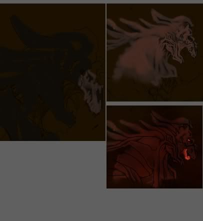
Step Three: Go back and keep adding details. For people using layers, you may want to add more layers as you keep adding color ontop of color. Adjust the color tones once or twice to get better vibrancy :3
Step Four: Make a final layer, color it in or make some squiggles, smudge and or blur it. Just make it nice and colorful. This goes ontop of all you're layers of course. Using multiply and then lightening that layer's opacity till you are saticified. Merge all the layers and adjust the colors till you're happy with it. Make sure to not only do that but also toggle with the values, saturation, and hues! I did so till I got Brehmon a nice fiery red, I am now happy with the Salamandrake. All done! Remember to take you're time and have lots of fun, experiment with as many colors as in the range as possible, meaning Reds go with yellows, tan greens, browns and organges. Take you're time and go back if you need to and have fun with it :3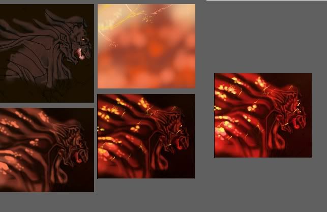
Till next time~ <3


