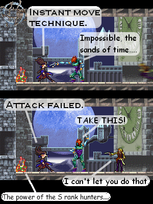
CVD 58 - Those of the S rank
Castle Pokemetroid on Aug. 12, 2011
It's possible this might be the last page for a while. I don't know if I'll be making very many more.
I do have plans for this chapter, and if you guys want, I can recap the rest of the chapter, so that the story just doesn't get dropped.
Maybe I should put up Albus' and Shanoa's info cards, just to delay the comic some more, so that I can buy enough time to make another page? It worked when I put up Juste and Maxim's info cards…
But that would also spoil Albus and Shanoa's abilities, and I don't want to do that…
Don't be mistaken that I'm going to stop making pages or anything, I'll just be making a comic every month or two (maybe three), instead of putting one up every week.
Sorry if I disappointed anyone.
If you readers want to make guest comics, feel free to send them in anytime.
But I don't think I have enough readers for that…


Castle Pokemetroid at 1:56PM, Nov. 17, 2011
I though that you could clearly see the difference between panels. Guess I was wrong. A problem with the text is that it's too big. There's no room to put anything else, which needs to be fixed. I rather like criticism. I don't mind it at all. But really, I never updated in September. Or October. I'm rather overdue for another comic page, I must say.
Ruin at 8:58PM, Nov. 15, 2011
I will admit, this comic is very interesting, but at times...quite often...it can be visually unpleasing. I'm not trying to sound rude here, and I truly apologize if I do. I only wish to offer some constructive criticism and some advice. One of the issues I have with it is that the spelling and writing in the comics is often greatly lacking, and yet, in your author's comments, your writing is splendid and pretty much perfect, in my opinion. It seems jarring, and comes off as a bit lazy... Another issue I find is that your pages tend to be only one or two panels long. That seems...I dunno. I'm sure there are other spectacular comics that do it too, but maybe I'm just greedy for more than this amount, like, four panels at the minimum or something. Also, when you do more than one panel, it's a pretty good idea to make the breaks between panels more obvious. Using black tends to work in some comics where the sprites and colors are bright and vibrant, but here...Castlevania is a very dark, gritty series, so oftentimes, that black bar just blends in. Perhaps a sort of dull gray? Something that stands out enough to show that it's a new panel. It's also a good idea to place the panels side-by-side, rather than one on top of the other. I notice you've gone to speech bubbles, which is a nice touch. I would comment on them, but I can't quite give proper criticism on them, otherwise, I might just give you bad advice. I do like the way you portray some of the characters, though, and I do hope you keep this comic going. Again, I apologize if I come off as rude, as that is not my intent.