
Page 1- The Meet
Huxley on June 6, 2006
Ughh, I kinda rushed this page so I can get up this website. So it is kinda confuzzling. Sorry.
Huxley on June 6, 2006
Ughh, I kinda rushed this page so I can get up this website. So it is kinda confuzzling. Sorry.


Liddy672 at 9:18PM, March 20, 2010
Neat first page!
Donovan at 1:41PM, Sept. 25, 2006
Sir, I might tell you I didn't take your avater from you. Instead I stole it from another person from an online forum! ^_^. Anyway, If you want me to change it, I will
Kagomas at 2:20PM, Sept. 9, 2006
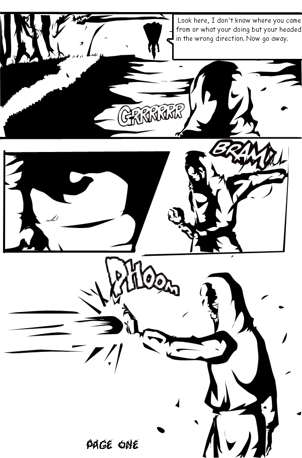
I'm sorry but I REALLY can't tell what's going on in this scene...I won't rate yet because my judgement may turn out to be unfair.
ccs1989 at 6:25PM, Sept. 5, 2006
Is it just me or is this Kiji an arsehole?
Kiji at 6:05AM, Aug. 29, 2006
o very very mature! EVERY1 CLAP FOR THE BABY!!!! o and even though this desevers a 5 im going to copy u and give it a 1 o i no very mature just like u!
lefarce at 3:55PM, July 22, 2006
Oh by the way, your avatar is really cool.
lefarce at 3:54PM, July 22, 2006
Lovely black and white work, but there is too much white as opposed to black, which makes it a bit blinding. Your characters are nicely drawn, and the environment is great. I really like this and I look foreword to seeing more!
Huxley at 9:15PM, July 16, 2006
Ohh this thing It's rushed. Thats why it's like this. I'ma try some different style later this month when I get my inking tools.
ccs1989 at 3:36PM, July 14, 2006
In fact, you probably have a better basic grasp of anatomy than I do.
ccs1989 at 3:36PM, July 14, 2006
Still, for your age, this is excellent.
ccs1989 at 3:35PM, July 14, 2006
The contrast is a bit over the top, but it definitly stands out. It's a little hard to make out exactly WHAT the background is though. Also, change the font to something better. [url]http://www.blambot.com[/url]
ZoeStead at 2:37PM, July 10, 2006
Love the black and white. Great style!