So this is wonderfully crazy with some good, bent humor lol The pace of action could be clearer (it was a bit hard to know what was happening at times), but overall it's amusing and has nice, clean artwork. Interested to see where this goes!
I saw on the forum that this is your first attempt at a comic, and are looking to improve.
First things first, congratulations on getting this far! Many people want to start a comic but never do. They want their skill to be at its best before they even start. But if you look at most (if not all) of the webcomics out there, there's a big difference in quality when comparing their first pages to their recent ones. Now on to the things I see...
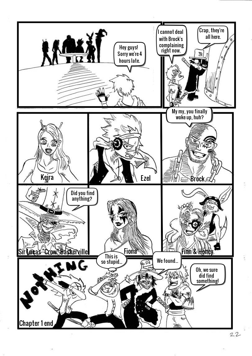
Right off, I can see the influences of “One Piece” in the character designs as well as the art style. That’s not a bad thing, just an observation on my part. The main thing about Oda’s art, there’s a confidence behind the inks, even with his wonky/exaggerated anatomy. Anatomy is something else to work on. I’ve noticed better results from artists who understand anatomy when it comes to simplifying things in a more stylized manner. Reference is one of the best tools in an artist’s arsenal. (1)
Omg I cannot believe I just noticed these comments. I had closed the tab to this site because of no response and not I come back so many days later to find your comments. I read them all so carefully and am so grateful for all the practical advice and encouragement. I am working on chapter 2 at the moment and I'm going to start applying everything you just said. Thank you so so much for everything my friend. I hope I don't disappoint next time :)
(2) The comic was a little confusing to read at first, then I realized that the pages are posted backwards. Where the buttons are Previous Last, the navigation doesn't fit with how the comic is intended to be read. I understand that this may be a way to resemble how manga is read, also from right to left. I've read plenty of manga and can switch from left to right, and right to left depending on comic. However, when it comes to standard webcomics, it can get a little confusing to those who used to it. You can upload your own navigation buttons here to The Duck, to remove some of that confusion, if you want to keep the pages as they are.
(3) The lineart/inks can feel confusing at times. With no greys, screentones, or stronger spot blacks, it can be difficult to understand what’s going on. The hatching, while I can see it’s being used as shadows and textures, seems to be used excessively and needlessly at times. There’s also the lack of backgrounds and a sense of where everything is taking place. This can also be a gripe of mine when reading some manga. For the most part, an establishing shot is needed, and the lack of backgrounds isn’t as noticed after that.
(4) The text and balloons: The type of font used feels out of place. Blambot’s site has a nice selection of free dialog fonts if you want to look at something more fitting for your comic’s style. The words also feel cramps within the balloons, and the balloons themselves also seem ridged compared to the art. Typos/misspellings are something else I noticed. Having someone else read over the pages before posting can help in weeding out those pesky typos. Some of the other words were also hard to read--their names for example. When it comes to the SFX words, it might work well if you hand lettered those. It’s something you can do on separate paper, scan, and place over the art after it’s scanned, as well. (With the magic of layers.) That brings me to my next point...
(5) I can see you’re using some kind of digital program. If you’re looking to stick with a free program, GIMP is a nice choice. (Not sure which one you’re using, though.) Other programs like Clip Studio Paint are made specifically for making comics, and has become to go-to program for many artists. I also mention art programs because your images seem to suffer from a low resolution issue. When saving as JPEG, things can look muddled around the inks (the greyish clusters). Saving the image at a higher quality can eliminate this issue.
You have a good start going here. I’m looking forward to seeing you improve over time. The most important thing is to have fun, and I can see you had fun drawing this first chapter. Keep on working and practicing and the improvement will come naturally.
-Eno


Sketchydrawer at 9:21PM, Jan. 20, 2021
I love it so far :D
BustyLaroo at 9:22AM, Oct. 4, 2018
So this is wonderfully crazy with some good, bent humor lol The pace of action could be clearer (it was a bit hard to know what was happening at times), but overall it's amusing and has nice, clean artwork. Interested to see where this goes!
Eno at 2:42PM, Aug. 17, 2018
I saw on the forum that this is your first attempt at a comic, and are looking to improve. First things first, congratulations on getting this far! Many people want to start a comic but never do. They want their skill to be at its best before they even start. But if you look at most (if not all) of the webcomics out there, there's a big difference in quality when comparing their first pages to their recent ones. Now on to the things I see... Right off, I can see the influences of “One Piece” in the character designs as well as the art style. That’s not a bad thing, just an observation on my part. The main thing about Oda’s art, there’s a confidence behind the inks, even with his wonky/exaggerated anatomy. Anatomy is something else to work on. I’ve noticed better results from artists who understand anatomy when it comes to simplifying things in a more stylized manner. Reference is one of the best tools in an artist’s arsenal. (1)
WilliamB at 1:46PM, Aug. 29, 2018
Omg I cannot believe I just noticed these comments. I had closed the tab to this site because of no response and not I come back so many days later to find your comments. I read them all so carefully and am so grateful for all the practical advice and encouragement. I am working on chapter 2 at the moment and I'm going to start applying everything you just said. Thank you so so much for everything my friend. I hope I don't disappoint next time :)
Eno at 2:45PM, Aug. 17, 2018
(2) The comic was a little confusing to read at first, then I realized that the pages are posted backwards. Where the buttons are Previous Last, the navigation doesn't fit with how the comic is intended to be read. I understand that this may be a way to resemble how manga is read, also from right to left. I've read plenty of manga and can switch from left to right, and right to left depending on comic. However, when it comes to standard webcomics, it can get a little confusing to those who used to it. You can upload your own navigation buttons here to The Duck, to remove some of that confusion, if you want to keep the pages as they are.
Eno at 2:44PM, Aug. 17, 2018
(3) The lineart/inks can feel confusing at times. With no greys, screentones, or stronger spot blacks, it can be difficult to understand what’s going on. The hatching, while I can see it’s being used as shadows and textures, seems to be used excessively and needlessly at times. There’s also the lack of backgrounds and a sense of where everything is taking place. This can also be a gripe of mine when reading some manga. For the most part, an establishing shot is needed, and the lack of backgrounds isn’t as noticed after that.
Eno at 2:44PM, Aug. 17, 2018
(4) The text and balloons: The type of font used feels out of place. Blambot’s site has a nice selection of free dialog fonts if you want to look at something more fitting for your comic’s style. The words also feel cramps within the balloons, and the balloons themselves also seem ridged compared to the art. Typos/misspellings are something else I noticed. Having someone else read over the pages before posting can help in weeding out those pesky typos. Some of the other words were also hard to read--their names for example. When it comes to the SFX words, it might work well if you hand lettered those. It’s something you can do on separate paper, scan, and place over the art after it’s scanned, as well. (With the magic of layers.) That brings me to my next point...
Eno at 2:44PM, Aug. 17, 2018
(5) I can see you’re using some kind of digital program. If you’re looking to stick with a free program, GIMP is a nice choice. (Not sure which one you’re using, though.) Other programs like Clip Studio Paint are made specifically for making comics, and has become to go-to program for many artists. I also mention art programs because your images seem to suffer from a low resolution issue. When saving as JPEG, things can look muddled around the inks (the greyish clusters). Saving the image at a higher quality can eliminate this issue. You have a good start going here. I’m looking forward to seeing you improve over time. The most important thing is to have fun, and I can see you had fun drawing this first chapter. Keep on working and practicing and the improvement will come naturally. -Eno