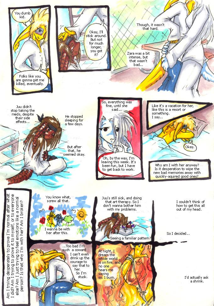
pg 74 : decent
inhuman on Oct. 6, 2008
visit INHUMAN-COMIC.COM
the colour quality on this page was…really good. almost as good as in real life. i have no idea what i did, but it makes it look so much better.
i also really enjoy the scribbly fantasy panel, and the on-fire panel. ahhhh yes.
the text being warped like that…i'm not sure. i guess i was using an old version of photoshop when i rotated it, and so it warped it.


