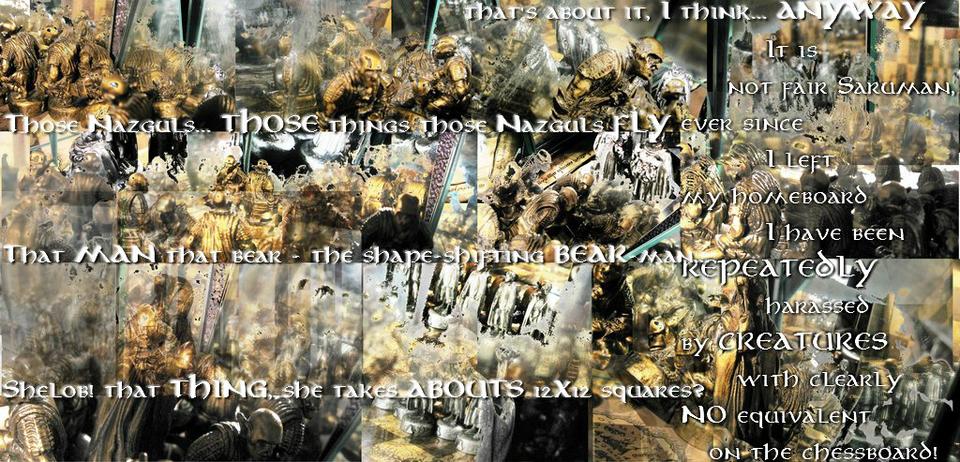
I read through your whole comment and left a couple comments and ratings. I wanted to leave an overall view of the comic.
First of all, I've got to say that I love the photography art. I think you take 'photographing action figures' from just photographs to artwork and a lot of the panels are simply beautiful. Very attractive.
The real flaw in your comic is the lettering. It's hard to read and follow. I've caught that it's translated from another language but it's not the translations, it's just how you letter it. With the active and high contrast panels, it's just hard to read them and see what they belong to. I really suggest you start putting speech bubbles or plain colored, or gradient rectangles behind the text or something. It'll make them more readable.
Also, in very active pages like this, it might help to make things more coherent if you added panel borders.
I loved some of the pages. Some of your photography/art was just stunning. The weird blend of photoshopping and photography of the metal figurines is very original. This is one of the more beautiful photo comics I've ever seen, it's just the text and layout that needs a bit of work.
I'd love to see you do wallpapers. Some of the single panel pages and closeups were just beautiful.
Plus Lord of the Rings is an awesome subject for a comic.


Metruis at 12:53PM, July 12, 2009
I read through your whole comment and left a couple comments and ratings. I wanted to leave an overall view of the comic. First of all, I've got to say that I love the photography art. I think you take 'photographing action figures' from just photographs to artwork and a lot of the panels are simply beautiful. Very attractive. The real flaw in your comic is the lettering. It's hard to read and follow. I've caught that it's translated from another language but it's not the translations, it's just how you letter it. With the active and high contrast panels, it's just hard to read them and see what they belong to. I really suggest you start putting speech bubbles or plain colored, or gradient rectangles behind the text or something. It'll make them more readable. Also, in very active pages like this, it might help to make things more coherent if you added panel borders. I loved some of the pages. Some of your photography/art was just stunning. The weird blend of photoshopping and photography of the metal figurines is very original. This is one of the more beautiful photo comics I've ever seen, it's just the text and layout that needs a bit of work. I'd love to see you do wallpapers. Some of the single panel pages and closeups were just beautiful. Plus Lord of the Rings is an awesome subject for a comic.