


[14] Space Waffles logo design
Black_Kitty on Aug. 16, 2007
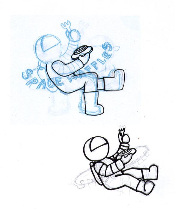
I originally intended to finish this up tonight and then upload a coloured and completed version here but I got sidetracked by a few things. :(
This was suppose to be an entry to Spambot's logo design contest. Alas, it looks like I won't make it. :( I wanted to create a logo that didn't center on the waffle aspect so much but at the same time did convey something along the lines of Space Waffles. Then I realized that oh wait, it's suppose to be a webcomic logo! Oops. Too late, onward!
The blue one is a rejected design. I later realized that the waist of the astronaut wasn't well thought out so I redid it. I was then going to add the words separately on a different layout. I don't like the inking for the right boot though. Bad perspective.
As a side note, I may be moving soon so I don't know if things will be shaky but I would be surprised if it wouldn't be.


Eirikr at 2:58PM, April 6, 2008
Space waffles...... I love you.
Ozoneocean at 10:28PM, Aug. 18, 2007
I will buy those waffles. Yes. Yes I will.
Shadows in the Rain at 9:37AM, Aug. 17, 2007
It's so cute!
spambot at 8:31AM, Aug. 17, 2007
It's not too late! I'm a patient guy :)
madscott at 3:47AM, Aug. 17, 2007
WOW!
FanGurlZ at 11:13PM, Aug. 16, 2007
I think it looks cute.