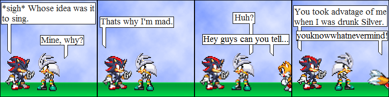
You know, I never saw Shadow as being an alcoholic. That's a good thing, cause that means you're not just copying what's in 500 trillion other comics.
Overall, your humor works well. #9 really made me laugh, and this one's pretty good too.
One thing in your comic that could use improvement is your spelling and grammar. It's not difficult to read, but try to keep your English as perfect as possible (slang's okay, obviously). Every mistake you make detracts the reader's attention, and therefore, detracts from the overall quality of the comic.
The text and text bubbles look kind of too plain. It's very hard to fix this if you use Paint (you poor thing), but if you use anything else, try to spice them up.
The title needs improvement. "Shadow and Sonic" is just too plain. It doesn't stand out, and that affects how many readers you'll get. People tend to assume comics with generic titles are crap. The title doesn't need to be awesome, it just needs to be unique. Furthermore, I notice the comic so far focuses on Shadow.
Your backgrounds (both in your banner and in your comic) look great. Your "grass & sky" BG in particular looks quite professional. You also throw in some nice effects, like blurs and stuff.
Characters are resized well, lined up well, and they proportion up to the panel nicely. One thing I would suggest you consider is increasing the size of your panels. Your text looks kinda scrunched, and increasing the size would give it more breathing room, which is nice.
Overall, your comic is good and has great potential. If you need any tips or script proofreading done, I'll help you if I'm on. Contact info's in my profile.


skybeast at 2:27PM, Aug. 7, 2007
@EvilCowSlayer hey thanks for the advise.
EvilCowSlayer at 8:17AM, Aug. 7, 2007
You know, I never saw Shadow as being an alcoholic. That's a good thing, cause that means you're not just copying what's in 500 trillion other comics. Overall, your humor works well. #9 really made me laugh, and this one's pretty good too. One thing in your comic that could use improvement is your spelling and grammar. It's not difficult to read, but try to keep your English as perfect as possible (slang's okay, obviously). Every mistake you make detracts the reader's attention, and therefore, detracts from the overall quality of the comic. The text and text bubbles look kind of too plain. It's very hard to fix this if you use Paint (you poor thing), but if you use anything else, try to spice them up. The title needs improvement. "Shadow and Sonic" is just too plain. It doesn't stand out, and that affects how many readers you'll get. People tend to assume comics with generic titles are crap. The title doesn't need to be awesome, it just needs to be unique. Furthermore, I notice the comic so far focuses on Shadow. Your backgrounds (both in your banner and in your comic) look great. Your "grass & sky" BG in particular looks quite professional. You also throw in some nice effects, like blurs and stuff. Characters are resized well, lined up well, and they proportion up to the panel nicely. One thing I would suggest you consider is increasing the size of your panels. Your text looks kinda scrunched, and increasing the size would give it more breathing room, which is nice. Overall, your comic is good and has great potential. If you need any tips or script proofreading done, I'll help you if I'm on. Contact info's in my profile.
Sonic Shadow sonadow at 10:17AM, Aug. 6, 2007
So bad timing...
DragoonX at 4:50PM, Aug. 5, 2007
Nice page.
slayer the hedgehog at 12:47PM, Aug. 5, 2007
Talking fast, huh?