Book 1
EmeraldCity on Oct. 8, 2007
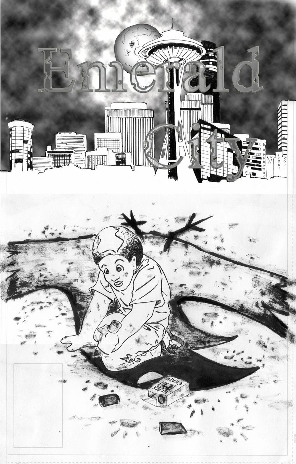
I cannot express how happy I am with it. This cover perfectly expresses what I try to put into words throughout our story. Oddly enough there is a bit of history to the “bird” that Drew (the boy) is drawing. When I was about 13 or so I tried my hand at making comics. Needless to say I felt comfortable making the stories but had the artistic skills of a wounded mule deer. Of course The Emerald City has nothing to do with the comics that I embarrassingly drew, but that is not to say that some of the characters I made so long ago have not been reinvented by Jason and me. But back to the point; that bird was apart of a comic I drew and I showed Jason, who in turn made fun of me for 10 years. But I think both of us know how important the dreams we had when we were kids are and even through the hazing we decided to mask my lack of artistic talent by having a kindergarten kid draw it on the cover. Jason almost was able to nail my style of art, but I still think his looks better!
With our covers we want to have Drew conveying a theme of the comic through his drawings. Also, we want to feature Seattle on all of our covers. We think this is very important for the identity of our series. We hope you enjoy it, and again please give us your thoughts. They mean so much to us!
-Kevin M. Jones


eric 4 3run at 2:09PM, July 22, 2008
cool kinda sci-fy ish i like it
EmeraldCity at 7:10AM, Nov. 16, 2007
It's my hometown too man! In fact my father worked highrise cranes to help make a lot of the skyline in Seattle
Hdub7 at 12:35AM, Nov. 16, 2007
I love this. I love anything that has to do with my home town. Anytime the skyline can get out is awsome. I can recognize the buildings too, so Great job on that. Love the kid in the front holding the chalk with his whole hand.
EmeraldCity at 5:04PM, Oct. 15, 2007
I love this cover. The whole concept of it. You have a child playing like kids should, and the city landscape. But while that would be a normal scene in most pictures something about the cover is a bit creepy or foreboding. I just love it and think it captures so much of the first book and the series as a whole as well
trevoramueller at 8:02AM, Oct. 15, 2007
Nice cover shot, with a great view of the city scape.
EmeraldCity at 4:54AM, Oct. 11, 2007
Thanks! I happen to do that sometimes and for the first issue we're (see I can do it!) going to re-edit the pages and fix that! I am glad you pointed that out!!
CoyoteLongshot at 11:14PM, Oct. 10, 2007
Hey, nice job! I love the way it's stylized, and the perspective is dead-on. The shading gives the comic a lot of character, and just the overall dynamism and flow works really well. I really can't find much to criticize, but if it were one thing, I'd say make the dialogue less static in certain areas. It's written well, but I noticed a lot of things like "it is" as opposed to "it's", etc. that made them seem kind of robotic. But overall, great job on this. And it is positively awesome that it's in Seattle. I'll surely keep an eye on this one, yes...