


Crossing Death
Salsa on July 20, 2010
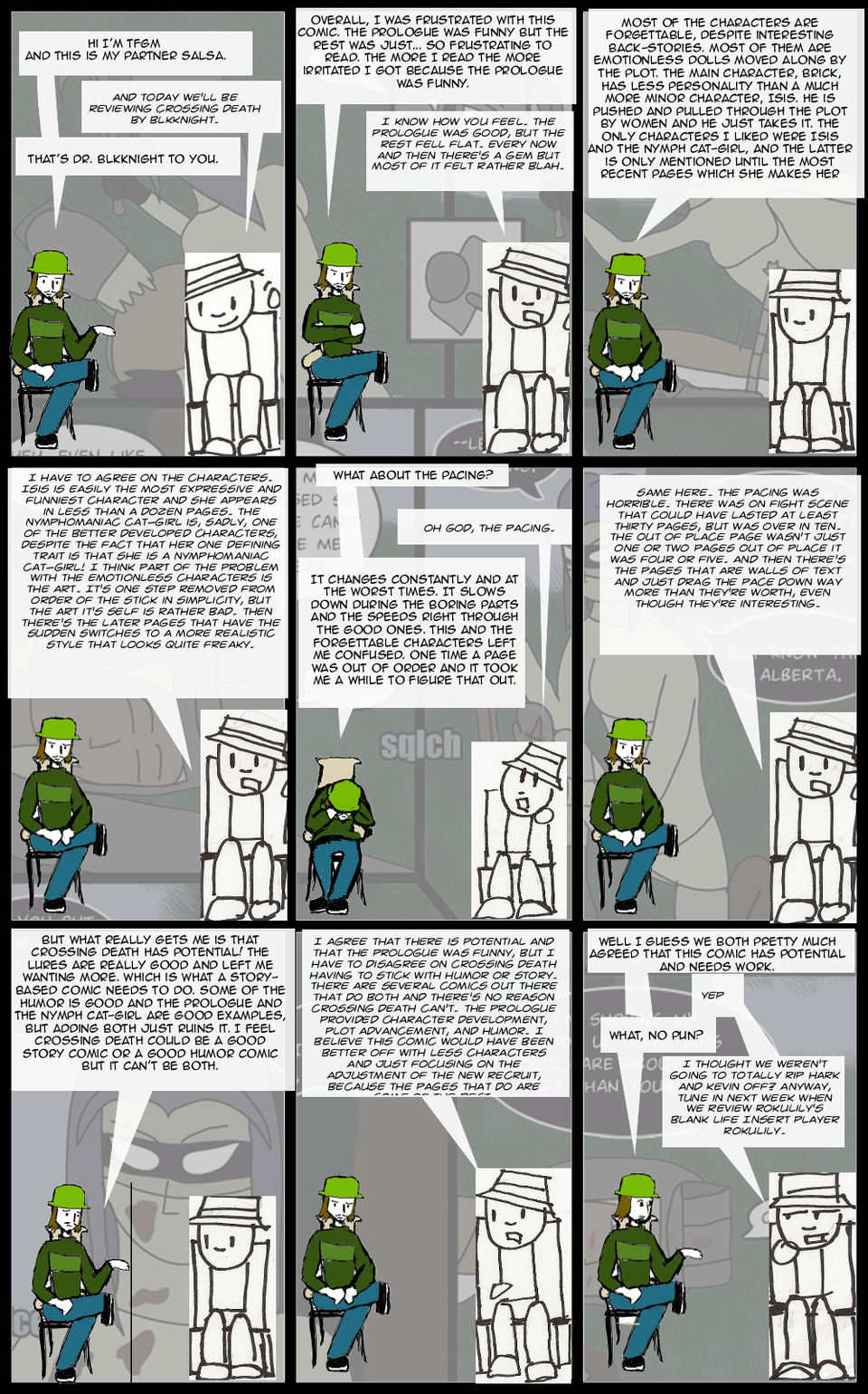
Well, we're live!
As you can tell, we both think this comic is in serious need of some help in numerous areas, but it does have it's moments. here's my favorite page, and here's my partner's. Agree? Disagree? Want to Lurk? Check out the forum!
Harkovast ans Kevin also reviewed this comic. View their review here.
Next Week: Blank Life Insert Player Rokulily
Edit: I know many of you hated the font I chose for myself, so I fixed it. It should be okay now.


Salsa at 9:12AM, July 28, 2010
My Partner seems to have gone missing. I apologize for the lateness of this next review I'll have it up in about an hour.
I Am The 1337 Master at 2:22PM, July 27, 2010
Hark told me you guys didn't really get permission but I still think you need lovin. Good lucks.
I Am The 1337 Master at 6:48PM, July 26, 2010
people don't really like that it looks like twrcotw. If you guys got permission to do these similarities as you did, there is not point in being yelled at. I thought it was a fair review. And deserved some lovin. lovin /lovin
mishi_hime at 2:20PM, July 22, 2010
Awesome. You managed to ripoff someone else's comic verbatim and toss in a few eye burning fonts. *claps hands* bravo gentlemen.
Salsa at 9:50PM, July 21, 2010
Yeah. I gotta Talk to TFG about all this. I like the Idea about the Television screen. I think I may have another one similar to that would be good.
Chernobog at 6:45PM, July 21, 2010
Kind of what everyone else already said here.
Salsa at 5:56PM, July 21, 2010
I take it we're going to get a mention in the next update then? :)
harkovast at 4:39PM, July 21, 2010
A webcomic with two guys in chairs in front of a background picture of another comic which they then review? Genius! I wish I had thought of it! Oh wait...
ifelldownthestairs at 2:50PM, July 21, 2010
I THOUGHT YOU GUYS WERE GOING TO BE NICE In any case, they're just starting out. I'm sure they'll come into their own sooner than later. And besides, the friendly competition could kick us into high gear as well!
Salsa at 2:18PM, July 21, 2010
I hope TFGM is reading this 'cause this is a lot to relay if he's not. First. TFGM made the layout of the page. He even told me that he based it upon the one that Hark and Kev use. IT just has an extra row of panels. I see what you mean about this coming off as jerk move, and not in the tasty chicken way. I'll talk to him when we start discussing BLIPR. Based on what everyone's said, it would probably be a good idea to experiment until we hit a niche, then redo all the comics that way. Second the font is called Arcanum and I agree that it's a lot harder to read than Anime Ace, which is the font I used for TFGM. I guess I need to so some font searching. Third. I apologize for stepping on toes. I honestly didn't know there was a problem with this until I read skool's post. Fourth. If I had known that the layout of the comic was going to cause a big discussion in the comments thread I'd have created a forum for this. :D I'm glad people are leaving feedback. This is a good sign for us.
Product Placement at 1:56PM, July 21, 2010
I'm gonna partially agree with those who posted before me. While I see nothing wrong with having more then one review comic (and there were other review comics around before Hark and Kev's), I'd like to see you guys develop your own style. Also, I find TFGM's text to be much more easily readable then Salsa's. I'd recommend using a different font for Salsa.
skoolmunkee at 1:46PM, July 21, 2010
I'm staying out of it, but I do have to say that using the same format makes you guys look kind of like jerks, especially after some people weren't happy you were doing the same sort of thing in the first place. I think changing your format would go a long way toward 1-distinguishing your review comic from theirs, 2-giving you credibility and community brownie points, and 3-freeing you more creatively to develop something more your own, do a different kind of review, etc. Just a little advice. :]
usedbooks at 8:55AM, July 21, 2010
The review's fine, but my complaint is the whole layout and set-up. Two characters, seated, talking. Blocks of panels. Voice baloons alternating between the characters. Pictures from the comic used in the background. Come now. You can be creative. Make it your own! Use a different gimmick, a different layout. Honestly, it doesn't need to be that creative or any effort. I just hoped it would be different. Simply altering the number and size of panels would do wonders. Like you could have your characters sitting to one side looking at a TV screen showing parts of the comic with long horizontal panels arranged in a single column rather than a bunch of small ones in a block -- or use no panels at all. Make a set/background. Or design it like a magazine article rather than a dialogue using inserted pictures of the critics and of the comic under review. I don't mean to be critical. I hope this is taken as a friendly suggestion. I mean, Hark and Kev might be flattered that they set a standard for review format, but it isn't the only way or necessarily the best way. (Thanks for fixing the text.)
Asbin at 8:41AM, July 21, 2010
Lol yup, just like Hark and Kev's but decent review
Salsa at 7:51AM, July 21, 2010
I can't speak for TFGM, but I'll try to speak for both of us and hope I don't tread on toes. The idea as pitched ot me was basically a review comic similar to hark's and kev's, since our tastes are different it would provide a little more diversity to our reviews. Though we pretty much agreed on Crossing Death and will probably do so on our next one, but my point is if we reviewed, say Mob Ties, we would both have different opinions. Yes we did retread new ground, but in our defense the art and the characters are the only things that we covered that they covered. I don't believe they covered pacing, and I know they didn't like the prologue. We did. I'll add a link to Hark and Kev's review in the author's notes. Another thing is we were hoping to be able to help out Hark and Kev some. Have you seen that list? IT'S HUGE. As for the text. My mouse is on the fritz and I accidentally turned off the font anti-aliasing. I'll have it fixed in a little while.
BlkKnight at 4:42AM, July 21, 2010
I was also expecting a non-clone of Hark's comic. If it's any consolation, Isis becomes a major character next page.
AccoSpoot at 4:03AM, July 21, 2010
I agree with Usedbooks, not only in the layout of your page but in the style of your review, it just seems to be retreading Hark and Kev, I didn't think there would be much difference if I substituted out your characters for Hark and Kev. There's plenty of room to experiment with the review format and still have a credible message, you could go deeper than Hark and Kev, exploring comics at a slower pace with more attention to individual pages, or you could explore in depth the semiotic value of the comic and what place it has in the world of visual narrative, these are just a few ideas. I really hope this review comic does delve into some new territory, I look forwards to the future.
usedbooks at 3:48AM, July 21, 2010
Aw. I was hoping you'd have a different format and approach than hark and kev rather than just copy theirs. :( Like showing excerpts or at least having the set-up different. Yeah, the font is not good, especially Blkknight's. Both could use some anti-aliasing too.
Genejoke at 12:37AM, July 21, 2010
change the fonts, it hurts the eyes... actually I had a few pages that looked like that ones I resized in Gimp so maybe it isn't the font.