


Issue 1 - Page 1
btstudios on Jan. 27, 2008
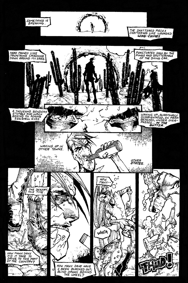
I'd like some feedback on the quality of this image - because of the detail if I jpg'd it you'd be staring down 250k. So this is an eight color gif. How does it look to everyone? Let me know if it's bad and I'll come up with something else. It looks fine over here. ^_^
~J


harkovast at 1:17PM, Jan. 23, 2009
Don't mess with mr Booze is the moral here.
trevoramueller at 10:39AM, March 11, 2008
Good textures here.
junoblairb at 5:23AM, Jan. 28, 2008
The bottle breaking is definitely my favorite. :D
DeadSquirrelJoJo at 1:31AM, Jan. 28, 2008
Image quality looks all right to me. Doesn't look pixellated, or anything. All the lettering is legible... ...This is such a gorgeous page. Those fifth and sixth panels are just...beautiful. The way that Shane has made this (beer?) look so opaque. And those bleary, dark-rimmed eyes. Wonderful value structure, and great textures. You can really feel the grit of large grains of sand, and the spines of the cactuses. And the narration is just pure poetry.