
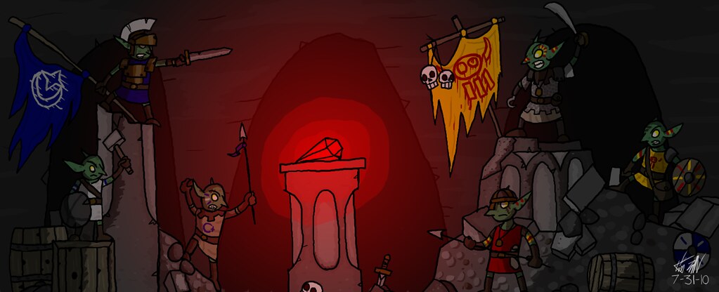
Goblins and robots are my two favorite subjects. There aren't any robots in this picture though.


 - Being a toy makes a difference…right?


darthfurbyVERY PERKY!
I like the detail work, good pose, with my favorite part being the head/beak. The line flow in the wings, tail and furry neck area are a bit unsteady/uneven(drawing from the shoulder would create a graceful and smooth line), otherwise very nice drawing. I see an illustrator.


shinka wrote:I absolutely adore the colors! The top scene with the character in front of the moon, gorgeous. I really like it!!!
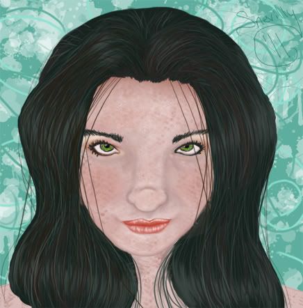
Awesome coloring and artwork.
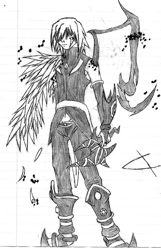
Fine lines and details.
Very good work here.
—————————————


