
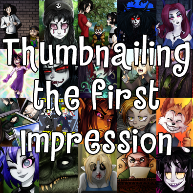
Here on DD, your thumbnail is your first impression and as such you should take care with your thumbnail, as it is your first chance to make an impression with a reader. Full disclosure, I don't really like our thumbnails here on DD. These stamp style thumbnails are too small and make it difficult to make a strong overall impression. As you might have noticed (or not if you don't look at the main page), I like to change my thumbnails whenever I update. I don't feel like settling on one image to represent my comic as a whole. I always want people to get a strong impression of what the comic is like now.
One mistake I see a lot of people make is putting in a thumbnail that doesn't really present the comic as it is. You should always put your best art forward, but do try not to fool people by putting your 100% best effort into your display and then just phoning in the actual comic. I've slammed the exit on so many comics that showed fantastic promise in the thumbnail, but the actual comic art was not even on the same level of effort, and updating too slow and in too small increments to justify the rush job art and rampant spelling errors. Putting effort into your thumbnail but phoning it in on the actual content sends conflicting messages to your potential reader– it's like putting up a big showy display out in front of a store and when the customer walks in, all of your products are scattered on the floor. People are more willing to bear with a little rough art if you don't show them you can do way better right from the start. Starting off dinner with a luscious dessert, then presenting the main course of day-old bread with the excuse “I didn't actually have time to make dinner” isn't going to thrill your potential new reader. Keep the display work you present to your potential audience at least a little consistent with your everyday art. And if you can, present something from your comic in your comic thumbnail as well! So many times have I checked out a comic because an interesting character design caught my eye, only for it to turn out said character is not appearing in this comic, whose actual characters are rather bland in comparison! You wouldn't think people would put something unrelated from their comic in their thumbnail, but they DO! Don't be like that, be honest about your work– nobody likes feeling catfished by a fancy thumbnail!
It's unfortunately a little difficult here as our tiny thumbnails are reduced even further on the main page where most of the eyes are going to be (I long for the day this is fixed!!) so you have to put a little more consideration into the image you choose than on other sites. There used to be a little gentle fun made of thumbnails that were zoomed-in faces, but the microscopic display size we are afforded really offers little choice. Faces are almost instantly recognized for what they are, and you can tell quite a bit of what art style to expect from facial expressions and construction. From my experience as a reader, a well-drawn face is going to distract people from the weaker parts of the art, as naturally our eyes are drawn to people's faces when they talk to us (even if it's in text!) Even those of us who generally avoid eye contact will try to look at someone's face when they are speaking to us. Our abilities to see faces in near anything should speak volumes to this– it is called pareidolia, the tendency to see shapes and images in random patterns. Because faces are so immediately recognizable, and our eyes are drawn to them, choosing your character's face for a thumbnail seems like the natural choice. Looking around DD that seems to be the popular choice! As of my writing, 6 of 10 of the top ten are focused on the face, and 5 of the 10 recent updates. Popular on Tapas and Webtoons? Big ol' giant faces! The majority of my thumbnails since 2007 have been character's faces, with only the occasional full body or spoiler-avoiding focus on something else in the scene. I stopped being sensitive about faces being in my thumbnails like everyone else and embraced it, because who can argue with success, eh? Even when given more space to work often times people still choose to focus on a face, I'm sure we've all seen the ‘big heads’ style of movie poster or slip cover. Only people who have mastered hands put their witchcraft on display so brazenly as to have that in their thumbnail!
On DD your best bet if you don't want to do big heads is to look at stamps and see what is effective there. The post offices all around the world try to make the most of similar tiny spaces and, while there a lot of phoned in stamps (I'm looking at you 8 millionth bland heart stamp!) there a lot of good ones which take strong elements of design and try and work it into a very tiny space. In general you are going to want something that is very clear, colorful with strong contrast. If done well this should provide you with something of a one-two punch. The colors and contrast will draw the viewer's eye to it and the clarity of the image will make an immediate impression. This way at least you had a chance to make an impression instead of being overlooked. People might not always click on your comic the first time they see it, but rather after seeing it a few times allowing it to build a bit of an impression, so it is important your thumbnail doesn't get lost in the crowd.
Well that is how I try to make an impression on potential readers anyway, but how about youseall? What thumbnails really grab you?
Do you put much thought into your own thumbnails or not at all?
Don’t forget you can now advertise on DrunkDuck for just $2 in whichever ad spot you like! The money goes straight into running the site. Want to know more? Click this link here! Or, if you want to help us keep the lights on you can sponsor us on Patreon. Every bit helps us!
Special thanks to our patrons!!
Justnopoint - Banes - Rmccool - Abt Nihil - Phoenixignis - Gunwallace - Cdmalcolm1 - Cresc - Pauleberhardt - Scruff - Dragonaur - Emma Clare - Dylandrawsdraws - Functioncreep - The D Wrek - Mks Monsters - Eustacheus - Dillycomics - Barrycorbett - Sinjinsoku - Smkinoshita - Jerrie - Chickfighter

Making Heads Of Thumbnails
Amelius at 12:04PM, April 28, 2019
5 likes!


©2011 WOWIO, Inc. All Rights Reserved Mastodon
meemjar at 4:39PM, April 30, 2019
I figured my character doing a Martial Scream into the readers face was a good impression.
Ozoneocean at 8:42PM, April 29, 2019
Faces work best at the tiny size of our thumbnails... I'd love to have bigger ones! I think that's part of the redesign Emma Clare has done for us. Just need the cash to pay to get all that coded/
bravo1102 at 2:43AM, April 29, 2019
I'm too wedded to my movie poster look. I like to fit in the title, because all those disembodied heads look like a stamp catalog and I'm just not into philately.
usedbooks at 7:39PM, April 28, 2019
Also, at the "mirror" on the domain I pay for, I have a table of contents with larger thumbnails for each chapter. It makes for a cool effect. At a glance, I can see the art changes and also jog my memory on the story.
usedbooks at 3:31PM, April 28, 2019
I usually go with an intense expression or active interaction between two characters cropped directly out of my most recent story arc. It keeps the art accurate to my current offering and depicts the mood of my story with an accurate plot teaser.
Banes at 1:51PM, April 28, 2019
Excellent article! I agree that a face on an appealing character is a good way to go. And very much agreed on the “catfish” of a thumbnail that doesn’t deliver! Very important! I would also give attention to the “blurb” that pops up - I’ve tuned in to many a comic that has an appealing hook to the story or a quip that makes me chuckle.