
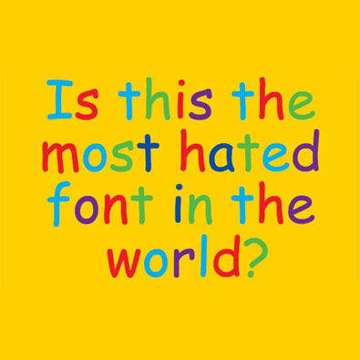
In my research for a larger article about comics and typography, I stumbled upon an article that talked about how and why the font “Comic Sans” came into existence. Published via The Guardian, Vincent Connare, Comic Sans’ typographer commented,
”One program was called Microsoft Bob, which was designed to make computers more accessible to children. I booted it up and out walked this cartoon dog, talking with a speech bubble in Times New Roman. Dogs don’t talk in Times New Roman! Conceptually, it made no sense.”
There was a clear need for a typeface that could be used by Microsoft products that was less formal, particularly with resources such as Encarta being used by children.
Connare goes on to describe how he broke many typographical rules, such as the “p” and “q” not being direct reflections of themselves. Taking inspiration from the hand drawn lettering in comic books such as Watchmen and the Dark Knight Returns he mentions, “I looked at various letters and tried to mimic them on screen. There were no sketches or studies – it was just me drawing with a mouse, deleting whatever was wrong."
By the time Comic Sans was completed, it was too late to include it in Microsoft Bob, however, this did not prevent the staff of Microsoft to continue using it in their emails, particularly when speaking about cheerful subjects such as birthdays or work events. It proved to be so popular that it was eventually included into the release of Windows 95.
Despite the backlash over is overuse, Connare remarked, ”Type should do exactly what it’s intended to do. That’s why I’m proud of Comic Sans. It was for novice computer users and it succeeded with that market."
The article goes into more depth and it is well worth the read. Click here to go read it now.
Have you ever used comic sans inappropriately? Do you see much these days? Let us know in the comment section below! And join us on Sunday evening for our Quackchat at 5:30PM(EST)!
Don’t forget you can now advertise on DrunkDuck for just $2 in whichever ad spot you like! The money goes straight into running the site. Want to know more? Click this link here! Or, if you want to help us keep the lights on you can sponsor us on Patreon. Every bit helps us!
Special thanks to our patrons!!


Justnopoint - Banes - Rmccool - Abt Nihil - Phoenixignis - Gunwallace - Cresc - Pauleberhardt - Scruff - Dragonaur - Emma Clare - Dylandrawsdraws - Functioncreep - Eustacheus - Dillycomics - Barrycorbett - Sinjinsoku - Smkinoshita - Jerrie - Chickfighter - Andreas_Helixfinger
Tantz Aerine - Cdmalcolm1 - Epic Saveroom - Spacewitch - Alpharie - Genejoke - ArityWOlf - Davey Do - Spark of Interest - Gullas - Spark of Interest - Damehelsing - Roma

"How we made the typeface Comic Sans"
Emma_Clare at 12:00AM, Dec. 13, 2019
6 likes!


©2011 WOWIO, Inc. All Rights Reserved Mastodon
Ozoneocean at 6:12PM, Dec. 18, 2019
As for "dyslexic friendly", that's really just a way to help apologise for it. True, it's awkward and uneven which makes it less prone to confusion for dyslexics, but it's not as universal as it once was and there's no reason that dyslexic people should be forced to suffer with something as ugly and stupid as Comic Sans (and make themselves vulnerable to criticism) when there are WAY better totally free fonts specifically designed for dyslexics just an easy google search away.
EssayBee at 5:44AM, Dec. 16, 2019
Don't understand the hatred behind it. I push its use in everything from funeral announcements to will/estate papers.
rmccool at 4:48PM, Dec. 14, 2019
comic sans is one of the dyslexic friendly texts..
Andreas_Helixfinger at 12:37PM, Dec. 14, 2019
HOORAY!!!
Ozoneocean at 6:30AM, Dec. 14, 2019
Hooray for Nate!
Ironscarf at 6:06AM, Dec. 14, 2019
We should also hand it to Nate Piekos for giving out great free fonts on Blambot, so no webcomic ever has to use comic sans again, unless they're trying to be ironic.
PaulEberhardt at 11:59PM, Dec. 13, 2019
We'll have to hand it to that guy that creating a comic-style font that actually looks good is a nigh impossible task. I'm not particularly fussy, but I used Times New Roman for years, just to avoid having to use Comic Sans and similar for my comic, until I found one that finally more or less suits my tastes.
Andreas_Helixfinger at 10:54AM, Dec. 13, 2019
So we have Alan Moore and Frank Miller and their respective teams of artists among others to thank, not only for intensifying comics in the mainstream back in the 80's, but also providing the inspiration for Comic Sans in the 90's. The more you learn.
El Cid at 9:13AM, Dec. 13, 2019
Comic Sans is a victim of its own success. Microsoft should re-release an improved version of it, and then sneakily have it retroactively overwrite everyone's existing fonts. Then the only way you can see original Comic Cans will be in webcomic art. Overnight, webcomics will become worth their weight in GOLD!!!
Jason Moon at 8:37AM, Dec. 13, 2019
The font reminds me of the 90's movie "TOYS" with Robin Williams.
Ironscarf at 5:38AM, Dec. 13, 2019
I still see it used by major media outlets when they do a mock up comic strip as a take on current affairs or something like that. Crossbar 'I's all the way. It hurts my 'I'balls.
sphinx8k at 5:36AM, Dec. 13, 2019
well...i prefer to use COMIC SANS in my stories... :)
bravo1102 at 2:25AM, Dec. 13, 2019
Whenever I hear of it now I think of Weird Al Yankovic 's "Tacky" which contains the lyric "see my new resume, printed in Comic Sans" . It's become tacky. Have to hand it to Weird Al, he always seems to have our culture all figured out.
plymayer at 2:20AM, Dec. 13, 2019
I always struggle with which font to use in comix. Often, when seeing one that I like in a web comic ask what it is called.
Ozoneocean at 8:44PM, Dec. 12, 2019
The first time I came across Comic Sans was the early days of Microsoft's Comic Chat program, where online chat was all done in the form of a comic strip with words as word bubbles and characters as black and white comic avatars. It worked well there because it was in the right context as well as being low res and on a screen so you couldn't see the problems with it. Printing is another story, it's a crappy font and there are much MUCH better versions of comic style fonts that do the same thing but are made by pros who know what they're doing. There's no reason to use it anymore. Fonts are very important and complex things, a lot more than people realise.