
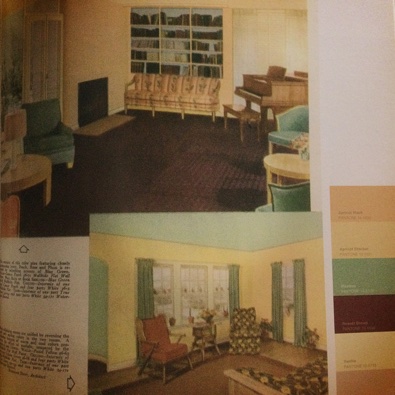
It is evident, when training the eye for color theory practice, that decades and movements in the twentieth century captured color schemes that exuded the vibe and mood of the time. The above photograph is taken from the chapter titled “The American Dream” section of Pantone’s 1940s collection and demonstrates how Apricot Wash, Apricot Sherbet, Meadow, Russet Brown, Vanilla, and Rose Smoke come together to embody a time that completely rattled the entire world as it was known.
An encyclopedia of color swatches is the most useful tool when constructing comic set in a specific period. A successful color palette can aid in setting the stage for a believable story. Take for example, the series Mad Men (2007), which was set during New York in the 1960s. There is a point on the story that takes place from 1969 to 1970 when Don Draper’s house was suddenly decorated with Burnt Orange, Cream Gold, Golden Olive, and Avocado that made the change in color palettes much more noticeable.
In recent years, the trend to emulate the Nordic style of the Danish “Hyyge” lifestyle will definitely be seen in warm and gentle neutral color tones of Taupe, Chinchilla, Cream, Arctic White, and Sand will most likely be one of the refreshing color schemes from the twenty-first century of color design.
How does any of this apply to comics?
That is easy for anyone who has acted as a colorist or attempted to give color to a full page of scribbles and inked sketches. Applying specific, known color schemes from the fashion periods from earlier decades is the easiest way to show the reader that the comic takes place during a different era from the present day one.
Selecting a calming color palette has a lasting effect of calming down a reader, while a stimulating color palette may have the opposite effect.
Has anyone ever used a specific decade’s color palette in their original comic work? Post a link to your comic page and share below!
.::.
What's Quacking?
Do you have any original art to contribute to our stock image database, announcements, community projects, ideas, news, or milestones to report? Please leave general comments below or send a PQ to kawaiidaigakusei. Email me at kawaiidaigakusei(at)gmail(dot)com.

Color Theory as a Rewind Machine
kawaiidaigakusei at 12:00AM, May 31, 2021
6 likes!


©2011 WOWIO, Inc. All Rights Reserved Mastodon
hushicho at 12:29AM, June 1, 2021
This is such a good point! I also would like to point people who use color in their comics to color guides for the period, if available. Not only in decor and interior decorating, but also in comic books, most of the major publishers had color guides that you can use with a simple color eyedropper in most graphics suites. Even if they don't, you can likely find scans of comic pages, panels, and covers and accomplish the same thing. It's especially helpful in setting a certain aesthetic, and it can be so handy when that's strongly attached to a specific time!
entropy0013 at 3:12PM, May 31, 2021
If you have a long standing college or university, in your local area, that teaches architecture, interior design, or historical site preservation. It can provide you with the color palettes and design accents of period in question. Better Home and Garden back issues can help as well since they marketed many home furnishings.
Xade at 1:25PM, May 31, 2021
I use color themes all the time, I used jewel-bright colors for my underwater scenes. And now I am using natural colors in the land scenes. I know it's not from an era but color themes are very important to catch the eye. Ive seen this done well, and I've seen eyewatering terrible examples. here's my comic link so you can see for yourself. https://www.theduckwebcomics.com/Growlution/
usedbooks at 5:33AM, May 31, 2021
I'm currently setting an arc in the 70s. I'm very uncomfortable with the colors and styles. lol. https://www.theduckwebcomics.com/Used_Books/5676196/