
Hello everyone, and welcome to Panel by Panel, a periodic exploration of comic panels around The Duck. This week we're talking about the comic called The Cherub Brothers. It is a comic by user Magor. The description of the comic from Magor reads: “The cherub brothers are maybe-kinda-sorta legitimate cherubs who live and help out people in an unfunded retirement town that's rumored to be demolished for condos. To be honest they're not brothers, but it's a catchy term the kids coined for them. The local gang/wannabe cultists fucked up and brought something back that was supposed to be sealed along with the darker secrets of the dying town…” Today we will look at a panel from page 27 of Chapter 11.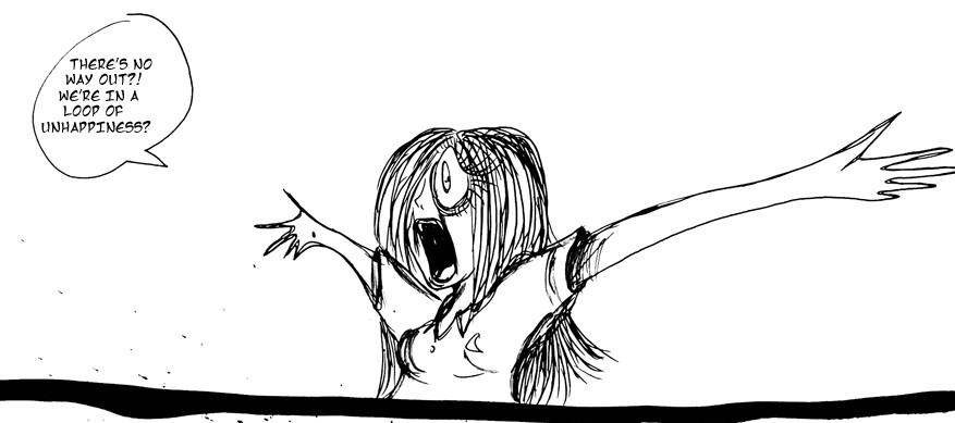
I have not had a chance to read much of the comic just yet, but flipping through some of the most recent updates, this panel caught my eye and got me to subscribe to the comic, so I can return to it later. But what is it about the panel that appeals to me so much?
Admittedly, there isn't much going on. A woman appears exasperated in what appears to be a void. That's about it. But this minimal panel has a few things going for it. I'll do my best to build on what I like.
First, I like minimalism. The wide panel doesn't do much but gives the character room to gesture, and gesture she does. Her arms are exaggerated and wide open, with a sense of depth as the leftmost arm makes the most of the width of the panel while the right is in the distance of the panel. I find that there isn't a lot in the panel. Still, the overall balance is excellent, with one arm exaggerated to create foreshortened depth. In contrast, the shorter, distanced arm is balanced by the dialogue balloon that helps fill the opposing space.
Secondly, I like the flow and motion. There is a very kinetic quality to the inkwork here. Magor understands character construction but also knows when to push exaggeration and fluidity to achieve an effect, such as the very simple, almost impressionistic fingers on the hands. The hands don't need a lot of detail or even need to appear overly realistic. They need to be a sketch of hands. The same applies to the very simple strokes that make up the hair. A tangle of individual lines instead of volumetric shapes and layers is quite simple, but it works well here. You get the sense from the line art that these are quick, gestural doodles, as though redrawing anything breaks a flow in the construction. There is a rhythm present in the line art here.
Lastly, I adore the stylized exaggeration on her face. Stylistically, I see elements animator Katie Rice, particularly in the eye shape, rings around the eyes, and the way the nose is small and almost the barest hint of a nose. The exaggerated jaw and open mouth balance out the size of the eye, being nearly the same height. The agape mouth is also the darkest spot on the panel, immediately drawing the eye and making the entire face the focus. In turn, you don't necessarily focus on the arms but acknowledge they are there. This may explain why the simplicity of the fingers I mentioned earlier works so well for me.
Those are my thoughts.
____________
Don’t forget you can now advertise on DrunkDuck for just $2 in whichever ad spot you like! The money goes straight into running the site. Want to know more? Click this link here! Or, if you want to help us keep the lights on you can sponsor us on Patreon. Every bit helps us!
Special thanks to our patrons!!


Justnopoint - Banes - RMccool - Abt_Nihil - PhoenixIgnis - Gunwallace - Cdmalcolm1 - PaulEberhardt - dragonaur - Emma_Clare - FunctionCreep - Eustacheus - SinJinsoku - Smkinoshita - jerrie - Chickfighter - Andreas_Helixfinger - Tantz_Aerine - Epic Saveroom - Genejoke - Davey Do - Spark of Interest - Gullas - Damehelsing - Roma - NanoCritters - Scott D - Bluecuts34 - j1ceasar - Tinchel - PhillipDP - Teh Andeh - Peipei - Digital_Genesis - Hushicho - Sad Demon Comics - JediAnn Solo - Kiddermat - BitterBadger - Palouka - cheeko - Paneltastic - L.C.Stein - Zombienomicon - dpat57 - Bravo1102 - The Jagged - LoliGen - OrcGirl - Miss Judged - Fallopiancrusader - arborcides - ChipperChartreuse - Jaybiejay - Chris_tar - Mogtrost - InkyMoondrop - Jgib99 - Hirokari - Orgivemedeath Ind

Panel By Panel: ‘The Cherub Brothers" and Spotlighting Expression
hpkomic at 2:31PM, Jan. 27, 2023
4 likes!


©2011 WOWIO, Inc. All Rights Reserved Mastodon
PaulEberhardt at 2:31AM, Jan. 28, 2023
The style reminds me a bit of Quentin Blake, too. The high art of making a drawing look like it had been casually scribbled on a beermat, when it in fact is quite the opposite with every single line skillfully conveying movement and emotion by the score, is a rare talent and a cool trick to make drawings really come alive. To anyone who hasn't had a go at stylised artwork yet, in case you drop by: never let minimalism and exaggeration fool you, this is much more about precision than you might realise.
Ironscarf at 7:39PM, Jan. 27, 2023
Good call, so much depth and motion achieved with those arms.