Welcome to 1337 Ninjaz! Warning! The quality will really really really really suck! If you can look past that, the art gets betta and theres a story line. The first four pages are the only ones that are fsked up like this it gets betta. Updated when i can. Any and all criticism and ideas are greatly apprcieated! Hope ya stick around!
Thanks! I appreciate the help. Sorry about the big white space, I acyually tried to size it down, but it didn't work out too well. I'll work on the hands as well. Again, thanks a bunch!
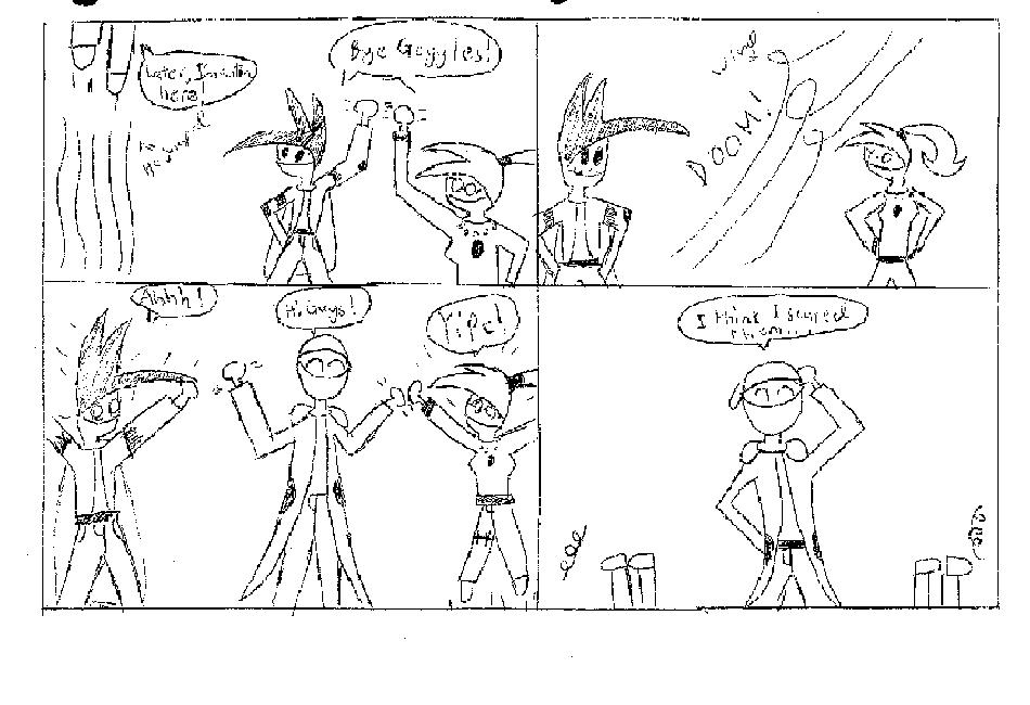
Oh gosh... this is rather difficult to even give a review on, seeing as how I can't understand it. Did you make it bigger? Because the lines are awfully pixelated.
1. Use the computer to make the text and panel lines. Don't use black-colored font if it's in pencil, but a medium gray to make the font not stand out over the art.
2. The action lines are best when also produced via computer. However, believe it or not, but a lot of people cannot do this properly... so... play around with it or find some action/zoom action lines on the internet.
3. Do NOT leave big giant white spaces, mainly because it make that little bit of comic load way slower, and it is slightly annoying. Crop it off in MS paint or photoshop, or something.
I'll give you an artwork tip: hands are not freaky circular things. Try to avoid that, at try to make fingers. I know hands are difficult, but you won't learn if you don't attempt! ^_^
Please don't misunderstand. I see some good potential, but it'll need some work. I'll keep an eye out.


xxhopingtearsxx at 5:49PM, May 18, 2006
lmao funny comic.
sufer009 at 10:19AM, May 18, 2006
Resized the page, know I'll see about all the other crap. T.T I'm sorry this page is still crap...
sufer009 at 10:06AM, May 18, 2006
Thanks! I appreciate the help. Sorry about the big white space, I acyually tried to size it down, but it didn't work out too well. I'll work on the hands as well. Again, thanks a bunch!
AshleeS at 6:50PM, May 17, 2006
Oh gosh... this is rather difficult to even give a review on, seeing as how I can't understand it. Did you make it bigger? Because the lines are awfully pixelated. 1. Use the computer to make the text and panel lines. Don't use black-colored font if it's in pencil, but a medium gray to make the font not stand out over the art. 2. The action lines are best when also produced via computer. However, believe it or not, but a lot of people cannot do this properly... so... play around with it or find some action/zoom action lines on the internet. 3. Do NOT leave big giant white spaces, mainly because it make that little bit of comic load way slower, and it is slightly annoying. Crop it off in MS paint or photoshop, or something. I'll give you an artwork tip: hands are not freaky circular things. Try to avoid that, at try to make fingers. I know hands are difficult, but you won't learn if you don't attempt! ^_^ Please don't misunderstand. I see some good potential, but it'll need some work. I'll keep an eye out.