


Issue 2 Pg. 01
Abt_Nihil on Nov. 29, 2009
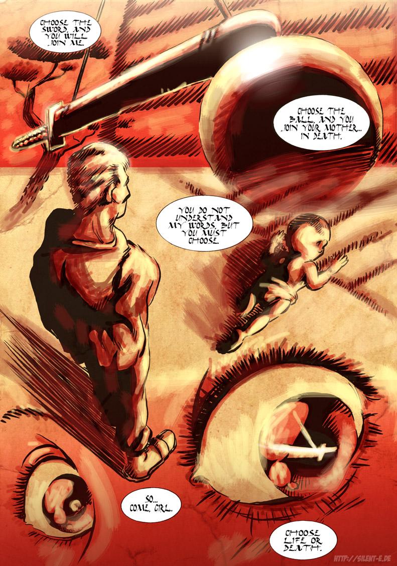
I thought a bit of a different style was in order for this page. And for the first time ever, I was thinking of webcomic artists when choosing this style. Does this mean I'm finally integrated into the community? If only mentally? :P
Anyway, the three artists I was thinking of are: TheMidge28 for his awesome Japanese-inspired black/white/red blood/hound pages (now deleted, sadly, but - oh joy! - replaced with all-new lavishly illustrated full-color-pages); NickGuy for his stark b/w-contrasts and dynamic compositions; and alejkhan for her great mix of classic Japanese and European styles on FireBorn, and also her beautiful b/w lineart. That's not to say I'm claiming that I did any or all of these justice… I just thought of their artwork as inspiration.
Also, for the first time EVER, I used a brush to ink this page. I used to work with actual ink until 2001 (been using pens since then), but I've never used actual ink brushes. But I knew that for this page, I just HAD to. And I like the result… using a brush, the line weight varies naturally; I don't have to work it out cognitively, as I would when using pens :P
I hope you can read the lettering; the font is a bit difficult for computer screens, but it was my number one choice. There were some asian-looking fonts which I considered, but they were just too kitschy.
Lastly, does someone recognize the monologue? If so: Major kudos.
And lastly lastly, what significance might this page have for the story? Hmmm…
Thanks for reading and commenting!
REPLIES:
mind_reader, plymayer, Hero, leeuwen12: Thanks!
DAJB: Thank you very much! And - nope, just a little red herring :P
MrHades: You're a true master! I bow to you, sensei.
AzuJOD, fukujinzuke, Wes_Nero123: Thanks a lot!
Legend Comics: I'm glad my inexperience doesn't show! :P
sux: My work has been compared to Orwell and Heinlein, and I'll gladly add Kurosawa to the list :D Thank you very much!


LuchaCoffee at 7:41AM, Dec. 8, 2009
It makes me feel like I'm not reading a comic, but watching some kind of epic film, like a Kurosawa film :)
Legend Comics at 2:42PM, Nov. 30, 2009
Nice brush work. I'd have never guessed that you weren't already well practiced with it. Good composition, too.
Wes_Nero123 at 2:35PM, Nov. 30, 2009
Just plain beautiful.
fukujinzuke at 9:06AM, Nov. 30, 2009
Beautiful!
AzuJOD at 3:12AM, Nov. 30, 2009
Excellent artwork!
MrHades at 2:49AM, Nov. 30, 2009
Monologue is from Lone Wolf & Cub/Shogun Assassin :) Real nice layout on this page. Great stuff
DAJB at 11:42PM, Nov. 29, 2009
Nice work all round! The brush is very effective, especially with the stark colour palette! Is this the beginning of Bombshell's origin story?