Another beautiful page from the Red Death. His comments:
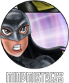
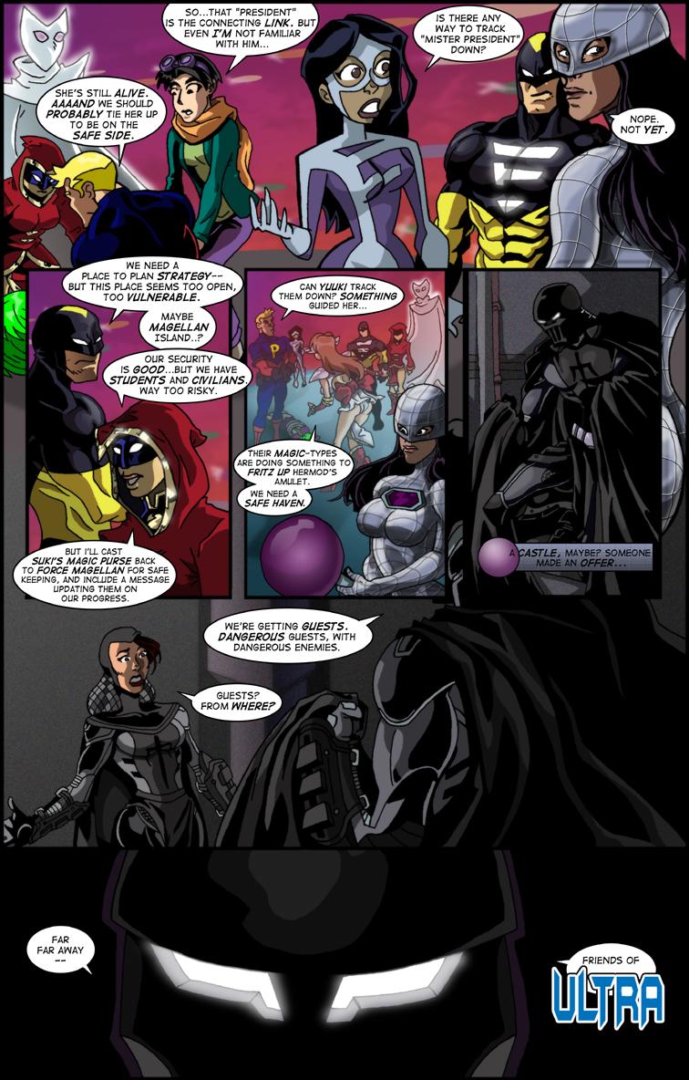
“I really tried to push myself outside of my usual comfort zone with today's page. I did a floating panel page composition with the three panels in the top-center, which is something I rarely ever do. I took a page from Xmung in the third panel and tried to draw a depth of field shot with the whole group. (That was not a separate drawing added digitally BTW, I just faded it out in the coloring stage.) And I even attempted (and I stress attempted) to base Mindmistress off Liv Tyler just like Al does. One of the best things about working on these community projects is the push and pull of the other artists motivating you do to better at your own art.”
This ends Chapter 2. Next week, a little interlude, as we look at the origin of ONE of the Doppelganger Gang, and his ties to a non-superhero webcomic, and we'll do daily updates Monday through Thursday with that origin (by myself) and then hopefully, on Friday, the cover of Chapter 3.
Personally Super Hero comics are why I started reading web comics, and Bad Guy High has always been a favorite (going to have a Wake when it comes to an end). I agree that personal taste influences peoples likes/dislikes for artistic styles, but for myself I prefer a good stroy over the drawing any day. When the two combine I'm a very happy man.
No problems. Next week, they'll mainly have MY artwork to nitpick (and that's okay, honest) Monday through Thursday, and then Nepath has a gorgeous cover on Friday.
I'm working on another Doppelganger origin right now, also. (Got three out of four pages done.)
Maybe the Liv Tyler thing was a bust, but for everything else I think people are finding things to pick at just because that seems to be the topic at hand. I draw all the characters in my own style, it's kind of impossible to NOT. But in some cases to give the comic a kind of "multi-dimensional" feel I do add stylistic flourishes that are based on the work of completely OTHER artists than the rest of the CrossoverKill crew.
I do Energize in a generic 90's comic style taking hints from Ed McGuinness and Jim Lee, not Nepath's style at all. Until now, the only thing I ever did to represent Al's style was give MM a metallic filter on her armor (Which I think looks great BTW), Yuuki is done in the anime style of "UFO Ultramaiden Valkyrie", which is the basis for some of Kittyhawk's work conceptually but isn't like Kitthawk's own style at all.
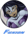
Hoodoo is virtually done in my own style without any alteration at all, and Fusion is done in a Bruce Timm style which shouldn't be weird at all since MY style was based off a Bruce Timm style in the first place. So that's every bit as natural for me as anything else. There's nothing going on with Fusion's design that would be out of place in BGH proper.
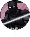
As for the Knight, the only stylistic thing I'm doing for him is to use a lot of heavy black shadows, because he comes from a B&W comic. But the actual anatomy (and tweaks to the armor design) are all my own.
This whole comment section went into a weird area. You get one naysayer, then everyone else has to weigh in on what is or isn't wrong with my style. Honestly I'm ready for the next page to go up so we can just move on. Yeesh.
I certainly never did that in Crossoverlord. I certainly tried to interpret certain physical characteristics INTO my style, but I never tried to emulate anyone else (except for both Ida and Kittyhawk, but those were both special circumstances).
I really don't get the sense that Dan is trying to emulate anyone's style here. Fusion certainly does stand out, but I don't think that looks like Essaybee's style at all. It looks like Dan's style with some Bruce Timm thrown in.
It could be the color swatches that are standing out. For example, Fusion's color pallet on this page is indeed taken directly from Essaybee's work, but he's also refined a few pallets to his style as well. For example, I can tell that Dan has altered Mindmistress's color pallet a bit, which would ordinarily just be gray.
I definitely like Dan's Mindmistress before he started doing Liv Tylor's face. I would say scale it back just a bit and find a happy medium. But that's being REALLY nitpicky.
@Tolrick: I don't bother trying to copy a style since I know it wouldn't work for me - certainly I don't bother to use pics of Liv Tyler for MM... I just aim for attractive brunette and hope for the best!
Also, I have to point out that part of the apparent strangeness some people might be seeing with these pages is the fact that every artist tries to draw all the guests with an eye towards the original artist's character.
So Fusion here gets drawn essentially as Red Death's interpretation of Essaybee's artwork. Which is then stood next to Red Death's interpretation of Al's MindMistress.
If you look at BGH, for example, not a single character stands out as looking unusual as they're all RD characters drawn in RD's interpretation of his own style. i.e they're all supposed to look exactly that way.
I love RD's artwork, but he's just not suited to emulating certain other styles. I love Essaybee's art, but same thing.
I suspect if each artist drew all the characters in their own styles and didn't worry about the originals, there would be less for Anon to gripe about.
But then the reset of us wouldn't get the entertainment of seeing just how some of the best artists on DD interpret each other.
I'll stop rambling now.
BTW, Anon, if you think Red Death would do a good horror comic, may I plug the latest arc in BGH? Zombies, Cthulhu, and Death's Master, all in a few pages!
Wow. I have a busy day, and the comments are---interesting.
I think I got the greastest compliment I've ever gotten when Anon disliked BOTH my and Red Death's work---that puts me in very good company! However, I assume he likes SOME of the artists' work---Xmung, or Essaybee, or Nepath, or Neil, or Aisaku---and that's one of the great things about this series. IF you don't like the artwork---just wait.
It's like the original ALL-STAR COMICS, which had each chapter in a different art style.
No hard feelings, Anon. I'm VERY aware of some of the limitations of MY artwork. And no artist satisfies everyone. I personally consider Red Death the Jack Kirby of our little grouping---the best overall artist, but we all have strengths and weaknesses. And some people can't stand Kirby!
Let's see now---Flame, Ultra is the hero of [url=http://pointguardian.com] POINT GUARDIAN[/url], who was one of the main group towards the latter half of CROSSOVERLORD, CROSSOVERKILL's predecessor. Majestic Knight is of the same reality as Ultra, and they have a relationship rather like Batman and Superman---as written by Frank Miller. (I.E., frosty at best.) The lady the Knight is talking to is ---wait for it--THE Lady, the partner-in-crime-fighting Majestic Knight has as a companion. More can be found by either going to POINT GUARDIAN or the MAJESTIC KNIGHT link above.
I know Hogan like to bitch & moan about trying to keep track of the various cameos and cross-overs done both now and in the past, but I for one am grateful that they happen as that is how I have been introduced to so many really good comics and artists across the web.
Love this story-line and the artwork. Only complaint is that now I HAVE to go read more of Majestic Knight so I can find out more about him. Like, who is the pretty lady in panel five?
I could critique, but it would be from a purely reader/viewer standpoint as my own personal art skills are sorely lacking.
Generally from what i've seen, everyone who does pages here have characters they're good at, and characters they're not so good at. Sometimes the specifics vary from page to page based on poses or story needs.
Also keep in mind that artwork is very much a subjective media. Not everyone is going to like every artists work.
Myself, I'm not as partial to Al's pages.... again, dependent on a lot of little specifics. Sometimes it's dead on anyhow.
Disliking someone's art style is not a bad thing. See above regarding subjectivity. In my opinion, the bad thing here is saying it anonymously.
@jamoecw: Well remember MM's face/jaw look different today because I was trying to base her off of Liv Tyler, which is the model Al uses for her.
I've never been very good at likenesses, so it was definitely an experiment. I haven't decided yet if I'll keep trying at it though. On one hand she's not as generically good looking as my normal females, (Though Liv Tyler is beautiful and If I were any good my drawing would be too) but on the other hand it does give MM a uniqueness and individuality to her character, as apposed to just being generically good looking. So we'll see.
As for horror comics...maybe I'd be good at it, maybe not. I don't know. I've always considered my style to be pretty cartoony, so this whole discussion is kind of throwing me for a loop.
I will say thought that I LOVE the superhero genre, I'm an avid DC/Marvel fan, and I've always based my own artwork off the work of mainstream professional comics artists. I don't really emulate any indie artists as far as I know. (With the exception of maybe Ryan Ottley, who draws INVINCIBLE.)
I definitely intend to keep doing projects in the super hero genre for the foreseeable future at any rate.
as for anonymous's comment:
what do you mean by grotesque shapes? could you be a bit more specific? i have learned that if you do need to express yourself it helps to be as specific as possible. most people just say silly things like "this shit sucks balls." or something equally vague, which doesn't really say anything other than you don't like it. what you said was pretty good as you indicated that you don't like the shapes and that the style seemed to be suited towards a horror comic style. with the zombie stuff and mr. prez in this comic i can see that red death's style would look very good in a horror comic, which is actually pretty good criticism as it helps the artist. overall i don't see why you should get bashed, you don't like his work, and you said why without using vague comments.
MM on this page looks a bit off, i am pretty sure it is the jaw. i think it could work though if you shorten/weaken the chin a bit. i think you nailed majestic knight, the rest looks pretty solid, even MM's armor. though while you say you have problems with it, i don't see them usually, as her armor is generally pretty good when you do it. as far as why i think you horror stuff good, the line art you do is pretty good, and you can make stuff with fairly similar colors look good (like th knight on this page). though i personally like your style, so i would be reading what ever horror comic you did, well at first, then if the story line didn't grip me i might not later.
I like that evey character looks different - Energize is most musculed, all girls have different body-shapes (something today's comics seriously lacks) and Majestic Knight has this dark style like he escaped from Batman comics. You had to put lot of effort in that page.
Red Death's stuff is always good, imo. With that said, I can give my opinion on this art quality stuff. Why does it matter? I'm personally a webcomic addict and I have atm in my favorites at least over two hundred comics of which I actually remember to read most + a bit more comics that I access otherwise. I say that art quality means nothing...i read some comics I think I could draw better and thats something.
Good art is always a big plus and I admit I look at good looking comics more often, but bad art is not a reason not to read comic. Most important thing is that it tells whatever its trying to tell.
*sadface*
Despising my art so much that you have to be open about it to make yourself feel better is pretty intense.
Though just to clarify: when you say "more suitable in say a horror comic..." was that just a vague insult as in "My art is so bad it's scary" or did you really mean it?
Because some horror comics are awesome and have great art. And if that's what you're saying, then that's not so bad.
Well, everyone's entitled to their opinion "Anonymous"... and I disagree with you. I'm always impressed with the composition and dynamic quality in Red Death's work - in today's page, the fourth and fifth panels in particular are fantastic.
anonymous
at 3:31AM, June 9, 2011
I know a lot of people like Red Death's work but to me the art style is just plain ugly its the same reason why I don't read Mindmistress comics. The shapes are grotesque and I feel This artstyle is more sutible in say a horror comic than a super hero comic. But then again it just comes down to being my oppinion and people are gonna bash me, crash me, and call me an asshole; but the fact remains is don't like Red Death's art and i dispise it so much that i have to be open about it just to make me feel better, But if it put in any better light; i admit that my artwork is a hell of a lot worse.


Ozmandious at 8:13AM, June 15, 2011
Personally Super Hero comics are why I started reading web comics, and Bad Guy High has always been a favorite (going to have a Wake when it comes to an end). I agree that personal taste influences peoples likes/dislikes for artistic styles, but for myself I prefer a good stroy over the drawing any day. When the two combine I'm a very happy man.
alschroeder at 7:22PM, June 12, 2011
No problems. Next week, they'll mainly have MY artwork to nitpick (and that's okay, honest) Monday through Thursday, and then Nepath has a gorgeous cover on Friday. I'm working on another Doppelganger origin right now, also. (Got three out of four pages done.)
xmung at 7:21PM, June 12, 2011
Nothing against your style at all - I think it's great!
theRedDeath at 7:14PM, June 12, 2011
Maybe the Liv Tyler thing was a bust, but for everything else I think people are finding things to pick at just because that seems to be the topic at hand. I draw all the characters in my own style, it's kind of impossible to NOT. But in some cases to give the comic a kind of "multi-dimensional" feel I do add stylistic flourishes that are based on the work of completely OTHER artists than the rest of the CrossoverKill crew. I do Energize in a generic 90's comic style taking hints from Ed McGuinness and Jim Lee, not Nepath's style at all. Until now, the only thing I ever did to represent Al's style was give MM a metallic filter on her armor (Which I think looks great BTW), Yuuki is done in the anime style of "UFO Ultramaiden Valkyrie", which is the basis for some of Kittyhawk's work conceptually but isn't like Kitthawk's own style at all. Hoodoo is virtually done in my own style without any alteration at all, and Fusion is done in a Bruce Timm style which shouldn't be weird at all since MY style was based off a Bruce Timm style in the first place. So that's every bit as natural for me as anything else. There's nothing going on with Fusion's design that would be out of place in BGH proper. As for the Knight, the only stylistic thing I'm doing for him is to use a lot of heavy black shadows, because he comes from a B&W comic. But the actual anatomy (and tweaks to the armor design) are all my own. This whole comment section went into a weird area. You get one naysayer, then everyone else has to weigh in on what is or isn't wrong with my style. Honestly I'm ready for the next page to go up so we can just move on. Yeesh.
alschroeder at 5:05PM, June 12, 2011
I personally LOVE seeing many different versions of my character, and I love trying to do interesting versions of other characters.
Neilsama at 4:48PM, June 12, 2011
I certainly never did that in Crossoverlord. I certainly tried to interpret certain physical characteristics INTO my style, but I never tried to emulate anyone else (except for both Ida and Kittyhawk, but those were both special circumstances). I really don't get the sense that Dan is trying to emulate anyone's style here. Fusion certainly does stand out, but I don't think that looks like Essaybee's style at all. It looks like Dan's style with some Bruce Timm thrown in. It could be the color swatches that are standing out. For example, Fusion's color pallet on this page is indeed taken directly from Essaybee's work, but he's also refined a few pallets to his style as well. For example, I can tell that Dan has altered Mindmistress's color pallet a bit, which would ordinarily just be gray. I definitely like Dan's Mindmistress before he started doing Liv Tylor's face. I would say scale it back just a bit and find a happy medium. But that's being REALLY nitpicky.
xmung at 2:16PM, June 12, 2011
@Tolrick: I don't bother trying to copy a style since I know it wouldn't work for me - certainly I don't bother to use pics of Liv Tyler for MM... I just aim for attractive brunette and hope for the best!
Tolrick at 11:06AM, June 12, 2011
Also, I have to point out that part of the apparent strangeness some people might be seeing with these pages is the fact that every artist tries to draw all the guests with an eye towards the original artist's character. So Fusion here gets drawn essentially as Red Death's interpretation of Essaybee's artwork. Which is then stood next to Red Death's interpretation of Al's MindMistress. If you look at BGH, for example, not a single character stands out as looking unusual as they're all RD characters drawn in RD's interpretation of his own style. i.e they're all supposed to look exactly that way. I love RD's artwork, but he's just not suited to emulating certain other styles. I love Essaybee's art, but same thing. I suspect if each artist drew all the characters in their own styles and didn't worry about the originals, there would be less for Anon to gripe about. But then the reset of us wouldn't get the entertainment of seeing just how some of the best artists on DD interpret each other. I'll stop rambling now.
dwrean at 6:24PM, June 10, 2011
okay, everyone will soon be together. soon we will gititON!
alschroeder at 6:43PM, June 9, 2011
BTW, Anon, if you think Red Death would do a good horror comic, may I plug the latest arc in BGH? Zombies, Cthulhu, and Death's Master, all in a few pages!
alschroeder at 6:24PM, June 9, 2011
Wow. I have a busy day, and the comments are---interesting. I think I got the greastest compliment I've ever gotten when Anon disliked BOTH my and Red Death's work---that puts me in very good company! However, I assume he likes SOME of the artists' work---Xmung, or Essaybee, or Nepath, or Neil, or Aisaku---and that's one of the great things about this series. IF you don't like the artwork---just wait. It's like the original ALL-STAR COMICS, which had each chapter in a different art style. No hard feelings, Anon. I'm VERY aware of some of the limitations of MY artwork. And no artist satisfies everyone. I personally consider Red Death the Jack Kirby of our little grouping---the best overall artist, but we all have strengths and weaknesses. And some people can't stand Kirby! Let's see now---Flame, Ultra is the hero of [url=http://pointguardian.com] POINT GUARDIAN[/url], who was one of the main group towards the latter half of CROSSOVERLORD, CROSSOVERKILL's predecessor. Majestic Knight is of the same reality as Ultra, and they have a relationship rather like Batman and Superman---as written by Frank Miller. (I.E., frosty at best.) The lady the Knight is talking to is ---wait for it--THE Lady, the partner-in-crime-fighting Majestic Knight has as a companion. More can be found by either going to POINT GUARDIAN or the MAJESTIC KNIGHT link above.
OrlahEhontas at 6:03PM, June 9, 2011
I know Hogan like to bitch & moan about trying to keep track of the various cameos and cross-overs done both now and in the past, but I for one am grateful that they happen as that is how I have been introduced to so many really good comics and artists across the web. Love this story-line and the artwork. Only complaint is that now I HAVE to go read more of Majestic Knight so I can find out more about him. Like, who is the pretty lady in panel five?
Tolrick at 4:54PM, June 9, 2011
I could critique, but it would be from a purely reader/viewer standpoint as my own personal art skills are sorely lacking. Generally from what i've seen, everyone who does pages here have characters they're good at, and characters they're not so good at. Sometimes the specifics vary from page to page based on poses or story needs. Also keep in mind that artwork is very much a subjective media. Not everyone is going to like every artists work. Myself, I'm not as partial to Al's pages.... again, dependent on a lot of little specifics. Sometimes it's dead on anyhow. Disliking someone's art style is not a bad thing. See above regarding subjectivity. In my opinion, the bad thing here is saying it anonymously.
theRedDeath at 4:10PM, June 9, 2011
@jamoecw: Well remember MM's face/jaw look different today because I was trying to base her off of Liv Tyler, which is the model Al uses for her. I've never been very good at likenesses, so it was definitely an experiment. I haven't decided yet if I'll keep trying at it though. On one hand she's not as generically good looking as my normal females, (Though Liv Tyler is beautiful and If I were any good my drawing would be too) but on the other hand it does give MM a uniqueness and individuality to her character, as apposed to just being generically good looking. So we'll see. As for horror comics...maybe I'd be good at it, maybe not. I don't know. I've always considered my style to be pretty cartoony, so this whole discussion is kind of throwing me for a loop. I will say thought that I LOVE the superhero genre, I'm an avid DC/Marvel fan, and I've always based my own artwork off the work of mainstream professional comics artists. I don't really emulate any indie artists as far as I know. (With the exception of maybe Ryan Ottley, who draws INVINCIBLE.) I definitely intend to keep doing projects in the super hero genre for the foreseeable future at any rate.
jamoecw at 2:37PM, June 9, 2011
as for anonymous's comment: what do you mean by grotesque shapes? could you be a bit more specific? i have learned that if you do need to express yourself it helps to be as specific as possible. most people just say silly things like "this shit sucks balls." or something equally vague, which doesn't really say anything other than you don't like it. what you said was pretty good as you indicated that you don't like the shapes and that the style seemed to be suited towards a horror comic style. with the zombie stuff and mr. prez in this comic i can see that red death's style would look very good in a horror comic, which is actually pretty good criticism as it helps the artist. overall i don't see why you should get bashed, you don't like his work, and you said why without using vague comments. MM on this page looks a bit off, i am pretty sure it is the jaw. i think it could work though if you shorten/weaken the chin a bit. i think you nailed majestic knight, the rest looks pretty solid, even MM's armor. though while you say you have problems with it, i don't see them usually, as her armor is generally pretty good when you do it. as far as why i think you horror stuff good, the line art you do is pretty good, and you can make stuff with fairly similar colors look good (like th knight on this page). though i personally like your style, so i would be reading what ever horror comic you did, well at first, then if the story line didn't grip me i might not later.
God of War at 11:28AM, June 9, 2011
I like that evey character looks different - Energize is most musculed, all girls have different body-shapes (something today's comics seriously lacks) and Majestic Knight has this dark style like he escaped from Batman comics. You had to put lot of effort in that page.
Dem at 7:40AM, June 9, 2011
Red Death's stuff is always good, imo. With that said, I can give my opinion on this art quality stuff. Why does it matter? I'm personally a webcomic addict and I have atm in my favorites at least over two hundred comics of which I actually remember to read most + a bit more comics that I access otherwise. I say that art quality means nothing...i read some comics I think I could draw better and thats something. Good art is always a big plus and I admit I look at good looking comics more often, but bad art is not a reason not to read comic. Most important thing is that it tells whatever its trying to tell.
AzuJOD at 6:27AM, June 9, 2011
Well, I like the artwork, if that makes you feel better.
theRedDeath at 6:19AM, June 9, 2011
*sadface* Despising my art so much that you have to be open about it to make yourself feel better is pretty intense. Though just to clarify: when you say "more suitable in say a horror comic..." was that just a vague insult as in "My art is so bad it's scary" or did you really mean it? Because some horror comics are awesome and have great art. And if that's what you're saying, then that's not so bad.
Dragonfire10503 at 4:51AM, June 9, 2011
I'm not furmilure with Ultra what is it?
xmung at 4:24AM, June 9, 2011
Well, everyone's entitled to their opinion "Anonymous"... and I disagree with you. I'm always impressed with the composition and dynamic quality in Red Death's work - in today's page, the fourth and fifth panels in particular are fantastic.
anonymous at 3:31AM, June 9, 2011
I know a lot of people like Red Death's work but to me the art style is just plain ugly its the same reason why I don't read Mindmistress comics. The shapes are grotesque and I feel This artstyle is more sutible in say a horror comic than a super hero comic. But then again it just comes down to being my oppinion and people are gonna bash me, crash me, and call me an asshole; but the fact remains is don't like Red Death's art and i dispise it so much that i have to be open about it just to make me feel better, But if it put in any better light; i admit that my artwork is a hell of a lot worse.
Dethfan at 12:23AM, June 9, 2011
He looks like a mix of Dr. Doom, Iron Man and Azrael's Batman