


G-mans Scam
Marche on July 23, 2007
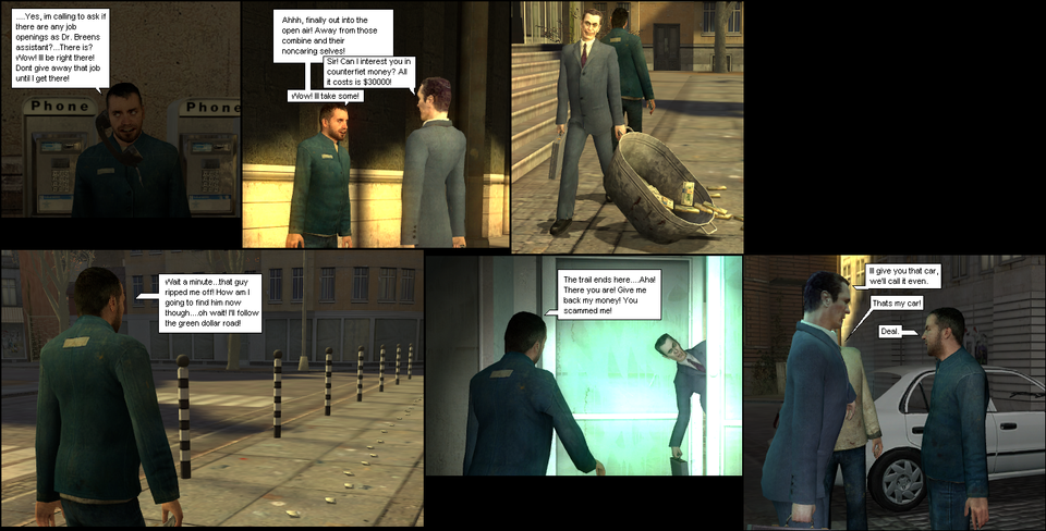
G-man looks like a buisnessman, why not make him one that creates scams? Anyways, this is the last one for today. I created a fill in color for the space inbetween panels. It looks nicer. Well now that Harry has a car, what will happen? I dont know yet. I dont plan ahead at all.


Marche at 2:48PM, Aug. 3, 2007
Ill try comic sans. Sadly I've already made the next comic. Though this next comic will have a different font, ill try comics san.
Dchao at 5:01PM, July 25, 2007
okay maybe try comic sands or balloonist? Or id be happy to put the text bubbles in if you were having trouble?
Marche at 6:56PM, July 24, 2007
Alright. Now that you've brought it to my attention, a better font would do well. And as for how it goes, you dont want to know what Harry Freemans going to get into next. (for once I have it planned out!)
Dchao at 5:41PM, July 24, 2007
Maybe try a different font? That could brighten the panels up a bit. Faved to see how it goes.