


White Shadows - Page 3
jonmkl on May 17, 2007
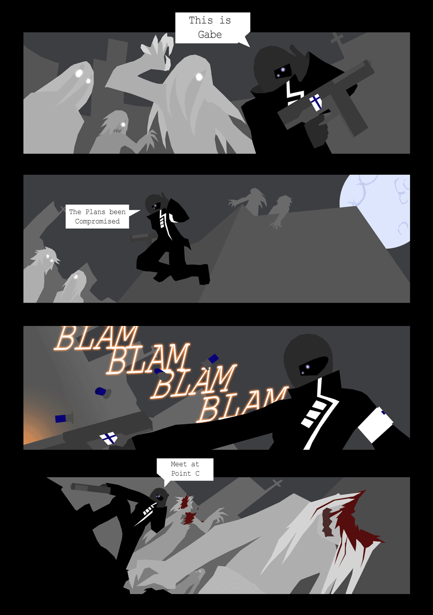
new page for you! with talking!
fear the square speech bubbles.
yes well I won't be making any pages next week. :( i know, sad isn't it.
oh and by the way, is it just me? or do those two in the bottom left of the second panel look like zombie hair models lol!


D0m at 6:45PM, June 18, 2007
It's fascinating how you put your story across like this... :-) Lovely.
jonmkl at 12:06AM, June 1, 2007
Dudes and Ladies!! I'm so sorry. but theres no comics this week.. but do not fear, I'm not procrastinating i just haven't been able to work my scanner :-(. but as a consolation I'm gonna hit you with three next week. PLUS the next page has not only a new character, but also unmasks our hero. Look forward to it!!
vie4 at 2:21PM, May 25, 2007
sweet action
Ninja_Jette at 12:23PM, May 24, 2007
waaaaaaaaaaaaaaaaaaaaah!!!! I LOVES! *drooles* me love u style! fantastic! its great!!! i really love it! (okay okay jette relax a bit will ya?) *sits down and meditates for about an hour* right.. im back! great artwork! i really like it and i believe you just got another fan of your comic :) ~Jette(that would be a girls-name.. yah.. i know ^-^')
FAL at 1:19PM, May 23, 2007
I like your style man, very distinctive. Keep improving on it, I'm keeping an eye on this!
Allan at 4:32PM, May 22, 2007
A Finnish gun?! Hilarious.
Mistchiff at 7:15AM, May 22, 2007
i like the style some its alittle confusing on your character tho wich has the visier thing going on no biggie really. the big issue here is the fact that you aint showing where this takes place i mean like really. i could guess its a metropolis of crucifixes but thats basicly all. som of the movents dont show very well and could need som guidelines such as Lines to show where he comes from so you can understand where he will end up basicly. i think its great effort and a very interesting style. but also show when you show someone shooting its interesting to see what it hits not the after math so much. casue it id work with a katana slash or something but not so much guns you want to see where it hits when he shoots most of the time. Just a pointer of my own opinion. and also structure your panels alittle better. page 2 has large gaps wich shows that you had to do that to make the page work basicly. and thats a sign of bad planning. so what id suggest is to redo page 1. or use it as page 2 with page 1 with a scenery image so you can orient yourself in the comic story telling zhizznelets i think its cool tho.. alos maybe try to get some more colors for your backgrounds eh you dont have any textures so use another color then only grays becasue it can get alittle,.....errr... well i dunno i think it id be cool if you had used a little Blue in the background grayish blue to make it more versatile in the color scheme the other parts stand out better... well stuff... i duinno peascess but do a new 1 page with a scenery image biggest thing here. and some lines to show movment Or some really expressive movement to show where he moves. Well done! cya that gun is from finland .. also..