"EASY to make? "
Before I took up typical comic art I tried my hand at sprite comics. I've since lost my original comic, but yes, it was very easy. It was of decent quality (think Tony the Hedgehog, or something of the like. Not amazing, but not bad). However, it became so easy that I quit to work on hand drawn comics.
Speaking from experiance, it's all copy and past. There is nothing hard about it. Try drawing a full city scape with a broken ruler, and a pen that is nearly out of ink. Now THAT'S hard.
And to KC, thanks for taking my crit well! I do hape this improves, despite the falws it has. Of course I know your just starting out, but with that bit of advice, if taken to heart, you wil quickly improve.
le farce did you just say sprite comics were EASY to make? well sure if they're random but not if they have story and stuff. I mean, it takes twenty minutes jut for me to get everything looking good, and I use friggin' paint. and I know people who use PSP and Photoshop have a hard friggin time what with how complex it is.
As for bugging him, it's more than obvious this kid is a beginner and constructive sriticicsm is fine but you're being damned rude about it.
As for the comics, yeah they do need work, tons of it, but the color code text is used by lazy people or beginners. As for the FX, yeah the fire was pretty hilarious and he should get some SFX sheets but dude, do you know how damn hard it is to get BLOOD sfx, nobody friggin' rips the blood. The text bubbles, i gotta agree with, that's pretty lame, if you can't fit them in the square just type the text with the solid back and resize it around the text.
as in make a small text box-resize it largely, type, then resize to fit text.
As for the Disney Enix thing, it doesn't matter, you wanna' know why? It's his story and he can crossover as much stuff as he wants. Comics don't have to be canonical.(not sure if that's a word...but it is now)
It's a fan comic as in made by a fan as in it doesn't need to follow the storyline, and if he was following the storyline he'd be using a recolored black outfit sora to match KHII.
Well, First of all, I thank you for your criticism. I would like to point out that this is Kingdom Clubs, a parody of sorts of Kingdom Hearts. This take place in a different dimension then the Kingdom Hearts so more non-Square or Disney characters will appear. As for the black, I've always done that, the simple border between scenes bore me. And the color text is just there because thats how I usually saw it in other sprite comics. The fire was simply for comedic effect and the word bubbles came out a bit small then I though they should but the word was still readable so I assumed that was acceptable.
The use of black in this is amazing. And I don't mean in a good way. I mean that there is just too much. Far too much. To me it seems like a lazy way out of actually animating that section of the story with real sprites. And there is no excuse for laziness in sprite comics considering how easy they are to make.
Your bit mixing to an obscene amount. I know that kingdom hearts does that, but still. And besides that, KH is supposed to be with only Disney characters mixed with square. Correct me if I'm wrong, but I could have sword Tiny Toons Adventures was a product of WB.
The fire part was just funny. Listen, if your not going to do passable SFX or even take the time to get a FX sheet, then just don't do them at all. Whats next, spray paint red blood. C'mon, it's a sprite comic, it ain't that hard.
The color coded text is ANNOYING. Color coded text implies that your readers are too stupid to know who is saying what. If you had a decent story line, you would be able to identify the characters based on their dialogue. Secondly, it implies emotion in their voices. I.E. blue text implies a character is sad, and pink implies that a character is either female, or really gay.
Not to mention that it bleeds into the background. Alot.
The text bubbles you did use are horribly constructed. The text bleeds out of the bubbles an into the picture. Hell, you didn't even make tails to the bubbles. Just these poor lines that don't even show up well.
I honestly cannot find anything good about this comic, or anything you did right. You have allot to improve on, here's hoping you do
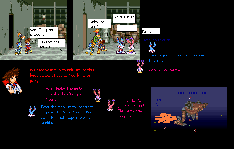
Actually I used Buster and Babs is because I couldn't find any other characters. I was going to use a strange character from a PS1 game I've never heard of but since I didn't know anything about him I used them.


herio at 3:54PM, July 27, 2006
nice
lefarce at 12:16PM, July 27, 2006
"EASY to make? " Before I took up typical comic art I tried my hand at sprite comics. I've since lost my original comic, but yes, it was very easy. It was of decent quality (think Tony the Hedgehog, or something of the like. Not amazing, but not bad). However, it became so easy that I quit to work on hand drawn comics. Speaking from experiance, it's all copy and past. There is nothing hard about it. Try drawing a full city scape with a broken ruler, and a pen that is nearly out of ink. Now THAT'S hard. And to KC, thanks for taking my crit well! I do hape this improves, despite the falws it has. Of course I know your just starting out, but with that bit of advice, if taken to heart, you wil quickly improve.
Tomcat at 9:35AM, July 27, 2006
le farce did you just say sprite comics were EASY to make? well sure if they're random but not if they have story and stuff. I mean, it takes twenty minutes jut for me to get everything looking good, and I use friggin' paint. and I know people who use PSP and Photoshop have a hard friggin time what with how complex it is. As for bugging him, it's more than obvious this kid is a beginner and constructive sriticicsm is fine but you're being damned rude about it. As for the comics, yeah they do need work, tons of it, but the color code text is used by lazy people or beginners. As for the FX, yeah the fire was pretty hilarious and he should get some SFX sheets but dude, do you know how damn hard it is to get BLOOD sfx, nobody friggin' rips the blood. The text bubbles, i gotta agree with, that's pretty lame, if you can't fit them in the square just type the text with the solid back and resize it around the text. as in make a small text box-resize it largely, type, then resize to fit text. As for the Disney Enix thing, it doesn't matter, you wanna' know why? It's his story and he can crossover as much stuff as he wants. Comics don't have to be canonical.(not sure if that's a word...but it is now) It's a fan comic as in made by a fan as in it doesn't need to follow the storyline, and if he was following the storyline he'd be using a recolored black outfit sora to match KHII.
Kingdom Clubs at 9:34AM, July 27, 2006
Well, First of all, I thank you for your criticism. I would like to point out that this is Kingdom Clubs, a parody of sorts of Kingdom Hearts. This take place in a different dimension then the Kingdom Hearts so more non-Square or Disney characters will appear. As for the black, I've always done that, the simple border between scenes bore me. And the color text is just there because thats how I usually saw it in other sprite comics. The fire was simply for comedic effect and the word bubbles came out a bit small then I though they should but the word was still readable so I assumed that was acceptable.
lefarce at 8:59AM, July 27, 2006
The use of black in this is amazing. And I don't mean in a good way. I mean that there is just too much. Far too much. To me it seems like a lazy way out of actually animating that section of the story with real sprites. And there is no excuse for laziness in sprite comics considering how easy they are to make. Your bit mixing to an obscene amount. I know that kingdom hearts does that, but still. And besides that, KH is supposed to be with only Disney characters mixed with square. Correct me if I'm wrong, but I could have sword Tiny Toons Adventures was a product of WB. The fire part was just funny. Listen, if your not going to do passable SFX or even take the time to get a FX sheet, then just don't do them at all. Whats next, spray paint red blood. C'mon, it's a sprite comic, it ain't that hard. The color coded text is ANNOYING. Color coded text implies that your readers are too stupid to know who is saying what. If you had a decent story line, you would be able to identify the characters based on their dialogue. Secondly, it implies emotion in their voices. I.E. blue text implies a character is sad, and pink implies that a character is either female, or really gay. Not to mention that it bleeds into the background. Alot. The text bubbles you did use are horribly constructed. The text bleeds out of the bubbles an into the picture. Hell, you didn't even make tails to the bubbles. Just these poor lines that don't even show up well. I honestly cannot find anything good about this comic, or anything you did right. You have allot to improve on, here's hoping you do
Kingdom Clubs at 7:14AM, July 27, 2006
Actually I used Buster and Babs is because I couldn't find any other characters. I was going to use a strange character from a PS1 game I've never heard of but since I didn't know anything about him I used them.
jarlino at 7:01AM, July 27, 2006
That's a unique way to ride around...and Buster and Babs are really comparable to Chip&Dale.