
stuff done for someone else
a perfect opposite on Jan. 29, 2007
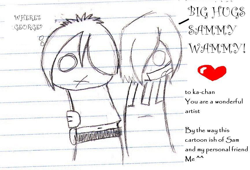
ok FANART i did for someone else and thought was good so i put it ehre KiittyKattle this ish her character sam and me ^^ :P enjoy and go check out her comic it is awsome!!!


a perfect opposite on Jan. 29, 2007
ok FANART i did for someone else and thought was good so i put it ehre KiittyKattle this ish her character sam and me ^^ :P enjoy and go check out her comic it is awsome!!!


Marrow96 at 8:43PM, Jan. 31, 2009
i have got to stop reading these comments first my brain almost exploded then a threw up a little in my mouth
Teava at 8:27PM, July 7, 2008
-stares- you shave your legs? Seriously, you need to talk to the guys I know and get them to shave. o.e I see their legs and its like 'fuck! put that away! there are CHILDREN here for yaoi's sake! D
luvmylab at 6:25PM, Feb. 2, 2007
I agree with most of what demagogue said(for once) XD but I think the little red line of hair looks neat. :)
a perfect opposite at 3:40PM, Feb. 2, 2007
XDDDDD i love your comment thank you i will take all these into thought when i work on my next one some thign i will keep how they are thought because i liek them for example the red highlight he ish the main character so he has to have that!!! and i liek the chibi look i'm not to shabby at realistic anime but i enjoy chibi the simplicity of it ish good ^^ AND I DO SHAVE MY LEGS! XDD
Demagogue at 8:38PM, Feb. 1, 2007
Ok well I want to start off by saying that I am happy to receive a request for advice and will usually honor such requests. Now to the rating and critique: The Good: 1) You have the ââ¬Åchibiââ¬Â style art down pretty well. 2) The jokes arenââ¬â¢t bad and the text is easy to read. 3) You show improvement as the comic goes on. 4) You use fine dark lines usually which makes it a lot easier to see. The Decent: 1) There isnââ¬â¢t much shading, I would suggest experimenting with it. You can print out a copy and see what works and what doesnââ¬â¢t, try to make a base sketch and practice on it. 2) Some lines tend to be a little off, a good rule of thumb is ââ¬ÅIf itââ¬â¢s organic free hand it but if itââ¬â¢s mechanical use a rulerââ¬Â. Thatââ¬â¢s a rule most artists follow as organic matter is rather imperfect and when you free hand it, it looks natural, but anything man made has a much stiffer frame/form. Even malleable things like fabric follow a pattern. The Bad: 1) Ok this jumps out right away, make sure to erase the ruler lines. While the lines on lined paper make it easier to draw you should erase them in a paint program (MS Paint or Photoshop). When you leave the lines it seems like you didnââ¬â¢t care enough to erase them rather than being part of the art work. Now this might create some white space leaving things looking a little bland but you can easily apply a light grey background or shade things to make it look better. 2) The red line on the hair just looks out of place most of the time. Itââ¬â¢s hard to incorporate a single color into art thatââ¬â¢s black and white otherwise. Sometimes it works (Sin City for example) but itââ¬â¢s a lot better to just shade it with a grey tone than put a red line. The red is just way to eye-catching and should probably be used if you want to clearly direct some ones attention to a specific item. 3) Make sure to spell check and reread everything, even the comments area. We are all capable of mistakes and improvement. Also the authorââ¬â¢s comment area is just as much a part of the comic as the art. Over all itââ¬â¢s a decent comic, for what it is. Just remember that 3 is a medium score meaning that you are on the right track but could use some improvement. Also remember if you are going to wear a skirt being a guy is no excuse not to shave your legs.
luvmylab at 7:57PM, Feb. 1, 2007
ha sammy wammy looks like he's about to barf. lol this gets a five.
squeakyreaper at 5:01PM, Jan. 30, 2007
OH NOES. I don't think I'll be going to that one. Yao isn't exactly what I want to see. >>
a perfect opposite at 3:56PM, Jan. 30, 2007
http://www.drunkduck.com/Its_A_Boy_Thing/index.php GO THERE!!!! It's a boy thing ^^ best comic done bye KittyKattle90