


ch 1 pg 2
anninhell on April 12, 2009
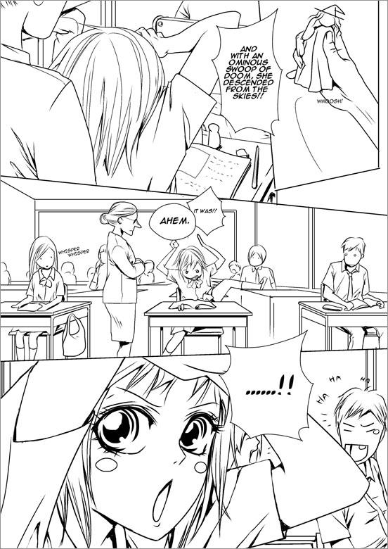
I must have worked on this for days! I'm rather tired of it now T-T
Anyway! If it's not a bother, I'd like to ask for some opinions! If you've noticed, I've deliberately used more contrasting lines on this page, but I'm not sure if it works without toning. So I'd like you, dear readers, to give me your opinions.
Also another matter is, (as a sort of survey) I'd like to know your preferences/opinions on A)More girly/shoujo-looking art with thicker lines or B)More realistic art with thinner lines.
Any input at all, would be greatly appreciate and would earn my eternal gratefulness =D Thanks so much for viewing!


Irys_Rocker_Thornz at 1:00PM, Jan. 31, 2010
awsome eyes
Almost Famous at 9:39PM, May 25, 2009
wow very good Anninhell very good!!
kaleygeminni at 5:14PM, May 3, 2009
wahahaha! so cuute!
NikiPaprika at 12:59PM, April 28, 2009
aaaaaw, so cute! But wooooow. Such clean, crisp lines!!!! Make me want to colour!!!! xD So beautiful. I love you art soo much!! O:
anninhell at 7:41PM, April 14, 2009
Wow, you guys really are an awesome bunch of readers xD I'd like to thank everyone - Ushio, Emily Elizabeth, Avie, Lilac, Whirlwynd, kichou - who have given me wonderful advice! I've read, read and re-read everyone's opinions and although some opinions are differing, they certainly help to clear my thoughts alot =D The next page for SNM is complete, and I feel much more certain about what I'm doing, thanks to all your feedback, so a big THANK YOU to all of ya ^___^
JustNoPoint at 2:40PM, April 14, 2009
And, another comic to read from you XD ^^
PiggyLove1940 at 8:47PM, April 13, 2009
lol just beautiful!
Ushio at 4:48PM, April 13, 2009
Because the line work here is thicker, it's very clear with less/no need for tones. I think this page looks great! :-D As for which you should draw I would just go with the flow and do whatever you feel like. Maybe a balance of thicker lines and less tone would work as well? The possibilities are endless, lol!
Emily Elizabeth at 1:18PM, April 13, 2009
Your art is so gorgeous and you draw like a pro! I think you need to choose, and decide what suits the style. If you're writing a shoujo comic, then shoujo lines, etc. I prefer this look though, without toning, it looks really arty and retro!
Rim at 1:07PM, April 13, 2009
haha, she's actually doing this in class?
Dark Pascual at 11:31AM, April 13, 2009
Great artwork!!!! Seems like a cool story!!!
Avie at 11:13AM, April 13, 2009
I agree 100% with Lilac. Listen to her ! Ha. By the way, amusing page ! Very cute.
Lilac at 11:02AM, April 13, 2009
Ack! I forgot to say that I really like this page. >
Lilac at 11:01AM, April 13, 2009
I like the contrasting of the lines when there's no toning. That way it makes the images stand out from one another. If you use only one line type, then you should stick with toning because it could get hard to tell the images apart or make anything stand out. And I'm all for the shoujo art with thicker lines. I think, because this is a shoujo manga you're making, realism would take away from that shoujo quality and the whimsy that comes with the genre. Anyway, that's my take on it. :D
kichou at 10:38AM, April 13, 2009
I forgot to rate!! :3
kichou at 10:35AM, April 13, 2009
without toning is beautiful but needs to have thinner lines
Whirlwynd at 10:23AM, April 13, 2009
Ooh, very nice linework =3 I think it looks good without the tones -