


The Starsign
Toppenzap on Aug. 19, 2008
Whee; My first and only comic on Drunkduck most likely, I've read a bunch of pokemon ones but just never made an account, So yeah. Comments/Suggestions/Criticisms are greatly appreciated, however just don't give me a 1-3 without saying why/how to improve. I know Drunkduck thinks this is Starsine, but that's only because the name Starsign was taken.
Edit~ Okay, my parents planned an unexpected trip so don't expect another comic until Friday-Saturday.


VinceLikesRooster at 7:43PM, Aug. 20, 2008
Whoops! Looks like I screwed up on the BB code. Anime Ace for the font and Paint.Net for the program there. for font: go to Google and type in "Anime Ace 2.0 BB Font for Paint.Net: [url]http://www.getpaint.net[/url]
VinceLikesRooster at 7:40PM, Aug. 20, 2008
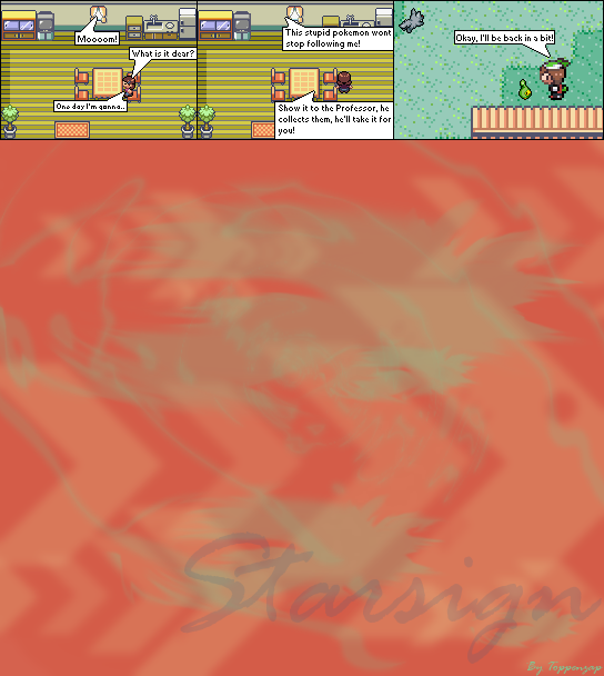
Criticism: 1. Text is too small. Use 10 for font size. Use this font instead. 2. The sprite in the second panel is between pixels, [b][u]Don't do that, ever![/b][/u]. Have the sprite aligned with the chair. It will make it a lot better. 3. If it's another story with the "get a PoKéMoN from the professor", just quit your comic right there. 4. Use the stretch and skew option in Paint. It will make your comic a bit better. I would recommend 300x300 for the story and 400x400 for the battles. 5. Paint is too overrated. Let's add some .Net to it. This program is a good starter and if you want photoshop, go to youtube and read the comments before attempting it yourself cause some of those are viruses to begin with. 6. Plus, if this is an actual comic, then 3 panels ain't gonna cut it. try 6 at least. ...... Keep trying, that's all I have to say.