Supermassive Black Hole A Star
- A* continues @ smbhax.com!
- Ep. 43, Page 50
- Ep. 43, Page 49
- Ep. 43, Page 48
- Ep. 43, Page 47
- Ep. 43, Page 46
- Ep. 43, Page 45
- Ep. 43, Page 44
- Ep. 43, Page 43
- Ep. 43, Page 42
- Ep. 43, Page 41
- Ep. 43, Page 40
- Ep. 43, Page 39
- Ep. 43, Page 38
- Ep. 43, Page 37
- Ep. 43, Page 36
- Ep. 43, Page 35
- Ep. 43, Page 34
- Ep. 43, Page 33
- Ep. 43, Page 32
- Ep. 43, Page 31
- Ep. 43, Page 30
- Ep. 43, Page 29
- Ep. 43, Page 28
- Ep. 43, Page 27
- Ep. 43, Page 26
- Ep. 43, Page 25
- Ep. 43, Page 24
- Ep. 43, Page 23
- Ep. 43, Page 22
- Ep. 43, Page 21
- Ep. 43, Page 20
- Ep. 43, Page 19
- Ep. 43, Page 18
- Ep. 43, Page 17
- Ep. 43, Page 16
- Ep. 43, Page 15
- Ep. 43, Page 14
- Ep. 43, Page 13
- Ep. 43, Page 12
- Ep. 43, Page 11
- Ep. 43, Page 10
- Ep. 43, Page 9
- Ep. 43, Page 8
- Ep. 43, Page 7
- Ep. 43, Page 6
- Ep. 43, Page 5
- Ep. 43, Page 4
- Ep. 43, Page 3
- Ep. 43, Page 2
Episode 43, Page 1
- Ep. 42, Page 96
- Ep. 42, Page 95
- Ep. 42, Page 94
- Ep. 42, Page 93
- Ep. 42, Page 92
- Ep. 42, Page 91
- Ep. 42, Page 90
- Ep. 42, Page 89
- Ep. 42, Page 88
- Ep. 42, Page 87
- Ep. 42, Page 86
- Ep. 42, Page 85
- Ep. 42, Page 84
- Ep. 42, Page 83
- Ep. 42, Page 82
- Ep. 42, Page 81
- Ep. 42, Page 80
- Ep. 42, Page 79
- Ep. 42, Page 78
- Ep. 42, Page 77
- Ep. 42, Page 76
- Ep. 42, Page 75
- Ep. 42, Page 74
- Ep. 42, Page 73
- Ep. 42, Page 72
- Ep. 42, Page 71
- Ep. 42, Page 70
- Ep. 42, Page 69
- Ep. 42, Page 68
- Ep. 42, Page 67
- Ep. 42, Page 66
- Ep. 42, Page 65
- Ep. 42, Page 64
- Ep. 42, Page 63
- Ep. 42, Page 62
- Ep. 42, Page 61
- Ep. 42, Page 60
- Ep. 42, Page 59
- Ep. 42, Page 58
- Ep. 42, Page 57
- Ep. 42, Page 56
- Ep. 42, Page 55
- Ep. 42, Page 54
- Ep. 42, Page 53
- Ep. 42, Page 52
- Ep. 42, Page 51
- Ep. 42, Page 50
- Ep. 42, Page 49
- Ep. 42, Page 48
- Ep. 42, Page 47
- Ep. 42, Page 46
- Ep. 42, Page 45
- Ep. 42, Page 44
- Ep. 42, Page 43
- Ep. 42, Page 42
- Ep. 42, Page 41
- Ep. 42, Page 40
- Ep. 42, Page 39
- Ep. 42, Page 38
- Ep. 42, Page 37
- Ep. 42, Page 36
- Ep. 42, Page 35
- Ep. 42, Page 34
- Ep. 42, Page 33
- Ep. 42, Page 32
- Ep. 42, Page 31
- Ep. 42, Page 30
- Ep. 42, Page 29
- Ep. 42, Page 28
- Ep. 42, Page 27
- Ep. 42, Page 26
- Ep. 42, Page 25
- Ep. 42, Page 24
- Ep. 42, Page 23
- Ep. 42, Page 22
- Ep. 42, Page 21
- Ep. 42, Page 20
- Ep. 42, Page 19
- Ep. 42, Page 18
- Ep. 42, Page 17
- Ep. 42, Page 16
- Ep. 42, Page 15
- Ep. 42, Page 14
- Ep. 42, Page 13
- Ep. 42, Page 12
- Ep. 42, Page 11
- Ep. 42, Page 10
- Ep. 42, Page 9
- Ep. 42, Page 8
- Ep. 42, Page 7
- Ep. 42, Page 6
- Ep. 42, Page 5
- Ep. 42, Page 4
- Ep. 42, Page 3
- Ep. 42, Page 2
Episode 42, Page 1
- Ep. 41, Page 150
- Ep. 41, Page 149
- Ep. 41, Page 148
- Ep. 41, Page 147
- Ep. 41, Page 146
- Ep. 41, Page 145
- Ep. 41, Page 144
- Ep. 41, Page 143
- Ep. 41, Page 142
- Ep. 41, Page 141
- Ep. 41, Page 140
- Ep. 41, Page 139
- Ep. 41, Page 138
- Ep. 41, Page 137
- Ep. 41, Page 136
- Ep. 41, Page 135
- Ep. 41, Page 134
- Ep. 41, Page 133
- Ep. 41, Page 132
- Ep. 41, Page 131
- Ep. 41, Page 130
- Ep. 41, Page 129
- Ep. 41, Page 128
- Ep. 41, Page 127
- Ep. 41, Page 126
- Ep. 41, Page 125
- Ep. 41, Page 124
- Ep. 41, Page 123
- Ep. 41, Page 122
- Ep. 41, Page 121
- Ep. 41, Page 120
- Ep. 41, Page 119
- Ep. 41, Page 118
- Ep. 41, Page 117
- Ep. 41, Page 116
- Ep. 41, Page 115
- Ep. 41, Page 114
- Ep. 41, Page 113
- Ep. 41, Page 112
- Ep. 41, Page 111
- Ep. 41, Page 110
- Ep. 41, Page 109
- Ep. 41, Page 108
- Ep. 41, Page 107
- Ep. 41, Page 106
- Ep. 41, Page 105
- Ep. 41, Page 104
- Ep. 41, Page 103
- Ep. 41, Page 102
- Ep. 41, Page 101
- Ep. 41, Page 100
- Ep. 41, Page 99
- Ep. 41, Page 98
- Ep. 41, Page 97
- Ep. 41, Page 96
- Ep. 41, Page 95
- Ep. 41, Page 94
- Ep. 41, Page 93
- Ep. 41, Page 92
- Ep. 41, Page 91
- Ep. 41, Page 90
- Ep. 41, Page 89
- Ep. 41, Page 88
- Ep. 41, Page 87
- Ep. 41, Page 86
- Ep. 41, Page 85
- Ep. 41, Page 84
- Ep. 41, Page 83
- Ep. 41, Page 82
- Ep. 41, Page 81
- Ep. 41, Page 80
- Ep. 41, Page 79
- Ep. 41, Page 78
- Ep. 41, Page 77
- Ep. 41, Page 76
- Ep. 41, Page 75
- Ep. 41, Page 74
- Ep. 41, Page 73
- Ep. 41, Page 72
- Ep. 41, Page 71
- Ep. 41, Page 70
- Ep. 41, Page 69
- Ep. 41, Page 68
- Ep. 41, Page 67
- Ep. 41, Page 66
- Ep. 41, Page 65
- Ep. 41, Page 64
- Ep. 41, Page 63
- Ep. 41, Page 62
- Ep. 41, Page 61
- Ep. 41, Page 60
- Ep. 41, Page 59
- Ep. 41, Page 58
- Ep. 41, Page 57
- Ep. 41, Page 56
- Ep. 41, Page 55
- Ep. 41, Page 54
- Ep. 41, Page 53
- Ep. 41, Page 52
- Ep. 41, Page 51
- Ep. 41, Page 50
- Ep. 41, Page 49
- Ep. 41, Page 48
- Ep. 41, Page 47
- Ep. 41, Page 46
- Ep. 41, Page 45
- Ep. 41, Page 44
- Ep. 41, Page 43
- Ep. 41, Page 42
- Ep. 41, Page 41
- Ep. 41, Page 40
- Ep. 41, Page 39
- Ep. 41, Page 38
- Ep. 41, Page 37
- Ep. 41, Page 36
- Ep. 41, Page 35
- Ep. 41, Page 34
- Ep. 41, Page 33
- Ep. 41, Page 32
- Ep. 41, Page 31
- Ep. 41, Page 30
- Ep. 41, Page 29
- Ep. 41, Page 28
- Ep. 41, Page 27
- Ep. 41, Page 26
- Ep. 41, Page 25
- Ep. 41, Page 24
- Ep. 41, Page 23
- Ep. 41, Page 22
- Ep. 41, Page 21
- Ep. 41, Page 20
- Ep. 41, Page 19
- Ep. 41, Page 18
- Ep. 41, Page 17
- Ep. 41, Page 16
- Ep. 41, Page 15
- Ep. 41, Page 14
- Ep. 41, Page 13
- Ep. 41, Page 12
- Ep. 41, Page 11
- Ep. 41, Page 10
- Ep. 41, Page 9
- Ep. 41, Page 8
- Ep. 41, Page 7
- Ep. 41, Page 6
- Ep. 41, Page 5
- Ep. 41, Page 4
- Ep. 41, Page 3
- Ep. 41, Page 2
Episode 41, Page 1
- Ep. 40, Page 108
- Ep. 40, Page 107
- Ep. 40, Page 106
- Ep. 40, Page 105
- Ep. 40, page 104
- Ep. 40, Page 103
- Ep. 40, Page 102
- Ep. 40, Page 101
- Ep. 40, Page 100
- Ep. 40, Page 99
- Ep. 40, Page 98
- Ep. 40, Page 97
- Ep. 40, Page 96
- Ep. 40, Page 95
- Ep. 40, Page 94
- Ep. 40, Page 93
- Ep. 40, Page 92
- Ep. 40, Page 91
- Ep. 40, Page 90
- Ep. 40, Page 89
- Ep. 40, Page 88
- Ep. 40, Page 87
- Ep. 40, Page 86
- Ep. 40, Page 85
- Ep. 40, Page 84
- Ep. 40, Page 83
- Ep. 40, Page 82
- Ep. 40, Page 81
- Ep. 40, Page 80
- Ep. 40, Page 79
- Ep. 40, Page 78
- Ep. 40, Page 77
- Ep. 40, Page 76
- Ep. 40, Page 75
- Ep. 40, Page 74
- Ep. 40, Page 73
- Ep. 40, Page 72
- Ep. 40, Page 71
- Ep. 40, Page 70
- Ep. 40, Page 69
- Ep. 40, Page 68
- Ep. 40, Page 67
- Ep. 40, Page 66
- Ep. 40, Page 65
- Ep. 40, Page 64
- Ep. 40, Page 63
- Ep. 40, Page 62
- Ep. 40, Page 61
- Ep. 40, Page 60
- Ep. 40, Page 59
- Ep. 40, Page 58
- Ep. 40, Page 57
- Ep. 40, Page 56
- Ep. 40, Page 55
- Ep. 40, Page 54
- Ep. 40, Page 53
- Ep. 40, Page 52
- Ep. 40, Page 51
- Ep. 40, Page 50
- Ep. 40, Page 49
- Ep. 40, Page 48
- Ep. 40, Page 47
- Ep. 40, Page 46
- Ep. 40, Page 45
- Ep. 40, Page 44
- Ep. 40, Page 43
- Ep. 40, Page 42
- Ep. 40, Page 41
- Ep. 40, Page 40
- Ep. 40, Page 39
- Ep. 40, Page 38
- Ep. 40, Page 37
- Ep. 40, Page 36
- Ep. 40, Page 35
- Ep. 40, Page 34
- Ep. 40, Page 33
- Ep. 40, Page 32
- Ep. 40, Page 31
- Ep. 40, Page 30
- Ep. 40, Page 29
- Ep. 40, Page 28
- Ep. 40, Page 27
- Ep. 40, Page 26
- Ep. 40, Page 25
- Ep. 40, Page 24
- Ep. 40, Page 23
- Ep. 40, Page 22
- Ep. 40, Page 21
- Ep. 40, Page 20
- Ep. 40, Page 19
- Ep. 40, Page 18
- Ep. 40, Page 17
- Ep. 40, Page 16
- Ep. 40, Page 15
- Ep. 40, Page 14
- Ep. 40, Page 13
- Ep. 40, Page 12
- Ep. 40, Page 11
- Ep. 40, Page 10
- Ep. 40, Page 9
- Ep. 40, Page 8
- Ep. 40, Page 7
- Ep. 40, Page 6
- Ep. 40, Page 5
- Ep. 49, Page 4
- Ep. 40, Page 3
- Ep. 40, Page 2
Episode 40, Page 1
- Ep. 39, Page 47
- Ep. 39, Page 46
- Ep. 39, Page 45
- Ep. 39, Page 44
- Ep. 39, Page 43
- Ep. 39, Page 42
- Ep. 39, Page 41
- Ep. 39, Page 40
- Ep. 39, Page 39
- Ep. 39, Page 38
- Ep. 39, Page 37
- Ep. 39, Page 36
- Ep. 39, Page 35
- Ep. 39, Page 34
- Ep. 39, Page 33
- Ep. 39, Page 32
- Ep. 39, Page 31
- Ep. 39, Page 30
- Ep. 39, Page 29
- Ep. 39, Page 28
- Ep. 39, Page 27
- Ep. 39, Page 26
- Ep. 39, Page 25
- Ep. 39, Page 24
- Ep. 39, Page 23
- Ep. 39, Page 22
- Ep. 39, Page 21
- Ep. 39, Page 20
- Ep. 39, Page 19
- Ep. 39, Page 18
- Ep. 39, Page 17
- Ep. 39, Page 16
- Ep. 39, Page 15
- Ep. 39, Page 14
- Ep. 39, Page 13
- Ep. 39, Page 12
- Ep. 39, Page 11
- Ep. 39, Page 10
- Ep. 39, Page 9
- Ep. 39, Page 8
- Ep. 39, Page 7
- Ep. 39, Page 6
- Ep. 39, Page 5
- Ep. 39, Page 4
- Ep. 39, Page 3
- Ep. 39, Page 2
Episode 39, Page 1
- Ep. 38, Page 88
- Ep. 38, Page 87
- Ep. 38, Page 86
- Ep. 38, Page 85
- Ep. 38, Page 84
- Ep. 38, Page 83
- Ep. 38, Page 82
- Ep. 38, Page 81
- Ep. 38, Page 80
- Ep. 38, Page 79
- Ep. 38, Page 78
- Ep. 38, Page 77
- Ep. 38, Page 76
- Ep. 38, Page 75
- Ep. 38, Page 74
- Ep. 38, Page 73
- Ep. 38, Page 72
- Ep. 38, Page 71
- Ep. 38, Page 70
- Ep. 38, Page 69
- Ep. 38, Page 68
- Ep. 38, Page 67
- Ep. 38, Page 66
- Ep. 38, Page 65
- Ep. 38, Page 64
- Ep. 38, Page 63
- Ep. 38, Page 62
- Ep. 38, Page 61
- Ep. 38, Page 60
- Ep. 38, Page 59
- Ep. 38, Page 58
- Ep. 38, Page 57
- Ep. 38, Page 56
- Ep. 38, Page 55
- Ep. 38, Page 54
- Ep. 38, Page 53
- Ep. 38, Page 52
- Ep. 38, Page 51
- Ep. 38, Page 50
- Ep. 38, Page 49
- Ep. 38, Page 48
- Ep. 38, Page 47
- Ep. 38, Page 46
- Ep. 38, Page 45
- Ep. 38, Page 44
- Ep. 38, Page 43
- Ep. 38, Page 42
- Ep. 38, Page 41
- Ep. 38, Page 40
- Ep. 38, Page 39
- Ep. 38, Page 38
- Ep. 38, Page 37
- Ep. 38, Page 36
- Ep. 38, Page 35
- Ep. 38, Page 34
- Ep. 38, Page 33
- Ep. 38, Page 32
- Ep. 38, Page 31
- Ep. 38, Page 30
- Ep. 38, Page 29
- Ep. 38, Page 28
- Ep. 38, Page 27
- Ep. 38, Page 26
- Ep. 38, Page 25
- Ep. 38, Page 24
- Ep. 38, Page 23
- Ep. 38, Page 22
- Ep. 38, Page 21
- Ep. 38, Page 20
- Ep. 38, Page 19
- Ep. 38, Page 18
- Ep. 38, Page 17
- Ep. 38, Page 16
- Ep. 38, Page 15
- Ep. 38, Page 14
- Ep. 38, Page 13
- Ep. 38, Page 12
- Ep. 38, Page 11
- Ep. 38, Page 10
- Ep. 38, Page 9
- Ep. 38, Page 8
- Ep. 38, Page 7
- Ep. 38, Page 6
- Ep. 38, Page 5
- Ep. 38, Page 4
- Ep. 38, Page 3
- Ep. 38, Page 2
Episode 38, Page 1
- Ep. 37, Page 53
- Ep. 37, Page 52
- Ep. 37, Page 51
- Ep. 37, Page 50
- Ep. 37, Page 49
- Ep. 37, Page 48
- Ep. 37, Page 47
- Ep. 37, Page 46
- Ep. 37, Page 45
- Ep. 37, Page 44
- Ep. 37, Page 43
- Ep. 37, Page 42
- Ep. 37, Page 41
- Ep. 37, Page 40
- Ep. 37, Page 39
- Ep. 37, Page 38
- Ep. 37, Page 37
- Ep. 37, Page 36
- Ep. 37, Page 35
- Ep. 37, Page 34
- Ep. 37, Page 33
- Ep. 37, Page 32
- Ep. 37, Page 31
- Ep. 37, Page 30
- Ep. 37, Page 29
- Ep. 37, Page 28
- Ep. 37, Page 27
- Ep. 37, Page 26
- Ep. 37, Page 25
- Ep. 37, Page 24
- Ep. 37, Page 23
- Ep. 37, Page 22
- Ep. 37, Page 21
- Ep. 37, Page 20
- Ep. 37, Page 19
- Ep. 37, Page 18
- Ep. 37, Page 17
- Ep. 37, Page 16
- Ep. 37, Page 15
- Ep. 37, Page 14
- Ep. 37, Page 13
- Ep. 37, Page 12
- Ep. 37, Page 11
- Ep. 37, Page 10
- Ep. 37, Page 9
- Ep. 37, Page 8
- Ep. 37, Page 7
- Ep. 37, Page 6
- Ep. 37, Page 5
- Ep. 37, Page 4
- Ep. 37, Page 3
- Ep. 37, Page 2
Episode 37, Page 1
- Ep. 36, Page 82
- Ep. 36, Page 81
- Ep. 36, Page 80
- Ep. 36, Page 79
- Ep. 36, Page 78
- Ep. 36, Page 77
- Ep. 36, Page 76
- Ep. 36, Page 75
- Ep. 36, Page 74
- Ep. 36, Page 73
- Ep. 36, Page 72
- Ep. 36, Page 71
- Ep. 36, Page 70
- Ep. 36, Page 69
- Ep. 36, Page 68
- Ep. 36, Page 67
- Ep. 36, Page 66
- Ep. 36, Page 65
- Ep. 36, Page 64
- Ep. 36, Page 63
- Ep. 36, Page 62
- Ep. 36, Page 61
- Ep. 36, Page 60
- Ep. 36, Page 59
- Ep. 36, Page 58
- Ep. 36, Page 57
- Ep. 36, Page 56
- Ep. 36, Page 55
- Ep. 36, Page 54
- Ep. 36, Page 53
- Ep. 36, Page 52
- Ep. 36, Page 51
- Ep. 36, Page 50
- Ep. 36, Page 49
- Ep. 36, Page 48
- Ep. 36, Page 47
- Ep. 36, Page 46
- Ep. 36, Page 45
- Ep. 36, Page 44
- Ep. 36, Page 43
- Ep. 36, Page 42
- Ep. 36, Page 41
- Ep. 36, Page 40
- Ep. 36, Page 39
- Ep. 36, Page 38
- Ep. 36, Page 37
- Ep. 36, Page 36
- Ep. 36, Page 35
- Ep. 36, Page 34
- Ep. 36, Page 33
- Ep. 36, Page 32
- Ep. 36, Page 31
- Ep. 36, Page 30
- Ep. 36, Page 29
- Ep. 36, Page 28
- Ep. 36, Page 27
- Ep. 36, Page 26
- Ep. 36, Page 25
- Ep. 36, Page 24
- Ep. 36, Page 23
- Ep. 36, Page 22
- Ep. 36, Page 21
- Ep. 36, Page 20
- Ep. 36, Page 19
- Ep. 36, Page 18
- Ep. 36, Page 17
- Ep. 36, Page 16
- Ep. 36, Page 15
- Ep. 36, Page 14
- Ep. 36, Page 13
- Ep. 36, Page 12
- Ep. 36, Page 11
- Ep. 36, Page 10
- Ep. 36, Page 9
- Ep. 36, Page 8
- Ep. 36, Page 7
- Ep. 36, Page 6
- Ep. 36, Page 5
- Ep. 36, Page 4
- Ep. 36, Page 3
- Ep. 36, Page 2
Episode 36, Page 1
- Ep. 35, Page 67
- Ep. 35, Page 66
- Ep. 35, Page 65
- Ep. 35, Page 64
- Ep. 35, Page 63
- Ep. 35, Page 62
- Ep. 35, Page 61
- Ep. 35, Page 60
- Ep. 35, Page 59
- Ep. 35, Page 58
- Ep. 35, Page 57
- Ep. 35, Page 56
- Ep. 35, Page 55
- Ep. 35, Page 54
- Ep. 35, Page 53
- Ep. 35, Page 52
- Ep. 35, Page 51
- Ep. 35, Page 50
- Ep. 35, Page 49
- Ep. 35, Page 48
- Ep. 35, Page 47
- Ep. 35, Page 46
- Ep. 35, Page 45
- Ep. 35, Page 44
- Ep. 35, Page 43
- Ep. 35, Page 42
- Ep. 35, Page 41
- Ep. 35, Page 40
- Ep. 35, Page 39
- Ep. 35, Page 38
- Ep. 35, Page 37
- Ep. 35, Page 36
- Ep. 35, Page 35
- Ep. 35, Page 34
- Ep. 35, Page 33
- Ep. 35, Page 32
- Ep. 35, Page 31
- Ep. 35, Page 30
- Ep. 35, Page 29
- Ep. 35, Page 28
- Ep. 35, Page 27
- Ep. 35, Page 26
- Ep. 35, Page 25
- Ep. 35, Page 24
- Ep. 35, Page 23
- Ep. 35, Page 22
- Ep. 35, Page 21
- Ep. 35, Page 20
- Ep. 35, Page 19
- Ep. 35, Page 18
- Ep. 35, Page 17
- Ep. 35, Page 16
- Ep. 35, Page 15
- Ep. 35, Page 14
- Ep. 35, Page 13
- Ep. 35, Page 12
- Ep. 35, Page 11
- Ep. 35, Page 10
- Ep. 35, Page 9
- Ep. 35, Page 8
- Ep. 35, Page 7
- Ep. 35, Page 6
- Ep. 35, Page 5
- Ep. 35, Page 4
- Ep. 35, Page 3
- Ep. 35, Page 2
Episode 35, Page 1
- Ep. 34, Page 65
- Ep. 34, Page 64
- Ep. 34. Page 63
- Ep. 34, Page 62
- Ep. 34, Page 61
- Ep. 34, Page 60
- Ep. 34, Page 59
- Ep. 34, Page 58
- Ep. 34, Page 57
- Ep. 34, Page 56
- Ep. 34, Page 55
- Ep. 34, Page 54
- Ep. 34, Page 53
- Ep. 34, Page 52
- Ep. 34, Page 51
- Ep. 34, Page 50
- Ep. 34, Page 49
- Ep. 34, Page 48
- Ep. 34, Page 47
- Ep. 34, Page 46
- Ep. 34, Page 45
- Ep. 34, Page 44
- Ep. 34, Page 43
- Ep 34, Page 42
- Ep. 34, Page 41
- Ep. 34, Page 40
- Ep. 34, Page 39
- Ep. 34, Page 38
- Ep. 34, Page 37
- Ep. 34, Page 36
- Ep. 34, Page 35
- Ep. 34, Page 34
- Ep. 34, Page 33
- Ep. 34, Page 32
- Ep. 34, Page 31
- Ep. 34, Page 30
- Ep. 34, Page 29
- Ep. 34, Page 28
- Ep. 34, Page 27
- Ep. 34, Page 26
- Ep. 34, Page 25
- Ep. 34, Page 24
- Ep. 34, Page 23
- Ep. 34, Page 22
- Ep. 34, Page 21
- Ep. 34, Page 20
- Ep. 34, Page 19
- Ep. 34, Page 18
- Ep. 34, Page 17
- Ep. 34, Page 16
- Ep. 34, Page 15
- Ep. 34, Page 14
- Ep. 34, Page 13
- Ep. 34, Page 12
- Ep. 34, Page 11
- Ep. 34, Page 10
- Ep. 34, Page 9
- Ep. 34, Page 8
- Ep. 34, Page 7
- Ep. 34, Page 6
- Ep. 34, Page 5
- Ep 34, Page 4
- Ep. 34, Page 3
- Ep. 34, Page 2
Episode 34, Page 1
- Ep. 33, Page 56
- Ep. 33, Page 55
- Ep. 33, Page 54
- Ep. 33, Page 53
- Ep. 33, Page 52
- Ep. 33, Page 51
- Ep. 33, Page 50
- Ep. 33, Page 49
- Ep. 33, Page 48
- Ep. 33, Page 47
- Ep. 33, Page 46
- Ep. 33, Page 45
- Ep. 33, Page 44
- Ep. 33, Page 43
- Ep. 33, Page 42
- Ep. 33, Page 41
- Ep. 33, Page 40
- Ep. 33, Page 39
- Ep. 33, Page 38
- Ep. 33, Page 37
- Ep. 33, Page 36
- Ep. 33, Page 35
- Ep. 33, Page 34
- Ep. 33, Page 33
- Ep. 33, Page 32
- Ep. 33, Page 31
- Ep. 33, Page 30
- Ep. 33, Page 29
- Ep. 33, Page 28
- Ep. 33, Page 27
- Ep. 33, Page 26
- Ep. 33, Page 25
- Ep. 33, Page 24
- Ep. 33, Page 23
- Ep. 33, Page 22
- Ep. 33, Page 21
- Ep. 33, Page 20
- Ep. 33, Page 19
- Ep. 33, Page 18
- Ep. 33, Page 17
- Ep. 33, Page 16
- Ep. 33, Page 15
- Ep. 33, Page 14
- Ep. 33, Page 13
- Ep. 33, Page 12
- Ep. 33, Page 11
- Ep. 33, Page 10
- Ep. 33, Page 9
- Ep. 33, Page 8
- Ep. 33, Page 7
- Ep. 33, Page 6
- Ep. 33, Page 5
- Ep. 33, Page 4
- Ep. 33, Page 3
- Ep. 33, Page 2
Episode 33, Page 1
- Ep. 32, Page 125
- Ep. 32, Page 124
- Ep. 32, Page 123
- Ep. 32, Page 122
- Ep. 32, Page 121
- Ep. 32, Page 120
- Ep. 32, Page 119
- Ep. 32, Page 118
- Ep. 32, Page 117
- Ep. 32, Page 116
- Ep. 32, Page 115
- Ep. 32, Page 114
- Ep. 32, Page 113
- Ep. 32, Page 112
- Ep. 32, Page 111
- Ep. 32, Page 110
- Ep. 32, Page 109
- Ep. 32, Page 108
- Ep. 32, Page 107
- Ep. 32, Page 106
- Ep. 32, Page 105
- Ep. 32, Page 104
- Ep. 32, Page 103
- Ep. 32, Page 102
- Ep. 32, Page 101
- Ep. 32, Page 100
- Ep. 32, Page 99
- Ep. 32, Page 98
- Ep. 32, Page 97
- Ep. 32, Page 96
- Ep. 32, Page 95
- Ep. 32, Page 94
- Ep. 32, Page 93
- Ep. 32, Page 92
- Ep. 32, Page 91
- Ep. 32, Page 90
- Ep. 32, Page 89
- Ep. 32, Page 88
- Ep. 32, Page 87
- Ep. 32, Page 86
- Ep. 32, Page 85
- Ep. 32, Page 84
- Ep. 32, Page 83
- Ep. 32, Page 82
- Ep. 32, Page 81
- Ep. 32, Page 80
- Ep. 32, Page 79
- Ep. 32, Page 78
- Ep. 32, Page 77
- Ep. 32, Page 76
- Ep. 32, Page 75
- Ep. 32, Page 74
- Ep. 32, Page 73
- Ep. 32, Page 72
- Ep. 32, Page 71
- Ep. 32, Page 70
- Ep. 32, Page 69
- Ep. 32, Page 68
- Ep. 32, Page 67
- Ep. 32, Page 66
- Ep. 32, Page 65
- Ep. 32, Page 64
- Ep. 32, Page 63
- Ep. 32, Page 62
- Ep. 32, Page 61
- Ep. 32, Page 60
- Ep. 32, Page 59
- Ep. 32, Page 58
- Ep. 32, Page 57
- Ep. 32, Page 56
- Ep. 32, Page 55
- Ep. 32, Page 54
- Ep. 32, Page 53
- Ep. 32, Page 52
- Ep. 32, Page 51
- Ep. 32, Page 50
- Ep. 32, Page 49
- Ep. 32, Page 48
- Ep. 32, Page 47
- Ep. 32, Page 46
- Ep. 32, Page 45
- Ep. 32, Page 44
- Ep. 32, Page 43
- Ep. 32, Page 42
- Ep. 32, Page 41
- Ep. 32, Page 40
- Ep. 32, Page 39
- Ep. 32, Page 38
- Ep. 32, Page 37
- Ep. 32, Page 36
- Ep. 32, Page 35
- Ep. 32, Page 34
- Ep. 32, Page 33
- Ep. 32, Page 32
- Ep. 32, Page 31
- Ep. 32, Page 30
- Ep. 32, Page 29
- Ep. 32, Page 28
- Ep. 32, Page 27
- Ep. 32, Page 26
- Ep. 32, Page 25
- Ep. 32, Page 24
- Ep. 32, Page 23
- Ep. 32, Page 22
- Ep. 32, Page 21
- Ep. 32, Page 20
- Ep. 32, Page 19
- Ep. 32, Page 18
- Ep. 32, Page 17
- Ep. 32, Page 16
- Ep. 32, Page 15
- Ep. 32, Page 14
- Ep. 32, Page 13
- Ep. 32, Page 12
- Ep. 32, Page 11
- Ep. 32, Page 10
- Ep. 32, Page 9
- Ep. 32, Page 8
- Ep. 32, Page 7
- Ep. 32, Page 6
- Ep. 32, Page 5
- Ep. 32, Page 4
- Ep. 32, Page 3
- Ep. 32, Page 2
Episode 32, Page 1
- Ep. 31, Page 96
- Ep. 31, Page 95
- Ep. 31, Page 94
- Ep. 31, Page 93
- Ep. 31, Page 92
- Ep. 31, Page 91
- Ep. 31, Page 90
- Ep. 31, Page 89
- Ep. 31, Page 88
- Ep. 31, Page 87
- Ep. 31, Page 86
- Ep. 31, Page 85
- Ep. 31, Page 84
- Ep. 31, Page 83
- Ep. 31, Page 82
- Ep. 31, Page 81
- Ep. 31, Page 80
- Ep. 31, Page 79
- Ep. 31, Page 78
- Ep. 31, Page 77
- Ep. 31, Page 76
- Ep. 31, Page 75
- Ep. 31, Page 74
- Ep. 31, Page 73
- Ep. 31, Page 72
- Ep. 31, Page 71
- Ep. 31, Page 70
- Ep. 31, Page 69
- Ep. 31, Page 68
- Ep. 31, Page 67
- Ep. 31, Page 66
- Ep. 31, Page 65
- Ep. 31, Page 64
- Ep. 31, Page 63
- Ep. 31, Page 62
- Ep. 31, Page 61
- Ep. 31, Page 60
- Ep. 31, Page 59
- Ep. 31, Page 58
- Ep. 31, Page 57
- Ep. 31, Page 56
- Ep. 31, Page 55
- Ep. 31, Page 54
- Ep. 31, Page 53
- Ep. 31, Page 52
- Ep. 31, Page 51
- Ep. 31, Page 50
- Ep. 31, Page 49
- Ep. 31, Page 48
- Ep. 31, Page 47
- Ep. 31, Page 46
- Ep. 31, Page 45
- Ep. 31, Page 44
- Ep. 31, Page 43
- Ep. 31, Page 42
- Ep. 31, Page 41
- Ep. 31, Page 40
- Ep. 31, Page 39
- Ep. 31, Page 38
- Ep. 31, Page 37
- Ep. 31, Page 36
- Ep. 31, Page 35
- Ep. 31, Page 34
- Ep. 31, Page 33
- Ep. 31, Page 32
- Ep. 31, Page 31
- Ep. 31, Page 30
- Ep. 31, Page 29
- Ep. 31, Page 28
- Ep. 31, Page 27
- Ep. 31, Page 26
- Ep. 31, Page 25
- Ep. 31, Page 24
- Ep. 31, Page 23
- Ep. 31, Page 22
- Ep. 31, Page 21
- Ep. 31, Page 20
- Ep. 31, Page 19
- Ep. 31, Page 18
- Ep. 31, Page 17
- Ep. 31, Page 16
- Ep. 31, Page 15
- Ep. 31, Page 14
- Ep. 31, Page 13
- Ep. 31, Page 12
- Ep. 31, Page 11
- Ep. 31, Page 10
- Ep. 31, Page 9
- Ep. 31, Page 8
- Ep. 31, Page 7
- Ep. 31, Page 6
- Ep. 31, Page 5
- Ep. 31, Page 4
- Ep. 31, Page 3
- Ep. 31, Page 2
Episode 31, Page 1
- Ep. 30, Page 119
- Ep. 30, Page 118
- Ep. 30, Page 117
- Ep. 30, Page 116
- Ep. 30, Page 115
- Ep. 30, Page 114
- Ep. 30, Page 113
- Ep. 30, Page 112
- Ep. 30, Page 111
- Ep. 30, Page 110
- Ep. 30, Page 109
- Ep. 30, Page 108
- Ep. 30, Page 107
- Ep. 30, Page 106
- Ep. 30, Page 105
- Ep. 30, Page 104
- Ep. 30, Page 103
- Ep. 30, Page 102
- Ep. 30, Page 101
- Ep. 30, Page 100
- Ep. 30, Page 99
- Ep. 30, Page 98
- Ep. 30, Page 97
- Ep. 30, Page 96
- Ep. 30, Page 95
- Ep. 30, Page 94
- Ep. 30, Page 93
- Ep. 30, Page 92
- Ep. 30, Page 91
- Ep. 30, Page 90
- Ep. 30, Page 89
- Ep. 30, Page 88
- Ep. 30, Page 87
- Ep. 30, Page 86
- Ep. 30, Page 85
- Ep. 30, Page 84
- Ep. 30, Page 83
- Ep. 30, Page 82
- Ep. 30, Page 81
- Ep. 30, Page 80
- Ep. 30, Page 79
- Ep. 30, Page 78
- Ep. 30, Page 77
- Ep. 30, Page 76
- Ep. 30, Page 75
- Ep. 30, Page 74
- Ep. 30, Page 73
- Ep. 30, Page 72
- Ep. 30, Page 71
- Ep. 30, Page 70
- Ep. 30, Page 69
- Ep. 30, Page 68
- Ep. 30, Page 67
- Ep. 30, Page 66
- Ep. 30, Page 65
- Ep. 30, Page 64
- Ep. 30, Page 63
- Ep. 30, Page 62
- Ep. 30, Page 61
- Ep. 30, Page 60
- Ep. 30, Page 59
- Ep. 30, Page 58
- Ep. 30, Page 57
- Ep. 30, Page 56
- Ep. 30, Page 55
- Ep. 30, Page 54
- Ep. 30, Page 53
- Ep. 30, Page 52
- Ep. 30, Page 51
- Ep. 30, Page 50
- Ep. 30, Page 49
- Ep. 30, Page 48
- Ep. 30, Page 47
- Ep. 30, Page 46
- Ep. 30, Page 45
- Ep. 30, Page 44
- Ep. 30, Page 43
- Ep. 30, Page 42
- Ep. 30, Page 41
- Ep. 30, Page 40
- Ep. 30, Page 39
- Ep. 30, Page 38
- Ep. 30, Page 37
- Ep. 30, Page 36
- Ep. 30, Page 35
- Ep. 30, Page 34
- Ep. 30, Page 33
- Ep. 30, Page 32
- Ep. 30, Page 31
- Ep. 30, Page 30
- Ep. 30, Page 29
- Ep. 30, Page 28
- Ep. 30, Page 27
- Ep. 30, Page 26
- Ep. 30, Page 25
- Ep. 30, Page 24
- Ep. 30, Page 23
- Ep. 30, Page 22
- Ep. 30, Page 21
- Ep. 30, Page 20
- Ep. 30, Page 19
- Ep. 30, Page 18
- Ep. 30, Page 17
- Ep. 30, Page 16
- Ep. 30, Page 15
- Ep. 30, Page 14
- Ep. 30, Page 13
- Ep. 30, Page 12
- Ep. 30, Page 11
- Ep. 30, Page 10
- Ep. 30, Page 9
- Ep. 30, Page 8
- Ep. 30, Page 7
- Ep. 30, Page 6
- Ep. 30, Page 5
- Ep. 30, Page 4
- Ep. 30, Page 3
- Ep. 30, Page 2
Episode 30, Page 1
- Ep. 29, Page 114
- Ep. 29, Page 113
- Ep. 29, Page 112
- Ep. 29, Page 111
- Ep. 29, Page 110
- Ep. 29, Page 109
- Ep. 29, Page 108
- Ep. 29, Page 107
- Ep. 29, Page 106
- Ep. 29, Page 105
- Ep. 29, Page 104
- Ep. 29, Page 103
- Ep. 29, Page 102
- Ep. 29, Page 101
- Ep. 29, Page 100
- Ep. 29, Page 99
- Ep. 29, Page 98
- Ep. 29, Page 97
- Ep. 29, Page 96
- Ep. 29, Page 95
- Ep. 29, Page 94
- Ep. 29, Page 93
- Ep. 29, Page 92
- Ep. 29, Page 91
- Ep. 29, Page 90
- Ep. 29, Page 89
- Ep. 29, Page 88
- Ep. 29, Page 87
- Ep. 29, Page 86
- Ep. 29, Page 85
- Ep. 29, Page 84
- Ep. 29, Page 83
- Ep. 29, Page 82
- Ep. 29, Page 81
- Ep. 29, Page 80
- Ep. 29, Page 79
- Ep. 29, Page 78
- Ep. 29, Page 77
- Ep. 29, Page 76
- Ep. 29, Page 75
- Ep. 29, Page 74
- Ep. 29, Page 73
- Ep. 29, Page 72
- Ep. 29, Page 71
- Ep. 29, Page 70
- Ep. 29, Page 69
- Ep. 29, Page 68
- Ep. 29, Page 67
- Ep. 29, Page 66
- Ep. 29, Page 65
- Ep. 29, Page 64
- Ep. 29, Page 63
- Ep. 29, Page 62
- Ep. 29, Page 61
- Ep. 29, Page 60
- Ep. 29, Page 59
- Ep. 29, Page 58
- Ep. 29, Page 57
- Ep. 29, Page 56
- Ep. 29, Page 55
- Ep. 29, Page 54
- Ep. 29, Page 53
- Ep. 29, Page 52
- Ep. 29, Page 51
- Ep. 29, Page 50
- Ep. 29, Page 49
- Ep. 29, Page 48
- Ep. 29, Page 47
- Ep. 29, Page 46
- Ep. 29, Page 45
- Ep. 29, Page 44
- Ep. 29, Page 43
- Ep. 29, Page 42
- Ep. 29, Page 41
- Ep. 29, Page 40
- Ep. 29, Page 39
- Ep. 29, Page 38
- Ep. 29, Page 37
- Ep. 29, Page 36
- Ep. 29, Page 35
- Ep. 29, Page 34
- Ep. 29, Page 33
- Ep. 29, Page 32
- Ep. 29, Page 31
- Ep. 29, Page 30
- Ep. 29, Page 29
- Ep. 29, Page 28
- Ep. 29, Page 27
- Ep. 29, Page 26
- Ep. 29, Page 25
- Ep. 29, Page 24
- Ep. 29, Page 23
- Ep. 29, Page 22
- Ep. 29, Page 21
- Ep. 29, Page 20
- Ep. 29, Page 19
- Ep. 29, Page 18
- Ep. 29, Page 17
- Ep. 29, Page 16
- Ep. 29, Page 15
- Ep. 29, Page 14
- Ep. 29, Page 13
- Ep. 29, Page 12
- Ep. 29, Page 11
- Ep. 29, Page 10
- Ep. 29, Page 9
- Ep. 29, Page 8
- Ep. 29, Page 7
- Ep. 29, Page 6
- Ep. 29, Page 5
- Ep. 29, Page 4
- Ep. 29, Page 3
- Ep. 29, Page 2
Episode 29, Page 1
- Ep. 28, Page 85
- Ep. 28, Page 84
- Ep. 28, Page 83
- Ep. 28, Page 82
- Ep. 28, Page 81
- Ep. 28, Page 80
- Ep. 28, Page 79
- Ep. 28, Page 78
- Ep. 28, Page 77
- Ep. 28, Page 76
- Ep. 28, Page 75
- Ep. 28, Page 74
- Ep. 28, Page 73
- Ep. 28, Page 72
- Ep. 28, Page 71
- Ep. 28, Page 70
- Ep. 28, Page 69
- Ep. 28, Page 68
- Ep. 28, Page 67
- Ep. 28, Page 66
- Ep. 28, Page 65
- Ep. 28, Page 64
- Ep. 28, Page 63
- Ep. 28, Page 62
- Ep. 28, Page 61
- Ep. 28, Page 60
- Ep. 28, Page 59
- Ep. 28, Page 58
- Ep. 28, Page 57
- Ep. 28, Page 56
- Ep. 28, Page 55
- Ep. 28, Page 54
- Ep. 28, Page 53
- Ep. 28, Page 52
- Ep. 28, Page 51
- Ep. 28, Page 50
- Ep. 28, Page 49
- Ep. 28, Page 48
- Ep. 28, Page 47
- Ep. 28, Page 46
- Ep. 28, Page 45
- Ep. 28, Page 44
- Ep. 28, Page 43
- Ep. 28, Page 42
- Ep. 28, Page 41
- Ep. 28, Page 40
- Ep. 28, Page 39
- Ep. 28, Page 38
- Ep. 28, Page 37
- Ep. 28, Page 36
- Ep. 28, Page 35
- Ep. 28, Page 34
- Ep. 28, Page 33
- Ep. 28, Page 32
- Ep. 28, Page 31
- Ep. 28, Page 30
- Ep. 28, Page 29
- Ep. 28, Page 28
- Ep. 28, Page 27
- Ep. 28, Page 26
- Ep. 28, Page 25
- Ep. 28, Page 24
- Ep. 28, Page 23
- Ep. 28, Page 22
- Ep. 28, Page 21
- Ep. 28, Page 20
- Ep. 28, Page 19
- Ep. 28, Page 18
- Ep. 28, Page 17
- Ep. 28, Page 16
- Ep. 28, Page 15
- Ep. 28, Page 14
- Ep. 28, Page 13
- Ep. 28, Page 12
- Ep. 28, Page 11
- Ep. 28, Page 10
- Ep. 28, Page 9
- Ep. 28, Page 8
- Ep. 28, Page 7
- Ep. 28, Page 6
- Ep. 28, Page 5
- Ep. 28, Page 4
- Ep. 28, Page 3
- Ep. 28, Page 2
Episode 28, Page 1
- Ep. 27, Page 101
- Ep. 27, Page 100
- Ep. 27, Page 99
- Ep. 27, Page 98
- Ep. 27, Page 97
- Ep. 27, Page 96
- Ep. 27, Page 95
- Ep. 27, Page 94
- Ep. 27, Page 93
- Ep. 27, Page 92
- Ep. 27, Page 91
- Ep. 27, Page 90
- Ep. 27, Page 89
- Ep. 27, Page 88
- Ep. 27, Page 87
- Ep. 27, Page 86
- Ep. 27, Page 85
- Ep. 27, Page 84
- Ep. 27, Page 83
- Ep. 27, Page 82
- Ep. 27, Page 81
- Ep. 27, Page 80
- Ep. 27, Page 59
- Ep. 27 Page 78
- Ep. 27, Page 77
- Ep. 27, Page 76
- Ep. 27, Page 75
- Ep. 27, Page 74
- Ep. 27, Page 73
- Ep. 27, Page 72
- Ep. 27, Page 71
- Ep. 27, Page 70
- Ep. 27, Page 69
- Ep. 27, Page 68
- Ep. 27, Page 67
- Ep. 27, Page 66
- Ep. 27, Page 65
- Ep. 27, Page 64
- Ep. 27, Page 63
- Ep. 27, Page 62
- Ep. 27, Page 61
- Ep. 27, Page 60
- Ep. 27, Page 59
- Ep. 27, Page 58
- Ep. 27, Page 57
- Ep. 27, Page 55
- Ep. 27, Page 55
- Ep. 27, Page 54
- Ep. 27, Page 53
- Ep. 27, Page 52
- Ep. 27, Page 51
- Ep. 27, Page 50
- Ep. 27, Page 49
- Ep. 27, Page 48
- Ep. 27, Page 47
- Ep. 27, Page 46
- Ep. 27, Page 45
- Ep. 27, Page 44
- Ep. 27, Page 43
- Ep. 27, Page 42
- Ep. 27, Page 41
- Ep. 27, Page 40
- Ep. 27, Page 39
- Ep. 27, Page 38
- Ep. 27, Page 37
- Ep. 27, Page 36
- Ep. 27, Page 35
- Ep. 27, Page 34
- Ep. 27, Page 33
- Ep. 27, Page 32
- Ep. 27, Page 31
- Ep. 27, Page 30
- Ep. 27, Page 29
- Ep. 27, Page 28
- Ep. 27, Page 27
- Ep. 27, Page 26
- Ep. 27, Page 25
- Ep. 27, Page 24
- Ep. 27, Page 23
- Ep. 27, Page 22
- Ep. 27, Page 21
- Ep. 27, Page 20
- Ep. 27, Page 19
- Ep. 27, Page 18
- Ep. 27, Page 17
- Ep. 27, Page 16
- Ep. 27, Page 15
- Ep. 27, Page 14
- Ep. 27, Page 13
- Ep. 27, Page 12
- Ep. 27, Page 11
- Ep. 27, Page 10
- Ep. 27, Page 9
- Ep. 27, Page 8
- Ep. 27, Page 7
- Ep. 27, Page 6
- Ep. 27, Page 5
- Ep. 27, Page 4
- Ep. 27, Page 3
- Ep. 27, Page 2
Episode 27, Page 1
- Ep. 26, Page 51
- Ep. 26, Page 50
- Ep. 26, Page 49
- Ep. 26, Page 48
- Ep. 26, Page 47
- Ep. 26, Page 46
- Ep. 26, Page 45
- Ep. 26, Page 44
- Ep. 26, Page 43
- Ep. 26, Page 42
- Ep. 26, Page 41
- Ep. 26, Page 40
- Ep. 26, Page 39
- Ep. 26, Page 38
- Ep. 26, Page 37
- Ep. 26, Page 36
- Ep. 26, Page 35
- Ep. 26, Page 34
- Ep. 26, Page 33
- Ep. 26, Page 32
- Ep. 26, Page 31
- Ep. 26, Page 30
- Ep. 26, Page 29
- Ep. 26, Page 28
- Ep. 26, Page 27
- Ep. 26, Page 26
- Ep. 26, Page 25
- Ep. 26, Page 24
- Ep. 26, Page 23
- Ep. 26, Page 22
- Ep. 26, Page 21
- Ep. 26, Page 20
- Ep. 26, Page 19
- Ep. 26, Page 18
- Ep. 26, Page 17
- Ep. 26, Page 16
- Ep. 26, Page 15
- Ep. 26, Page 14
- Ep. 26, Page 13
- Ep. 26, Page 12
- Ep. 26, Page 11
- Ep. 26, Page 10
- Ep. 26, Page 9
- Ep. 26, Page 8
- Ep. 26, Page 7
- Ep. 26, Page 6
- Ep. 26, Page 5
- Ep. 26, Page 4
- Ep. 26, Page 3
- Ep. 26, Page 2
Episode 26, Page 1
- Ep. 25, Page 80
- Ep. 25, Page 79
- Ep. 25, Page 78
- Ep. 25, Page 77
- Ep. 25, Page 76
- Ep. 25, Page 75
- Ep. 25, Page 74
- Ep. 25, Page 73
- Ep. 25, Page 72
- Ep. 25, Page 71
- Ep. 25, Page 70
- Ep. 25, Page 69
- Ep. 25, Page 68
- Ep. 25, Page 67
- Ep. 25, Page 66
- Ep. 25, Page 65
- Ep. 25, Page 64
- Ep. 25, Page 63
- Ep. 25, Page 62
- Ep. 25, Page 61
- Ep. 25, Page 60
- Ep. 25, Page 59
- Ep. 25, Page 58
- Ep. 25, Page 57
- Ep. 25, Page 56
- Ep. 25, Page 55
- Ep. 25, Page 54
- Ep. 25, Page 53
- Ep. 25, Page 52
- Ep. 25, Page 51
- Ep. 25, Page 50
- Ep. 25, Page 49
- Ep. 25, Page 48
- Ep. 25, Page 47
- Ep. 25, Page 46
- Ep. 25, Page 45
- Ep. 25, Page 44
- Ep. 25, Page 43
- Ep. 25, Page 42
- Ep. 25, Page 41
- Ep. 25, Page 40
- Ep. 25, Page 39
- Ep. 25, Page 38
- Ep. 25, Page 37
- Ep. 25, Page 36
- Ep. 25, Page 35
- Ep. 25, Page 34
- Ep. 25, Page 33
- Ep. 25, Page 32
- Ep. 25, Page 31
- Ep. 25, Page 30
- Ep. 25, Page 29
- Ep. 25, Page 28
- Ep. 25, Page 27
- Ep. 25, Page 26
- Ep. 25, Page 25
- Ep. 25, Page 24
- Ep. 25, Page 23
- Ep. 25, Page 22
- Ep. 25, Page 21
- Ep. 25, Page 20
- Ep. 25, Page 19
- Ep. 25, Page 18
- Ep. 25, Page 17
- Ep. 25, Page 16
- Ep. 25, Page 15
- Ep. 25, Page 14
- Ep. 25, Page 13
- Ep. 25, Page 12
- Ep. 25, Page 11
- Ep. 25, Page 10
- Ep. 25, Page 9
- Ep. 25, Page 8
- Ep. 25, Page 7
- Ep. 25, Page 6
- Ep. 25, Page 5
- Ep. 25, Page 4
- Ep. 25, Page 3
- Ep. 25, Page 2
Episode 25, Page 1
- Ep. 24, Page 47
- Ep. 24, Page 46
- Ep. 24, Page 45
- Ep. 24, Page 44
- Ep. 24, Page 43
- Ep. 24, Page 42
- Ep. 24, Page 41
- Ep. 24, Page 40
- Ep. 24, Page 39
- Ep. 24, Page 38
- Ep. 24, Page 37
- Ep. 24, Page 36
- Ep. 24, Page 35
- Ep. 24, Page 34
- Ep. 24, Page 33
- Ep. 24, Page 32
- Ep. 24, Page 31
- Ep. 24, Page 30
- Ep. 24, Page 29
- Ep. 24, Page 28
- Ep. 24, Page 27
- Ep. 24, Page 26
- Ep. 24, Page 25
- Ep. 24, Page 24
- Ep. 24, Page 23
- Ep. 24, Page 22
- Ep. 24, Page 21
- Ep. 24, Page 20
- Ep. 24, Page 19
- Ep. 24, Page 18
- Ep. 24, Page 17
- Ep. 24, Page 16
- Ep. 24, Page 15
- Ep. 24, Page 14
- Ep. 24, Page 13
- Ep. 24, Page 12
- Ep. 24, Page 11
- Ep. 24, Page 10
- Ep. 24, Page 9
- Ep. 24, Page 8
- Ep. 24, Page 7
- Ep. 24, Page 6
- Ep. 24, Page 5
- Ep. 24, Page 4
- Ep. 24, Page 3
- Ep. 24, Page 2
Episode 24, Page 1
- Ep. 23, Page 40
- Ep. 23, Page 39
- Ep. 23, Page 38
- Ep. 23, Page 37
- Ep. 23, Page 36
- Ep. 23, Page 35
- Ep. 23, Page 34
- Ep. 23, Page 33
- Ep. 23, Page 32
- Ep. 23, Page 31
- Ep. 23, Page 30
- Ep. 23, Page 29
- Ep. 23, Page 28
- Ep. 23, Page 27
- Ep. 23, Page 26
- Ep. 23, Page 25
- Ep. 23, Page 24
- Ep. 23, Page 23
- Ep. 23, Page 22
- Ep. 23, Page 21
- Ep. 23, Page 20
- Ep. 23, Page 19
- Ep. 23, Page 18
- Ep. 23, Page 17
- Ep. 23, Page 16
- Ep. 23, Page 15
- Ep. 23, Page 14
- Ep. 23, Page 13
- Ep. 23, Page 12
- Ep. 23, Page 11
- Ep. 23, Page 10
- Ep. 23, Page 9
- Ep. 23, Page 8
- Ep. 23, Page 7
- Ep. 23, Page 6
- Ep. 23, Page 5
- Ep. 23, Page 4
- Ep. 23, Page 3
- Ep. 23, Page 2
Episode 23, Page 1
- Ep. 22, Page 105
- Ep. 22, Page 104
- Ep. 22, Page 103
- Ep. 22, Page 102
- Ep. 22, Page 101
- Ep. 22, Page 100
- Ep. 22, Page 99
- Ep. 22, Page 98
- Ep. 22, Page 97
- Ep. 22, Page 96
- Ep. 22, Page 95
- Ep. 22, Page 94
- Ep. 22, Page 93
- Ep. 22, Page 92
- Ep. 22, Page 91
- Ep. 22, Page 90
- Ep. 22, Page 89
- Ep. 22, Page 88
- Ep. 22, Page 87
- Ep. 22, Page 86
- Ep. 22, Page 85
- Ep. 22, Page 84
- Ep. 22, Page 83
- Ep. 22, Page 82
- Ep. 22, Page 81
- Ep. 22, Page 80
- Ep. 22, Page 79
- Ep. 22, Page 78
- Ep. 22, Page 77
- Ep. 22, Page 76
- Ep. 22, Page 75
- Ep. 22, Page 74
- Ep. 22, Page 73
- Ep. 22, Page 72
- Ep. 22, Page 71
- Ep. 22, Page 70
- Ep. 22, Page 69
- Ep. 22, Page 68
- Ep. 22, Page 67
- Ep. 22, Page 66
- Ep. 22, Page 65
- Ep. 22, Page 64
- Ep. 22, Page 63
- Ep. 22, Page 62
- Ep. 22, Page 61
- Ep. 22, Page 60
- Ep. 22, Page 59
- Ep. 22, Page 58
- Ep. 22, Page 57
- Ep. 22, Page 56
- Ep. 22, Page 55
- Ep. 22, Page 54
- Ep. 22, Page 53
- Ep. 22, Page 52
- Ep. 22, Page 51
- Ep. 22, Page 50
- Ep. 22, Page 49
- Ep. 22, Page 48
- Ep. 22, Page 47
- Ep. 22, Page 46
- Ep. 22, Page 45
- Ep. 22, Page 44
- Ep. 22, Page 43
- Ep. 22, Page 42
- Ep. 22, Page 41
- Ep. 22, Page 40
- Ep. 22, Page 39
- Ep. 22, Page 38
- Ep. 22, Page 37
- Ep. 22, Page 36
- Ep. 22, Page 35
- Ep. 22, Page 34
- Ep. 22, Page 33
- Ep. 22, Page 32
- Ep. 22, Page 31
- Ep. 22, Page 30
- Ep. 22, Page 29
- Ep. 22, Page 28
- Ep. 22, Page 27
- Ep. 22, Page 26
- Ep. 22, Page 25
- Ep. 22, Page 24
- Ep. 22, Page 23
- Ep. 22, Page 22
- Ep. 22, Page 21
- Ep. 22, Page 20
- Ep. 22, Page 19
- Ep. 22, Page 18
- Ep. 22, Page 17
- Ep. 22, Page 16
- Ep. 22, Page 15
- Ep. 22, Page 14
- Ep. 22, Page 13
- Ep. 22, Page 12
- Ep. 22, Page 11
- Ep. 22, Page 10
- Ep. 22, Page 9
- Ep. 22, Page 8
- Ep. 22, Page 7
- Ep. 22, Page 6
- Ep. 22, Page 5
- Ep. 22, Page 4
- Ep. 22, Page 3
- Ep. 22, Page 2
Episode 22, Page 1
- Ep. 21, Page 121
- Ep. 21, Page 120
- Ep. 21, Page 119
- Ep. 21, Page 118
- Ep. 21, Page 117
- Ep. 21, Page 116
- Ep. 21, Page 115
- Ep. 21, Page 114
- Ep. 21, Page 113
- Ep. 21, Page 112
- Ep. 21, Page 111
- Ep. 21, Page 110
- Ep. 21, Page 109
- Ep. 21, Page 108
- Ep. 21, Page 107
- Ep. 21, Page 106
- Ep. 21, Page 105
- Ep. 21, Page 104
- Ep. 21, Page 103
- Ep. 21, Page 102
- Ep. 21, Page 101
- Ep. 21, Page 100
- Ep. 21, Page 99
- Ep. 21, Page 98
- Ep. 21, Page 97
- Ep. 21, Page 96
- Ep. 21, Page 95
- Ep. 21, Page 94
- Ep. 21, Page 93
- Ep. 21, Page 92
- Ep. 21, Page 91
- Ep. 21, Page 90
- Ep. 21, Page 89
- Ep. 21, Page 88
- Ep. 21, Page 87
- Ep. 21, Page 86
- Ep. 21, Page 85
- Ep. 21, Page 84
- Ep. 21, Page 83
- Ep. 21, Page 82
- Ep. 21, Page 81
- Ep. 21, Page 80
- Ep. 21, Page 79
- Ep. 21, Page 78
- Ep. 21, Page 77
- Ep. 21, Page 76
- Ep. 21, Page 75
- Ep. 21, Page 74
- Ep. 21, Page 73
- Ep. 21, Page 72
- Ep. 21, Page 71
- Ep. 21, Page 70
- Ep. 21, Page 69
- Ep. 21, Page 68
- Ep. 21, Page 67
- Ep. 21, Page 66
- Ep. 21, Page 65
- Ep. 21, Page 64
- Ep. 21, Page 63
- Ep. 21, Page 62
- Ep. 21, Page 61
- Ep. 21, Page 60
- Ep. 21, Page 59
- Ep. 21, Page 58
- Ep. 21, Page 57
- Ep. 21, Page 56
- Ep. 21, Page 55
- Ep. 21, Page 54
- Ep. 21, Page 53
- Ep. 21, Page 52
- Ep. 21, Page 51
- Ep. 21, Page 50
- Ep. 21, Page 49
- Ep. 21, Page 48
- Ep. 21, Page 47
- Ep. 21, Page 46
- Ep. 21, Page 45
- Ep. 21, Page 44
- Ep. 21, Page 43
- Ep. 21, Page 42
- Ep. 21, Page 41
- Ep. 21, Page 40
- Ep. 21, Page 39
- Ep. 21, Page 38
- Ep. 21, Page 37
- Ep. 21, Page 36
- Ep. 21, Page 35
- Ep. 21, Page 34
- Ep. 21, Page 33
- Ep. 21, Page 32
- Ep. 21, Page 31
- Ep. 21, Page 30
- Ep. 21, Page 29
- Ep. 21, Page 28
- Ep. 21, Page 27
- Ep. 21, Page 26
- Ep. 21, Page 25
- Ep. 21, Page 24
- Ep. 21, Page 23
- Ep. 21, Page 22
- Ep. 21, Page 21
- Ep. 21, Page 20
- Ep. 21, Page 19
- Ep. 21, Page 18
- Ep. 21, Page 17
- Ep. 21, Page 16
- Ep. 21, Page 15
- Ep. 21, Page 14
- Ep. 21, Page 13
- Ep. 21, Page 12
- Ep. 21, Page 11
- Ep. 21, Page 10
- Ep. 21, Page 9
- Ep. 21, Page 8
- Ep. 21, Page 7
- Ep. 21, Page 6
- Ep. 21, Page 5
- Ep. 21, Page 4
- Ep. 21, Page 3
- Ep. 21, Page 2
Episode 21, Page 1
- Ep. 20, Page 62
- Ep. 20, Page 61
- Ep. 20, Page 60
- Ep. 20, Page 59
- Ep. 20, Page 58
- Ep. 20, Page 57
- Ep. 20, Page 56
- Ep. 20, Page 55
- Ep. 20, Page 54
- Ep. 20, Page 53
- Ep. 20, Page 52
- Ep. 20, Page 51
- Ep. 20, Page 50
- Ep. 20, Page 49
- Ep. 20, Page 48
- Ep. 20, Page 47
- Ep. 20, Page 46
- Ep. 20, Page 45
- Ep. 20, Page 44
- Ep. 20, Page 43
- Ep. 20, Page 42
- Ep. 20, Page 41
- Ep. 20, Page 40
- Ep. 20, Page 39
- Ep. 20, Page 38
- Ep. 20, Page 37
- Ep. 20, Page 36
- Ep. 20, Page 35
- Ep. 20, Page 34
- Ep. 20, Page 33
- Ep. 20, Page 32
- Ep. 20, Page 31
- Ep. 20, Page 30
- Ep. 20, Page 29
- Ep. 20, Page 28
- Ep. 20, Page 27
- Ep. 20, Page 26
- Ep. 20, Page 25
- Ep. 20, Page 24
- Ep. 20, Page 23
- Ep. 20, Page 22
- Ep. 20, Page 21
- Ep. 20, Page 20
- Ep. 20, Page 19
- Ep. 20, Page 18
- Ep. 20, Page 17
- Ep. 20, Page 16
- Ep. 20, Page 15
- Ep. 20, Page 14
- Ep. 20, Page 13
- Ep. 20, Page 12
- Ep. 20, Page 11
- Ep. 20, Page 10
- Ep. 20, Page 9
- Ep. 20, Page 8
- Ep. 20, Page 7
- Ep. 20, Page 6
- Ep. 20, Page 5
- Ep. 20, Page 4
- Ep. 20, Page 3
- Ep. 20, Page 2
- Episode 20, Page 1
- Ep. 19, Page 141
- Ep. 19, Page 140
- Ep. 19, Page 139
- Ep. 19, Page 138
- Ep. 19, Page 137
- Ep. 19, Page 136
- Ep. 19, Page 135
- Ep. 19, Page 134
- Ep. 19, Page 133
- Ep. 19, Page 132
- Ep. 19, Page 131
- Ep. 19, Page 130
- Ep. 19, Page 129
- Ep. 19, Page 128
- Ep. 19, Page 127
- Ep. 19, Page 126
- Ep. 19, Page 125
- Ep. 19, Page 124
- Ep. 19, Page 123
- Ep. 19, Page 122
- Ep. 19, Page 121
- Ep. 19, Page 120
- Ep. 19, Page 119
- Ep. 19, Page 118
- Ep. 19, Page 117
- Ep. 19, Page 116
- Ep. 19, Page 115
- Ep. 19, Page 114
- Ep. 19, Page 113
- Ep. 19, Page 112
- Ep. 19, Page 111
- Ep. 19, Page 110
- Ep. 19, Page 109
- Ep. 19, Page 108
- Ep. 19, Page 107
- Ep. 19, Page 106
- Ep. 19, Page 105
- Ep. 19, Page 104
- Ep. 19, Page 103
- Ep. 19, Page 102
- Ep. 19, Page 101
- Ep. 19, Page 100
- Ep. 19, Page 99
- Ep. 19, Page 98
- Ep. 19, Page 97
- Ep. 19, Page 96
- Ep. 19, Page 95
- Ep. 19, Page 94
- Ep. 19, Page 93
- Ep. 19, Page 92
- Ep. 19, Page 91
- Ep. 19, Page 90
- Ep. 19, Page 89
- Ep. 19, Page 88
- Ep. 19, Page 87
- Ep. 19, Page 86
- Ep. 19, Page 85
- Ep. 19, Page 84
- Ep. 19, Page 83
- Ep. 19, Page 82
- Ep. 19, Page 81
- Ep. 19, Page 80
- Ep. 19, Page 79
- Ep. 19, Page 78
- Ep. 19, Page 77
- Ep. 19, Page 76
- Ep. 19, Page 75
- Ep. 19, Page 74
- Ep. 19, Page 73
- Ep. 19, Page 72
- Ep. 19, Page 71
- Ep. 19, Page 70
- Ep. 19, Page 69
- Ep. 19, Page 68
- Ep. 19, Page 67
- Ep. 19, Page 66
- Ep. 19, Page 65
- Ep. 19, Page 64
- Ep. 19, Page 63
- Ep. 19, Page 62
- Ep. 19, Page 61
- Ep. 19, Page 60
- Ep. 19, Page 59
- Ep. 19, Page 58
- Ep. 19, Page 57
- Ep. 19, Page 56
- Ep. 19, Page 55
- Ep. 19, Page 54
- Ep. 19, Page 53
- Ep. 19, Page 52
- Ep. 19, Page 51
- Ep. 19, Page 50
- Ep. 19, Page 49
- Ep. 19, Page 48
- Ep. 19, Page 47
- Ep. 19, Page 46
- Ep. 19, Page 45
- Ep. 19, Page 44
- Ep. 19, Page 43
- Ep. 19, Page 42
- Ep. 19, Page 41
- Ep. 19, Page 40
- Ep. 19, Page 39
- Ep. 19, Page 38
- Ep. 19, Page 37
- Ep. 19, Page 36
- Ep. 19, Page 35
- Ep. 19, Page 34
- Ep. 19, Page 33
- Ep. 19, Page 32
- Ep. 19, Page 31
- Ep. 19, Page 30
- Ep. 19, Page 29
- Ep. 19, Page 28
- Ep. 19, Page 27
- Ep. 19, Page 26
- Ep. 19, Page 25
- Ep. 19, Page 24
- Ep. 19, Page 23
- Ep. 19, Page 22
- Ep. 19, Page 21
- Ep. 19, Page 20
- Ep. 19, Page 19
- Ep. 19, Page 18
- Ep. 19, Page 17
- Ep. 19, Page 16
- Ep. 19, Page 15
- Ep. 19, Page 14
- Ep. 19, Page 13
- Ep. 19, Page 12
- Ep. 19, Page 11
- Ep. 19, Page 10
- Ep. 19, Page 9
- Ep. 19, Page 8
- Ep. 19, Page 7
- Ep. 19, Page 6
- Ep. 19, Page 5
- Ep. 19, Page 4
- Ep. 19, Page 3
- Ep. 19, Page 2
Episode 19, Page 1
- Ep. 18, Page 106
- Ep. 18, Page 105
- Ep. 18, Page 104
- Ep. 18, Page 103
- Ep. 18, Page 102
- Ep. 18, Page 101
- Ep. 18, Page 100
- Ep. 18, Page 99
- Ep. 18, Page 98
- Ep. 18, Page 97
- Ep. 18, Page 96
- Ep. 18, Page 95
- Ep. 18, Page 94
- Ep. 18, Page 93
- Ep. 18, Page 92
- Ep. 18, Page 91
- Ep. 18, Page 90
- Ep. 18, Page 89
- Ep. 18, Page 88
- Ep. 18, Page 87
- Ep. 18, Page 86
- Ep. 18, Page 85
- Ep. 18, Page 84
- Ep. 18, Page 83
- Ep. 18, Page 82
- Ep. 18, Page 81
- Ep. 18, Page 80
- Ep. 18, Page 79
- Ep. 18, Page 78
- Ep. 18, Page 77
- Ep. 18, Page 76
- Ep. 18, Page 75
- Ep. 18, Page 74
- Ep. 18, Page 73
- Ep. 18, Page 72
- Ep. 18, Page 71
- Ep. 18, Page 70
- Ep. 18, Page 69
- Ep. 18, Page 68
- Ep. 18, Page 67
- Ep. 18, Page 66
- Ep. 18, Page 65
- Ep. 18, Page 64
- Ep. 18, Page 63
- Ep. 18, Page 62
- Ep. 18, Page 61
- Ep. 18, Page 60
- Ep. 18, Page 59
- Ep. 18, Page 58
- Ep. 18, Page 57
- Ep. 18, Page 56
- Ep. 18, Page 55
- Ep. 18, Page 54
- Ep. 18, Page 53
- Ep. 18, Page 52
- Ep. 18, Page 51
- Ep. 18, Page 50
- Ep. 18, Page 49
- Ep. 18, Page 48
- Ep. 18, Page 47
- Ep. 18, Page 46
- Ep. 18, Page 45
- Ep. 18, Page 44
- Ep. 18, Page 43
- Ep. 18, Page 42
- Ep. 18, Page 41
- Ep. 18, Page 40
- Ep. 18, Page 39
- Ep. 18, Page 38
- Ep. 18, Page 37
- Ep. 18, Page 36
- Ep. 18, Page 35
- Ep. 18, Page 34
- Ep. 18, Page 33
- Ep. 18, Page 32
- Ep. 18, Page 31
- Ep. 18, Page 30
- Ep. 18, Page 29
- Ep. 18, Page 28
- Ep. 18, Page 27
- Ep. 18, Page 26
- Ep. 18, Page 25
- Ep. 18, Page 24
- Ep. 18, Page 23
- Ep. 18, Page 22
- Ep. 18, Page 21
- Ep. 18, Page 20
- Ep. 18, Page 19
- Ep. 18, Page 18
- Ep. 18, Page 17
- Ep. 18, Page 16
- Ep. 18, Page 15
- Ep. 18, Page 14
- Ep. 18, Page 13
- Ep. 18, Page 12
- Ep. 18, Page 11
- Ep. 18, Page 10
- Ep. 18, Page 9
- Ep. 18, Page 8
- Ep. 18, Page 7
- Ep. 18, Page 6
- Ep. 18, Page 5
- Ep. 18, Page 4
- Ep. 18, Page 3
- Ep. 18, Page 2
Episode 18, Page 1
- Ep. 17, Page 126
- Ep. 17, Page 125
- Ep. 17, Page 124
- Ep. 17, Page 123
- Ep. 17, Page 122
- Ep. 17, Page 121
- Ep. 17, Page 120
- Ep. 17, Page 119
- Ep. 17, Page 118
- Ep. 17, Page 117
- Ep. 17, Page 116
- Ep. 17, Page 115
- Ep. 17, Page 114
- Ep. 17, Page 113
- Ep. 17, Page 112
- Ep. 17, Page 111
- Ep. 17, Page 110
- Ep. 17, Page 109
- Ep. 17, Page 108
- Ep. 17, Page 107
- Ep. 17, Page 106
- Ep. 17, Page 105
- Ep. 17, Page 104
- Ep. 17, Page 103
- Ep. 17, Page 102
- Ep. 17, Page 101
- Ep. 17, Page 100
- Ep. 17, Page 99
- Ep. 17, Page 98
- Ep. 17, Page 97
- Ep. 17, Page 96
- Ep. 17, Page 95
- Ep. 17, Page 94
- Ep. 17, Page 93
- Ep. 17, Page 92
- Ep. 17, Page 91
- Ep. 17, Page 90
- Ep. 17, Page 89
- Ep. 17, Page 88
- Ep. 17, Page 87
- Ep. 17, Page 86
- Ep. 17, Page 85
- Ep. 17, Page 84
- Ep. 17, Page 83
- Ep. 17, Page 82
- Ep. 17, Page 81
- Ep. 17, Page 80
- Ep. 17, Page 79
- Ep. 17, Page 78
- Ep. 17, Page 77
- Ep. 17, Page 76
- Ep. 17, Page 75
- Ep. 17, Page 74
- Ep. 17, Page 73
- Ep. 17, Page 72
- Ep. 17, Page 71
- Ep. 17, Page 70
- Ep. 17, Page 69
- Ep. 17, Page 68
- Ep. 17, Page 67
- Ep. 17, Page 66
- Ep. 17, Page 65
- Ep. 17, Page 64
- Ep. 17, Page 63
- Ep. 17, Page 62
- Ep. 17, Page 61
- Ep. 17, Page 60
- Ep. 17, Page 59
- Ep. 17, Page 58
- Ep. 17, Page 57
- Ep. 17, Page 56
- Ep. 17, Page 55
- Ep. 17, Page 54
- Ep. 17, Page 53
- Ep. 17, Page 52
- Ep. 17, Page 51
- Ep. 17, Page 50
- Ep. 17, Page 49
- Ep. 17, Page 48
- Ep. 17, Page 47
- Ep. 17, Page 46
- Ep. 17, Page 45
- Ep. 17, Page 44
- Ep. 17, Page 43
- Ep. 17, Page 42
- Ep. 17, Page 41
- Ep. 17, Page 40
- Ep. 17, Page 39
- Ep. 17, Page 38
- Ep. 17, Page 37
- Ep. 17, Page 36
- Ep. 17, Page 35
- Ep. 17, Page 34
- Ep. 17, Page 33
- Ep. 17, Page 32
- Ep. 17, Page 31
- Ep. 17, Page 30
- Ep. 17, Page 29
- Ep. 17, Page 28
- Ep. 17, Page 27
- Ep. 17, Page 26
- Ep. 17, Page 25
- Ep. 17, Page 24
- Ep. 17, Page 23
- Ep. 17, Page 22
- Ep. 17, Page 21
- Ep. 17, Page 20
- Ep. 17, Page 19
- Ep. 17, Page 18
- Ep. 17, Page 17
- Ep. 17, Page 16
- Ep. 17, Page 15
- Ep. 17, Page 14
- Ep. 17, Page 13
- Ep. 17, Page 12
- Ep. 17, Page 11
- Ep. 17, Page 10
- Ep. 17, Page 9
- Ep. 17, Page 8
- Ep. 17, Page 7
- Ep. 17, Page 6
- Ep. 17, Page 5
- Ep. 17, Page 4
- Ep. 17, Page 3
- Ep. 17, Page 2
Episode 17, Page 1
- Ep. 16, Page 105
- Ep. 16, Page 104
- Ep. 16, Page 103
- Ep. 16, Page 102
- Ep. 16, Page 101
- Ep. 16, Page 100
- Ep. 16, Page 99
- Ep. 16, Page 98
- Ep. 16, Page 97
- Ep. 16, Page 96
- Ep. 16, Page 95
- Ep. 16, Page 94
- Ep. 16, Page 93
- Ep. 16, Page 92
- Ep. 16, Page 91
- Ep. 16, Page 90
- Ep. 16, Page 89
- Ep. 16, Page 88
- Ep. 16, Page 87
- Ep. 16, Page 86
- Ep. 16, Page 85
- Ep. 16, Page 84
- Ep. 16, Page 83
- Ep. 16, Page 82
- Ep. 16, Page 81
- Ep. 16, Page 80
- Ep. 16, Page 79
- Ep. 16, Page 78
- Ep. 16, Page 77
- Ep. 16, Page 76
- Ep. 16, Page 75
- Ep. 16, Page 74
- Ep. 16, Page 73
- Ep. 16, Page 72
- Ep. 16, Page 71
- Ep. 16, Page 70
- Ep. 16, Page 69
- Ep. 16, Page 68
- Ep. 16, Page 67
- Ep. 16, Page 66
- Ep. 16, Page 65
- Ep. 16, Page 64
- Ep. 16, Page 63
- Ep. 16, Page 62
- Ep. 16, Page 61
- Ep. 16, Page 60
- Ep. 16, Page 59
- Ep. 16, Page 58
- Ep. 16, Page 57
- Ep. 16, Page 56
- Ep. 16, Page 55
- Ep. 16, Page 54
- Ep. 16, Page 53
- Ep. 16, Page 52
- Ep. 16, Page 51
- Ep. 16, Page 50
- Ep. 16, Page 49
- Ep. 16, Page 48
- Ep. 16, Page 47
- Ep. 16, Page 46
- Ep. 16, Page 45
- Ep. 16, Page 44
- Ep. 16, Page 43
- Ep. 16, Page 42
- Ep. 16, Page 41
- Ep. 16, Page 40
- Ep. 16, Page 39
- Ep. 16, Page 38
- Ep. 16, Page 37
- Ep. 16, Page 36
- Ep. 16, Page 35
- Ep. 16, Page 34
- Ep. 16, Page 33
- Ep. 16, Page 32
- Ep. 16, Page 31
- Ep. 16, Page 30
- Ep. 16, Page 29
- Ep. 16, Page 28
- Ep. 16, Page 27
- Ep. 16, Page 26
- Ep. 16, Page 25
- Ep. 16, Page 24
- Ep. 16, Page 23
- Ep. 16, Page 22
- Ep. 16, Page 21
- Ep. 16, Page 20
- Ep. 16, Page 19
- Ep. 16, Page 18
- Ep. 16, Page 17
- Ep. 16, Page 16
- Ep. 16, Page 15
- Ep. 16, Page 14
- Ep. 16, Page 13
- Ep. 16, Page 12
- Ep. 16, Page 11
- Ep. 16, Page 10
- Ep. 16, Page 9
- Ep. 16, Page 8
- Ep. 16, Page 7
- Ep. 16, Page 6
- Ep. 16, Page 5
- Ep. 16, Page 4
- Ep. 16, Page 3
- Ep. 16, Page 2
Episode 16, Page 1
- Ep. 15, Page 56
- Ep. 15, Page 55
- Ep. 15, Page 54
- Ep. 15, Page 53
- Ep. 15, Page 52
- Ep. 15, Page 51
- Ep. 15, Page 50
- Ep. 15, Page 49
- Ep. 15, Page 48
- Ep. 15, Page 47
- Ep. 15, Page 46
- Ep. 15, Page 45
- Ep. 15, Page 44
- Ep. 15, Page 43
- Ep. 15, Page 42
- Ep. 15, Page 41
- Ep. 15, Page 40
- Ep. 15, Page 39
- Ep. 15, Page 38
- Ep. 15, Page 37
- Ep. 15, Page 36
- Ep. 15, Page 35
- Ep. 15, Page 34
- Ep. 15, Page 33
- Ep. 15, Page 32
- Ep. 15, Page 31
- Ep. 15, Page 30
- Ep. 15, Page 29
- Ep. 15, Page 28
- Ep. 15, Page 27
- Ep. 15, Page 26
- Ep. 15, Page 25
- Ep. 15, Page 24
- Ep. 15, Page 23
- Ep. 15, Page 22
- Ep. 15, Page 21
- Ep. 15, Page 20
- Ep. 15, Page 19
- Ep. 15, Page 18
- Ep. 15, Page 17
- Ep. 15, Page 16
- Ep. 15, Page 15
- Ep. 15, Page 14
- Ep. 15, Page 13
- Ep. 15, Page 12
- Ep. 15, Page 11
- Ep. 15, Page 10
- Ep. 15, Page 9
- Ep. 15, Page 8
- Ep. 15, Page 7
- Ep. 15, Page 6
- Ep. 15, Page 5
- Ep. 15, Page 4
- Ep. 15, Page 3
- Ep. 15, Page 2
Episode 15, Page 1
- Ep. 14, Page 13
- Ep. 14, Page 12
- Ep. 14, Page 11
- Ep. 14, Page 10
- Ep. 14, Page 9
- Ep. 14, Page 8
- Ep. 14, Page 7
- Ep. 14, Page 6
- Ep. 14, Page 5
- Ep. 14, Page 4
- Ep. 14, Page 3
- Ep. 14, Page 2
Episode 14, Page 1
- Ep. 13, Page 164
- Ep. 13, Page 163
- Ep. 13, Page 162
- Ep. 13, Page 161
- Ep. 13, Page 160
- Ep. 13, Page 159
- Ep. 13, Page 158
- Ep. 13, Page 157
- Ep. 13, Page 156
- Ep. 13, Page 155
- Ep. 13, Page 154
- Ep. 13, Page 153
- Ep. 13, Page 152
- Ep. 13, Page 151
- Ep. 13, Page 150
- Ep. 13, Page 149
- Ep. 13, Page 148
- Ep. 13, Page 147
- Ep. 13, Page 146
- Ep. 13, Page 145
- Ep. 13, Page 144
- Ep. 13, Page 143
- Ep. 13, Page 142
- Ep. 13, Page 141
- Ep. 13, Page 140
- Ep. 13, Page 139
- Ep. 13, Page 138
- Ep. 13, Page 137
- Ep. 13, Page 136
- Ep. 13, Page 135
- Ep. 13, Page 134
- Ep. 13, Page 133
- Ep. 13, Page 132
- Ep. 13, Page 131
- Ep. 13, Page 130
- Ep. 13, Page 129
- Ep. 13, Page 128
- Ep. 13, Page 127
- Ep. 13, Page 126
- Ep. 13, Page 125
- Ep. 13, Page 124
- Ep. 13, Page 123
- Ep. 13, Page 122
- Ep. 13, Page 121
- Ep. 13, Page 120
- Ep. 13, Page 119
- Ep. 13, Page 118
- Ep. 13, Page 117
- Ep. 13, Page 116
- Ep. 13, Page 115
- Ep. 13, Page 114
- Ep. 13, Page 113
- Ep. 13, Page 112
- Ep. 13, Page 111
- Ep. 13, Page 110
- Ep. 13, Page 109
- Ep. 13, Page 108
- Ep. 13, Page 107
- Ep. 13, Page 106
- Ep. 13, Page 105
- Ep. 13, Page 104
- Ep. 13, Page 103
- Ep. 13, Page 102
- Ep. 13, Page 101
- Ep. 13, Page 100
- Ep. 13, Page 99
- Ep. 13, Page 98
- Ep. 13, Page 97
- Ep. 13, Page 96
- Ep. 13, Page 95
- Ep. 13, Page 94
- Ep. 13, Page 93
- Ep. 13, Page 92
- Ep. 13, Page 91
- Ep. 13, Page 90
- Ep. 13, Page 89
- Ep. 13, Page 88
- Ep. 13, Page 87
- Ep. 13, Page 86
- Ep. 13, Page 85
- Ep. 13, Page 84
- Ep. 13, Page 83
- Ep. 13, Page 82
- Ep. 13, Page 81
- Ep. 13, Page 80
- Ep. 13, Page 79
- Ep. 13, Page 78
- Ep. 13, Page 77
- Ep. 13, Page 76
- Ep. 13, Page 75
- Ep. 13, Page 74
- Ep. 13, Page 73
- Ep. 13, Page 72
- Ep. 13, Page 71
- Ep. 13, Page 70
- Ep. 13, Page 69
- Ep. 13, Page 68
- Ep. 13, Page 67
- Ep. 13, Page 66
- Ep. 13, Page 65
- Ep. 13, Page 64
- Ep. 13, Page 63
- Ep. 13, Page 62
- Ep. 13, Page 61
- Ep. 13, Page 60
- Ep. 13, Page 59
- Ep. 13, Page 58
- Ep. 13, Page 57
- Ep. 13, Page 56
- Ep. 13, Page 55
- Ep. 13, Page 54
- Ep. 13, Page 53
- Ep. 13, Page 52
- Ep. 13, Page 51
- Ep. 13, Page 50
- Ep. 13, Page 49
- Ep. 13, Page 48
- Ep. 13, Page 47
- Ep. 13, Page 46
- Ep. 13, Page 45
- Ep. 13, Page 44
- Ep. 13, Page 43
- Ep. 13, Page 42
- Ep. 13, Page 41
- Ep. 13, Page 40
- Ep. 13, Page 39
- Ep. 13, Page 38
- Ep. 13, Page 37
- Ep. 13, Page 36
- Ep. 13, Page 35
- Ep. 13, Page 34
- Ep. 13, Page 33
- Ep. 13, Page 32
- Ep. 13, Page 31
- Ep. 13, Page 30
- Ep. 13, Page 29
- Ep. 13, Page 28
- Ep. 13, Page 27
- Ep. 13, Page 26
- Ep. 13, Page 25
- Ep. 13, Page 24
- Ep. 13, Page 23
- Ep. 13, Page 22
- Ep. 13, Page 21
- Ep. 13, Page 20
- Ep. 13, Page 19
- Ep. 13, Page 18
- Ep. 13, Page 17
- Ep. 13, Page 16
- Ep. 13, Page 15
- Ep. 13, Page 14
- Ep. 13, Page 13
- Ep. 13, Page 12
- Ep. 13, Page 11
- Ep. 13, Page 10
- Ep. 13, Page 9
- Ep. 13, Page 8
- Ep. 13, Page 7
- Ep. 13, Page 6
- Ep. 13, Page 5
- Ep. 13, Page 4
- Ep. 13, Page 3
- Ep. 13, Page 2
Episode 13, Page 1
- Ep. 12, Page 67
- Ep. 12, Page 66
- Ep. 12, Page 65
- Ep. 12, Page 64
- Ep. 12, Page 63
- Ep. 12, Page 62
- Ep. 12, Page 61
- Ep. 12, Page 60
- Ep. 12, Page 59
- Ep. 12, Page 58
- Ep. 12, Page 57
- Ep. 12, Page 56
- Ep. 12, Page 55
- Ep. 12, Page 54
- Ep. 12, Page 53
- Ep. 12, Page 52
- Ep. 12, Page 51
- Ep. 12, Page 50
- Ep. 12, Page 49
- Ep. 12, Page 48
- Ep. 12, Page 47
- Ep. 12, Page 46
- Ep. 12, Page 45
- Ep. 12, Page 44
- Ep. 12, Page 43
- Ep. 12, Page 42
- Ep. 12, Page 41
- Ep. 12, Page 40
- Ep. 12, Page 39
- Ep. 12, Page 38
- Ep. 12, Page 37
- Ep. 12, Page 36
- Ep. 12, Page 35
- Ep. 12, Page 34
- Ep. 12, Page 33
- Ep. 12, Page 32
- Ep. 12, Page 31
- Ep. 12, Page 30
- Ep. 12, Page 29
- Ep. 12, Page 28
- Ep. 12, Page 27
- Ep. 12, Page 26
- Ep. 12, Page 25
- Ep. 12, Page 24
- Ep. 12, Page 23
- Ep. 12, Page 22
- Ep. 12, Page 21
- Ep. 12, Page 20
- Ep. 12, Page 19
- Ep. 12, Page 18
- Ep. 12, Page 17
- Ep. 12, Page 16
- Ep. 12, Page 15
- Ep. 12, Page 14
- Ep. 12, Page 13
- Ep. 12, Page 12
- Ep. 12, Page 11
- Ep. 12, Page 10
- Ep. 12, Page 9
- Ep. 12, Page 8
- Ep. 12, Page 7
- Ep. 12, Page 6
- Ep. 12, Page 5
- Ep. 12, Page 4
- Ep. 12, Page 3
- Ep. 12, Page 2
Ep. 12, Page 1
- Ep. 11, Page 133
- Ep. 11, Page 132
- Ep. 11, Page 131
- Ep. 11, Page 130
- Ep. 11, Page 129
- Ep. 11, Page 128
- Ep. 11, Page 127
- Ep. 11, Page 126
- Ep. 11, Page 125
- Ep. 11, Page 124
- Ep. 11, Page 123
- Ep. 11, Page 122
- Ep. 11, Page 121
- Ep. 11, Page 120
- Ep. 11, Page 119
- Ep. 11, Page 118
- Ep. 11, Page 117
- Ep. 11, Page 116
- Ep. 11, Page 115
- Ep. 11, Page 114
- Ep. 11, Page 113
- Ep. 11, Page 112
- Ep. 11, Page 111
- Ep. 11, Page 110
- Ep. 11, Page 109
- Ep. 11, Page 108
- Ep. 11, Page 107
- Ep. 11, Page 106
- Ep. 11, Page 105
- Ep. 11, Page 104
- Ep. 11, Page 103
- Ep. 11, Page 102
- Ep. 11, Page 101
- Ep. 11, Page 100
- Ep. 11, Page 99
- Ep. 11, Page 98
- Ep. 11, Page 97
- Ep. 11, Page 96
- Ep. 11, Page 95
- Ep. 11, Page 94
- Ep. 11, Page 93
- Ep. 11, Page 92
- Ep. 11, Page 91
- Ep. 11, Page 90
- Ep. 11, Page 89
- Ep. 11, Page 88
- Ep. 11, Page 87
- Ep. 11, Page 86
- Ep. 11, Page 85
- Ep. 11, Page 84
- Ep. 11, Page 83
- Ep. 11, Page 82
- Ep. 11, Page 81
- Ep. 11, Page 80
- Ep. 11, Page 79
- Ep. 11, Page 78
- Ep. 11, Page 77
- Ep. 11, Page 76
- Ep. 11, Page 75
- Ep. 11, Page 74
- Ep. 11, Page 73
- Ep. 11, Page 72
- Ep. 11, Page 71
- Ep. 11, Page 70
- Ep. 11, Page 69
- Ep. 11, Page 68
- Ep. 11, Page 67
- Ep. 11, Page 66
- Ep. 11, Page 65
- Ep. 11, Page 64
- Ep. 11, Page 63
- Ep. 11, Page 62
- Ep. 11, Page 61
- Ep. 11, Page 60
- Ep. 11, Page 59
- Ep. 11, Page 58
- Ep. 11, Page 57
- Ep. 11, Page 56
- Ep. 11, Page 55
- Ep. 11, Page 54
- Ep. 11, Page 53
- Ep. 11, Page 52
- Ep. 11, Page 51
- Ep. 11, Page 50
- Ep. 11, Page 49
- Ep. 11, Page 48
- Ep. 11, Page 47
- Ep. 11, Page 46
- Ep. 11, Page 45
- Ep. 11, Page 44
- Ep. 11, Page 43
- Ep. 11, Page 42
- Ep. 11, Page 41
- Ep. 11, Page 40
- Ep. 11, Page 39
- Ep. 11, Page 38
- Ep. 11, Page 37
- Ep. 11, Page 36
- Ep. 11, Page 35
- Ep. 11, Page 34
- Ep. 11, Page 33
- Ep. 11, Page 32
- Ep. 11, Page 31
- Ep. 11, Page 30
- Ep. 11, Page 29
- Ep. 11, Page 28
- Ep. 11, Page 27
- Ep. 11, Page 26
- Ep. 11, Page 25
- Ep. 11, Page 24
- Ep. 11, Page 23
- Ep. 11, Page 22
- Ep. 11, Page 21
- Ep. 11, Page 20
- Ep. 11, Page 19
- Ep. 11, Page 18
- Ep. 11, Page 17
- Ep. 11, Page 16
- Ep. 11, Page 15
- Ep. 11, Page 14
- Ep. 11, Page 13
- Ep. 11, Page 12
- Ep. 11, Page 11
- Ep. 11, Page 10
- Ep. 11, Page 9
- Ep. 11, Page 8
- Ep. 11, Page 7
- Ep. 11, Page 6
- Ep. 11, Page 5
- Ep. 11, Page 4
- Ep. 11, Page 3
- Ep. 11, Page 2
Episode 11, Page 1
- Ep. 10, Page 152
- Ep. 10, Page 151
- Ep. 10, Page 150
- Ep. 10, Page 149
- Ep. 10, Page 148
- Ep. 10, Page 147
- Ep. 10, Page 146
- Ep. 10, Page 145
- Ep. 10, Page 144
- Ep. 10, Page 143
- Ep. 10, Page 142
- Ep. 10, Page 141
- Ep. 10, Page 140
- Ep. 10, Page 139
- Ep. 10, Page 138
- Ep. 10, Page 137
- Ep. 10, Page 136
- Ep. 10, Page 135
- Ep. 10, Page 134
- Ep. 10, Page 133
- Ep. 10, Page 132
- Ep. 10, Page 131
- Ep. 10, Page 130
- Ep. 10, Page 129
- Ep. 10, Page 128
- Ep. 10, Page 127
- Ep. 10, Page 126
- Ep. 10, Page 125
- Ep. 10, Page 124
- Ep. 10, Page 123
- Ep. 10, Page 122
- Ep. 10, Page 121
- Ep. 10, Page 120
- Ep. 10, Page 119
- Ep. 10, Page 118
- Ep. 10, Page 117
- Ep. 10, Page 116
- Ep. 10, Page 115
- Ep. 10, Page 114
- Ep. 10, Page 113
- Ep. 10, Page 112
- Ep. 10, Page 111
- Ep. 10, Page 110
- Ep. 10, Page 109
- Ep. 10, Page 108
- Ep. 10, Page 107
- Ep. 10, Page 106
- Ep. 10, Page 105
- Ep. 10, Page 104
- Ep. 10, Page 103
- Ep. 10, Page 102
- Ep. 10, Page 101
- Ep. 10, Page 100
- Ep. 10, Page 99
- Ep. 10, Page 98
- Ep. 10, Page 97
- Ep. 10, Page 96
- Ep. 10, Page 95
- Ep. 10, Page 94
- Ep. 10, Page 93
- Ep. 10, Page 92
- Ep. 10, Page 91
- Ep. 10, Page 90
- Ep. 10, Page 89
- Ep. 10, Page 88
- Ep. 10, Page 87
- Ep. 10, Page 86
- Ep. 10, Page 85
- Ep. 10, Page 84
- Ep. 10, Page 83
- Ep. 10, Page 82
- Ep. 10, Page 81
- Ep. 10, Page 80
- Ep. 10, Page 79
- Ep. 10, Page 78
- Ep. 10, Page 77
- Ep. 10, Page 76
- Ep. 10, Page 75
- Ep. 10, Page 74
- Ep. 10, Page 73
- Ep. 10, Page 72
- Ep. 10, Page 71
- Ep. 10, Page 70
- Ep. 10, Page 69
- Ep. 10, Page 68
- Ep. 10, Page 67
- Ep. 10, Page 66
- Ep. 10, Page 65
- Ep. 10, Page 64
- Ep. 10, Page 63
- Ep. 10, Page 62
- Ep. 10, Page 61
- Ep. 10, Page 60
- Ep. 10, Page 59
- Ep. 10, Page 58
- Ep. 10, Page 57
- Ep. 10, Page 56
- Ep. 10, Page 55
- Ep. 10, Page 54
- Ep. 10, Page 53
- Ep. 10, Page 52
- Ep. 10, Page 51
- Ep. 10, Page 50
- Ep. 10, Page 49
- Ep. 10, Page 48
- Ep. 10, Page 47
- Ep. 10, Page 46
- Ep. 10, Page 45
- Ep. 10, Page 44
- Ep. 10, Page 43
- Ep. 10, Page 42
- Ep. 10, Page 41
- Ep. 10, Page 40
- Ep. 10, Page 39
- Ep. 10, Page 38
- Ep. 10, Page 37
- Ep. 10, Page 36
- Ep. 10, Page 35
- Ep. 10, Page 34
- Ep. 10, Page 33
- Ep. 10, Page 32
- Ep. 10, Page 31
- Ep. 10, Page 30
- Ep. 10, Page 29
- Ep. 10, Page 28
- Ep. 10, Page 27
- Ep. 10, Page 26
- Ep. 10, Page 25
- Ep. 10, Page 24
- Ep. 10, Page 23
- Ep. 10, Page 22
- Ep. 10, Page 21
- Ep. 10, Page 20
- Ep. 10, Page 19
- Ep. 10, Page 18
- Ep. 10, Page 17
- Ep. 10, Page 16
- Ep. 10, Page 15
- Ep. 10, Page 14
- Ep. 10, Page 13
- Ep. 10, Page 12
- Ep. 10, Page 11
- Ep. 10, Page 10
- Ep. 10, Page 9
- Ep. 10, Page 8
- Ep. 10, Page 7
- Ep. 10, Page 6
- Ep. 10, Page 5
- Ep. 10, Page 4
- Ep. 10, Page 3
- Ep. 10, Page 2
Episode 10, Page 1
- Ep. 9, Page 95
- Ep. 9, Page 94
- Ep. 9, Page 93
- Ep. 9, Page 92
- Ep. 9, Page 91
- Ep. 9, Page 90
- Ep. 9, Page 89
- Ep. 9, Page 88
- Ep. 9, Page 87
- Ep. 9, Page 86
- Ep. 9, Page 85
- Ep. 9, Page 84
- Ep. 9, Page 83
- Ep. 9, Page 82
- Ep. 9, Page 81
- Ep. 9, Page 80
- Ep. 9, Page 79
- Ep. 9, Page 78
- Ep. 9, Page 77
- Ep. 9, Page 76
- Ep. 9, Page 75
- Ep. 9, Page 74
- Ep. 9, Page 73
- Ep. 9, Page 72
- Ep. 9, Page 71
- Ep. 9, Page 70
- Ep. 9, Page 69
- Ep. 9, Page 68
- Ep. 9, Page 67
- Ep. 9, Page 66
- Ep. 9, Page 65
- Ep. 9, Page 64
- Ep. 9, Page 63
- Ep. 9, Page 62
- Ep. 9, Page 61
- Ep. 9, Page 60
- Ep. 9, Page 59
- Ep. 9, Page 58
- Ep. 9, Page 57
- Ep. 9, Page 56
- Ep. 9, Page 55
- Ep. 9, Page 54
- Ep. 9, Page 53
- Ep. 9, Page 52
- Ep. 9, Page 51
- Ep. 9, Page 50
- Ep. 9, Page 49
- Ep. 9, Page 48
- Ep. 9, Page 47
- Ep. 9, Page 46
- Ep. 9, Page 45
- Ep. 9, Page 44
- Ep. 9, Page 43
- Ep. 9, Page 42
- Ep. 9, Page 41
- Ep. 9, Page 40
- Ep. 9, Page 39
- Ep. 9, Page 38
- Ep. 9, Page 37
- Ep. 9, Page 36
- Ep. 9, Page 35
- Ep. 9, Page 34
- Ep. 9, Page 33
- Ep. 9, Page 32
- Ep. 9, Page 31
- Ep. 9, Page 30
- Ep. 9, Page 29
- Ep. 9, Page 28
- Ep. 9, Page 27
- Ep. 9, Page 26
- Ep. 9, Page 25
- Ep. 9, Page 24
- Ep. 9, Page 23
- Ep. 9, Page 22
- Ep. 9, Page 21
- Ep. 9, Page 20
- Ep. 9, Page 19
- Ep. 9, Page 18
- Ep. 9, Page 17
- Ep. 9, Page 16
- Ep. 9, Page 15
- Ep. 9, Page 14
- Ep. 9, Page 13
- Ep. 9, Page 12
- Ep. 9, Page 11
- Ep. 9, Page 10
- Ep. 9, Page 9
- Ep. 9, Page 8
- Ep. 9, Page 7
- Ep. 9, Page 6
- Ep. 9, Page 5
- Ep. 9, Page 4
- Ep. 9, Page 3
- Ep. 9, Page 2
Episode 9, Page 1
- Ep. 8, Page 122
- Ep. 8, Page 121
- Ep. 8, Page 120
- Ep. 8, Page 119
- Ep. 8, Page 118
- Ep. 8, Page 117
- Ep. 8, Page 116
- Ep. 8, Page 115
- Ep. 8, Page 114
- Ep. 8, Page 113
- Ep. 8, Page 112
- Ep. 8, Page 111
- Ep. 8, Page 110
- Ep. 8, Page 109
- Ep. 8, Page 108
- Ep. 8, Page 107
- Ep. 8, Page 106
- Ep. 8, Page 105
- Ep. 8, Page 104
- Ep. 8, Page 103
- Ep. 8, Page 102
- Ep. 8, Page 101
- Ep. 8, Page 100
- Ep. 8, Page 99
- Ep. 8, Page 98
- Ep. 8, Page 97
- Ep. 8, Page 96
- Ep. 8, Page 95
- Ep. 8, Page 94
- Ep. 8, Page 93
- Ep. 8, Page 92
- Ep. 8, Page 91
- Ep. 8, Page 90
- Ep. 8, Page 89
- Ep. 8, Page 88
- Ep. 8, Page 87
- Ep. 8, Page 86
- Ep. 8, Page 85
- Ep. 8, Page 84
- Ep. 8, Page 83
- Ep. 8, Page 82
- Ep. 8, Page 81
- Ep. 8, Page 80
- Ep. 8, Page 79
- Ep. 8, Page 78
- Ep. 8, Page 77
- Ep. 8, Page 76
- Ep. 8, Page 75
- Ep. 8, Page 74
- Ep. 8, Page 73
- Ep. 8, Page 72
- Ep. 8, Page 71
- Ep. 8, Page 70
- Ep. 8, Page 69
- Ep. 8, Page 68
- Ep. 8, Page 67
- Ep. 8, Page 66
- Ep. 8, Page 65
- Ep. 8, Page 64
- Ep. 8, Page 63
- Ep. 8, Page 62
- Ep. 8, Page 61
- Ep. 8, Page 60
- Ep. 8, Page 59
- Ep. 8, Page 58
- Ep. 8, Page 57
- Ep. 8, Page 56
- Ep. 8, Page 55
- Ep. 8, Page 54
- Ep. 8, Page 53
- Ep. 8, Page 52
- Ep. 8, Page 51
- Ep. 8, Page 50
- Ep. 8, Page 49
- Ep. 8, Page 48
- Ep. 8, Page 47
- Ep. 8, Page 46
- Ep. 8, Page 45
- Ep. 8, Page 44
- Ep. 8, Page 43
- Ep. 8, Page 42
- Ep. 8, Page 41
- Ep. 8, Page 40
- Ep. 8, Page 39
- Ep. 8, Page 38
- Ep. 8, Page 37
- Ep. 8, Page 36
- Ep. 8, Page 35
- Ep. 8, Page 34
- Ep. 8, Page 33
- Ep. 8, Page 32
- Ep. 8, Page 31
- Ep. 8, Page 30
- Ep. 8, Page 29
- Ep. 8, Page 28
- Ep. 8, Page 27
- Ep. 8, Page 26
- Ep. 8, Page 25
- Ep. 8, Page 24
- Ep. 8, Page 23
- Ep. 8, Page 22
- Ep. 8, Page 21
- Ep. 8, Page 20
- Ep. 8, Page 19
- Ep. 8, Page 18
- Ep. 8, Page 17
- Ep. 8, Page 16
- Ep. 8, Page 15
- Ep. 8, Page 14
- Ep. 8, Page 13
- Ep. 8, Page 12
- Ep. 8, Page 11
- Ep. 8, Page 10
- Ep. 8, Page 9
- Ep. 8, Page 8
- Ep. 8, Page 7
- Ep. 8, Page 6
- Ep. 8, Page 5
- Ep. 8, Page 4
- Ep. 8, Page 3
- Ep. 8, Page 2
Episode 8, Page 1
- Ep. 7, Daily 124
- Ep. 7, Daily 123
- Ep. 7, Daily 122
- Ep. 7, Daily 121
- Ep. 7, Daily 120
- Ep. 7, Daily 119
- Ep. 7, Daily 118
- Ep. 7, Daily 117
- Ep. 7, Daily 116
- Ep. 7, Daily 115
- Ep. 7, Daily 114
- Ep. 7, Daily 113
- Ep. 7, Daily 112
- Ep. 7, Daily 111
- Ep. 7, Daily 110
- Ep. 7, Daily 109
- Ep. 7, Daily 108
- Ep. 7, Daily 107
- Ep. 7, Daily 106
- Ep. 7, Daily 105
- Ep. 7, Daily 104
- Ep. 7, Daily 103
- Ep. 7, Daily 102
- Ep. 7, Daily 101
- Ep. 7, Daily 100
- Ep. 7, Daily 99
- Ep. 7, Daily 98
- Ep. 7, Daily 97
- Ep. 7, Daily 96
- Ep. 7, Daily 95
- Ep. 7, Daily 94
- Ep. 7, Daily 93
- Ep. 7, Daily 92
- Ep. 7, Daily 91
- Ep. 7, Daily 90
- Ep. 7, Daily 89
- Ep. 7, Daily 88
- Ep. 7, Daily 87
- Ep. 7, Daily 86
- Ep. 7, Daily 85
- Ep. 7, Daily 84
- Ep. 7, Daily 83
- Ep. 7, Daily 82
- Ep. 7, Daily 81
- Ep. 7, Daily 80
- Ep. 7, Daily 79
- Ep. 7, Daily 78
- Ep. 7, Daily 77
- Ep. 7, Daily 76
- Ep. 7, Daily 75
- Ep. 7, Daily 74
- Ep. 7, Daily 73
- Ep. 7, Daily 72
- Ep. 7, Daily 71
- Ep. 7, Daily 70
- Ep. 7, Daily 69
- Ep. 7, Daily 68
- Ep. 7, Daily 67
- Ep. 7, Daily 66
- Ep. 7, Daily 65
- Ep. 7, Daily 64
- Ep. 7, Daily 63
- Ep. 7, Daily 62
- Ep. 7, Daily 61
- Ep. 7, Daily 60
- Ep. 7, Daily 59
- Ep. 7, Daily 58
- Ep. 7, Daily 57
- Ep. 7, Daily 56
- Ep. 7, Daily 55
- Ep. 7, Daily 54
- Ep. 7, Daily 53
- Ep. 7, Daily 52
- Ep. 7, Daily 51
- Ep. 7, Daily 50
- Ep. 7, Daily 49
- Ep. 7, Daily 48
- Ep. 7, Daily 47
- Ep. 7, Daily 46
- Ep. 7, Daily 45
- Ep. 7, Daily 44
- Ep. 7, Daily 43
- Ep. 7, Daily 42
- Ep. 7, Daily 41
- Ep. 7, Daily 40
- Ep. 7, Daily 39
- Ep. 7, Daily 38
- Ep. 7, Daily 37
- Ep. 7, Daily 36
- Ep. 7, Daily 35
- Ep. 7, Daily 34
- Ep. 7, Daily 33
- Ep. 7, Daily 32
- Ep. 7, Daily 31
- Ep. 7, Daily 30
- Ep. 7, Daily 29
- Ep. 7, Daily 28
- Ep. 7, Daily 27
- Ep. 7, Daily 26
- Ep. 7, Daily 25
- Ep. 7, Daily 24
- Ep. 7, Daily 23
- Ep. 7, Daily 22
- Ep. 7, Daily 21
- Ep. 7, Daily 20
- Ep. 7, Daily 19
- Ep. 7, Daily 18
- Ep. 7, Daily 17
- Ep. 7, Daily 16
- Ep. 7, Daily 15
- Ep. 7, Daily 14
- Ep. 7, Daily 13
- Ep. 7, Daily 12
- Ep. 7, Daily 11
- Ep. 7, Daily 10
- Ep. 7, Daily 9
- Ep. 7, Daily 8
- Ep. 7, Daily 7
- Ep. 7, Daily 6
- Ep. 7, Daily 5
- Ep. 7, Daily 4
- Ep. 7, Daily 3
- Ep. 7, Daily 2
Episode 7, Daily 1
- Ep. 6, Daily 139
- Ep. 6, Daily 138
- Ep. 6, Daily 137
- Ep. 6, Daily 136
- Ep. 6, Daily 135
- Ep. 6, Daily 134
- Ep. 6, Daily 133
- Ep. 6, Daily 132
- Ep. 6, Daily 131
- Ep. 6, Daily 130
- Ep. 6, Daily 129
- Ep. 6, Daily 128
- Ep. 6, Daily 127
- Ep. 6, Daily 126
- Ep. 6, Daily 125
- Ep. 6, Daily 124
- Ep. 6, Daily 123
- Ep. 6, Daily 122
- Ep. 6, Daily 121
- Ep. 6, Daily 120
- Ep. 6, Daily 119
- Ep. 6, Daily 118
- Ep. 6, Daily 117
- Ep. 6, Daily 116
- Ep. 6, Daily 115
- Ep. 6, Daily 114
- Ep. 6, Daily 113
- Ep. 6, Daily 112
- Ep. 6, Daily 111
- Ep. 6, Daily 110
- Ep. 6, Daily 109
- Ep. 6, Daily 108
- Ep. 6, Daily 107
- Ep. 6, Daily 106
- Ep. 6, Daily 105
- Ep. 6, Daily 104
- Ep. 6, Daily 103
- Ep. 6, Daily 102
- Ep. 6, Daily 101
- Ep. 6, Daily 100
- Ep. 6, Daily 99
- Ep. 6, Daily 98
- Ep. 6, Daily 97
- Ep. 6, Daily 96
- Ep. 6, Daily 95
- Ep. 6, Daily 94
- Ep. 6, Daily 93
- Ep. 6, Daily 92
- Ep. 6, Daily 91
- Ep. 6, Daily 90
- Ep. 6, Daily 89
- Ep. 6, Daily 88
- Ep. 6, Daily 87
- Ep. 6, Daily 86
- Ep. 6, Daily 85
- Ep. 6, Daily 84
- Ep. 6, Daily 83
- Ep. 6, Daily 82
- Ep. 6, Daily 81
- Ep. 6, Daily 80
- Ep. 6, Daily 79
- Ep. 6, Daily 78
- Ep. 6, Daily 77
- Ep. 6, Daily 76
- Ep. 6, Daily 75
- Ep. 6, Daily 74
- Ep. 6, Daily 73
- Ep. 6, Daily 72
- Ep. 6, Daily 71
- Ep. 6, Daily 70
- Ep. 6, Daily 69
- Ep. 6, Daily 68
- Ep. 6, Daily 67
- Ep. 6, Daily 66
- Ep. 6, Daily 65
- Ep. 6, Daily 64
- Ep. 6, Daily 63
- Ep. 6, Daily 62
- Ep. 6, Daily 61
- Ep. 6, Daily 60
- Ep. 6, Daily 59
- Ep. 6, Daily 58
- Ep. 6, Daily 57
- Ep. 6, Daily 56
- Ep. 6, Daily 55
- Ep. 6, Daily 54
- Ep. 6, Daily 53
- Ep. 6, Daily 52
- Ep. 6, Daily 51
- Ep. 6, Daily 50
- Ep. 6, Daily 49
- Ep. 6, Daily 48
- Ep. 6, Daily 47
- Ep. 6, Daily 46
- Ep. 6, Daily 45
- Ep. 6, Daily 44
- Ep. 6, Daily 43
- Ep. 6, Daily 42
- Ep. 6, Daily 41
- Ep. 6, Daily 40
- Ep. 6, Daily 39
- Ep. 6, Daily 38
- Ep. 6, Daily 37
- Ep. 6, Daily 36
- Ep. 6, Daily 35
- Ep. 6, Daily 34
- Ep. 6, Daily 33
- Ep. 6, Daily 32
- Ep. 6, Daily 31
- Ep. 6, Daily 30
- Ep. 6, Daily 29
- Ep. 6, Daily 28
- Ep. 6, Daily 27
- Ep. 6, Daily 26
- Ep. 6, Daily 25
- Ep. 6, Daily 24
- Ep. 6, Daily 23
- Ep. 6, Daily 22
- Ep. 6, Daily 21
- Ep. 6, Daily 20
- Ep. 6, Daily 19
- Ep. 6, Daily 18
- Ep. 6, Daily 17
- Ep. 6, Daily 16
- Ep. 6, Daily 15
- Ep. 6, Daily 14
- Ep. 6, Daily 13
- Ep. 6, Daily 12
- Ep. 6, Daily 11
- Ep. 6, Daily 10
- Ep. 6, Daily 9
- Ep. 6, Daily 8
- Ep. 6, Daily 7
- Ep. 6, Daily 6
- Ep. 6, Daily 5
- Ep. 6, Daily 4
- Ep. 6, Daily 3
- Ep. 6, Daily 2
Episode 6, Daily 1
- Ep. 5, Daily 179
- Ep. 5, Daily 178
- Ep. 5, Daily 177
- Ep. 5, Daily 176
- Ep. 5, Daily 175
- Ep. 5, Daily 174
- Ep. 5, Daily 173
- Ep. 5, Daily 172
- Ep. 5, Daily 171
- Ep. 5, Daily 170
- Ep. 5, Daily 169
- Ep. 5, Daily 168
- Ep. 5, Daily 167
- Ep. 5, Daily 166
- Ep. 5, Daily 165
- Ep. 5, Daily 164
- Ep. 5, Daily 162
- Ep. 5, Daily 161
- Ep. 5, Daily 160
- Ep. 5, Daily 159
- Ep. 5, Daily 158
- Ep. 5, Daily 157
- Ep. 5, Daily 156
- Ep. 5, Daily 155
- Ep. 5, Daily 154
- Ep. 5, Daily 153
- Ep. 5, Daily 152
- Ep. 5, Daily 151
- Ep. 5, Daily 150
- Ep. 5, Daily 149
- Ep. 5, Daily 148
- Ep. 5, Daily 147
- Ep. 5, Daily 146
- Ep. 5, Daily 145
- Ep. 5, Daily 144
- Ep. 5, Daily 143
- Ep. 5, Daily 142
- Ep. 5, Daily 141
- Ep. 5, Daily 140
- Ep. 5, Daily 139
- Ep. 5, Daily 138
- Ep. 5, Daily 137
- Ep. 5, Daily 136
- Ep. 5, Daily 135
- Ep. 5, Daily 134
- Ep. 5, Daily 133
- Ep. 5, Daily 132
- Ep. 5, Daily 131
- Ep. 5, Daily 130
- Ep. 5, Daily 129
- Ep. 5, Daily 128
- Ep. 5, Daily 127
- Ep. 5, Daily 126
- Ep. 5, Daily 125
- Ep. 5, Daily 124
- Ep. 5, Daily 123
- Ep. 5, Daily 122
- Ep. 5, Daily 121
- Ep. 5, Daily 120
- Ep. 5, Daily 119
- Ep. 5, Dailly 118
- Ep. 5, Dailly 117
- Ep. 5, Daily 116
- Ep. 5, Daily 115
- Ep. 5, Daily 114
- Ep. 5, Daily 113
- Ep. 5, Daily 112
- Ep. 5, Daily 111
- Ep. 5, Daily 110
- Ep. 5, Daily 109
- Ep. 5, Daily 108
- Ep. 5, Daily 107
- Ep. 5, Daily 106
- Ep. 5, Daily 105
- Ep. 5, Daily 104
- Ep. 5, Daily 103
- Ep. 5, Daily 102
- Ep. 5, Daily 101
- Ep. 5, Daily 100
- Ep. 5, Daily 99
- Ep. 5, Daily 98
- Ep. 5, Daily 97
- Ep. 5, Daily 96
- Ep. 5, Daily 95
- Ep. 5, Daily 94
- Ep. 5, Daily 93
- Ep. 5, Daily 92
- Ep. 5, Daily 91
- Ep. 5, Daily 90
- Ep. 5, Daily 89
- Ep. 5, Daily 88
- Ep. 5, Daily 87
- Ep. 5, Daily 86
- Ep. 5, Daily 85
- Ep. 5, Daily 84
- Ep. 5, Daily 83
- Ep. 5, Daily 82
- Ep. 5, Daily 81
- Ep. 5, Daily 80
- Ep. 5, Daily 79
- Ep. 5, Daily 78
- Ep. 5, Daily 77
- Ep. 5, Daily 76
- Ep. 5, Daily 75
- Ep. 5, Daily 74
- Ep. 5, Daily 73
- Ep. 5, Daily 72
- Ep. 5, Daily 71
- Ep. 5, Daily 70
- Ep. 5, Daily 69
- Ep. 5, Daily 68
- Ep. 5, Daily 67
- Ep. 5, Daily 66
- Ep. 5, Daily 65
- Ep. 5, Daily 64
- Ep. 5, Daily 63
- Ep. 5, Daily 62
- Ep. 5, Daily 61
- Ep. 5, Daily 60
- Ep. 5, Daily 59
- Ep. 5, Daily 58
- Ep. 5, Daily 57
- Ep. 5, Daily 56
- Ep. 5, Daily 55
- Ep. 5, Daily 54
- Ep. 5, Daily 53
- Ep. 5, Daily 52
- Ep. 5, Daily 51
- Ep. 5, Daily 50
- Ep. 5, Daily 49
- Ep. 5, Daily 48
- Ep. 5, Daily 47
- Ep. 5, Daily 46
- Ep. 5, Daily 45
- Ep. 5, Daily 44
- Ep. 5, Daily 43
- Ep. 5, Daily 42
- Ep. 5, Daily 41
- Ep. 5, Daily 40
- Ep. 5, Daily 39
- Ep. 5, Daily 38
- Ep. 5, Daily 37
- Ep. 5, Daily 36
- Ep. 5, Daily 35
- Ep. 5, Daily 34
- Ep. 5, Daily 33
- Ep. 5, Daily 32
- Ep. 5, Daily 31
- Ep. 5, Daily 30
- Ep. 5, Daily 29
- Ep. 5, Daily 28
- Ep. 5, Daily 27
- Ep. 5, Daily 26
- Ep. 5, Daily 25
- Ep. 5, Daily 24
- Ep. 5, Daily 23
- Ep. 5, Daily 22
- Ep. 5, Daily 21
- Ep. 5, Daily 20
- Ep. 5, Daily 19
- Ep. 5, Daily 18
- Ep. 5, Daily 17
- Ep. 5, Daily 16
- Ep. 5, Daily 15
- Ep. 5, Daily 14
- Ep. 5, Daily 13
- Ep. 5, Daily 12
- Ep. 5, Daily 11
- Ep. 5, Daily 10
- Ep. 5, Daily 9
- Ep. 5, Daily 8
- Ep. 5, Daily 7
- Ep. 5, Daily 6
- Ep. 5, Daily 5
- Ep. 5, Daily 4
- Ep. 5, Daily 3
- Ep. 5, Daily 2
Episode 5, Daily 1
Ep. 21, Page 78
smbhax on March 24, 2014
MAN was today's page ever a learning experience. You aren't going to read this, because it is way too long a session of art nerdery. : P I'm just making notes and thinking aloud for myself so I can work all this out and not forget it. : )


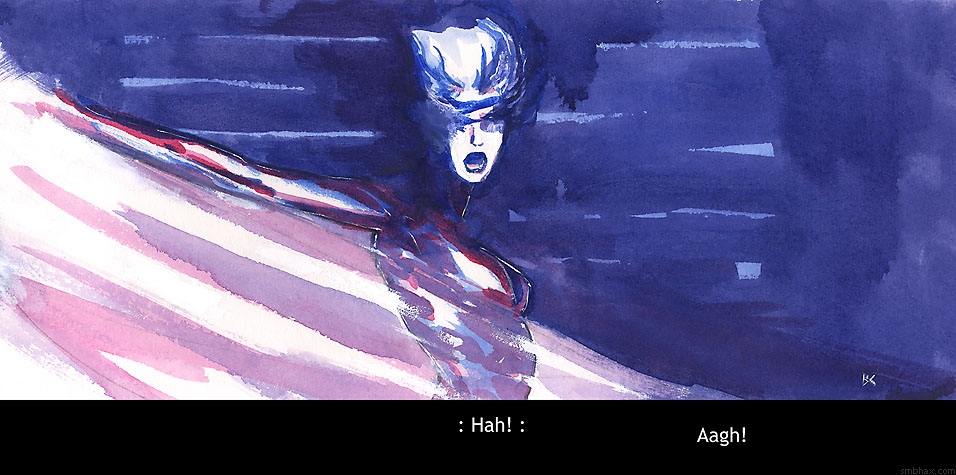


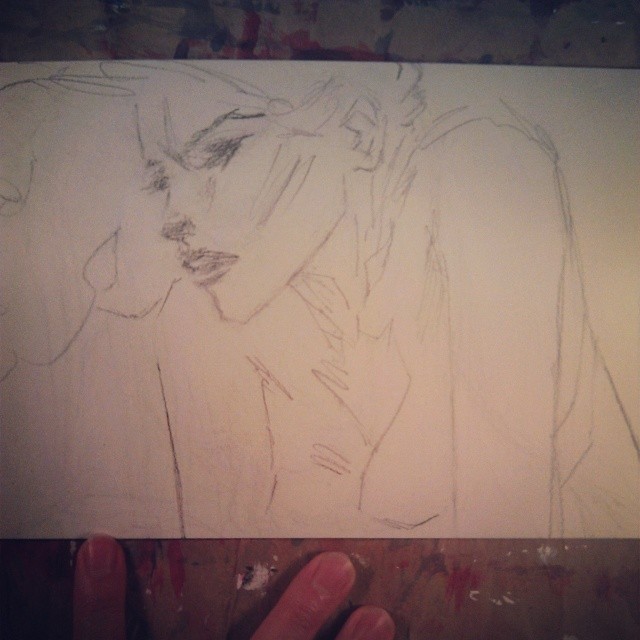
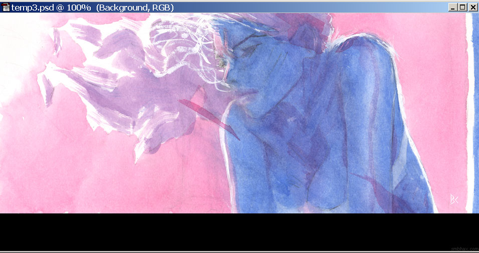
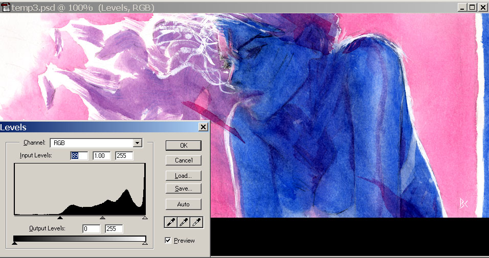
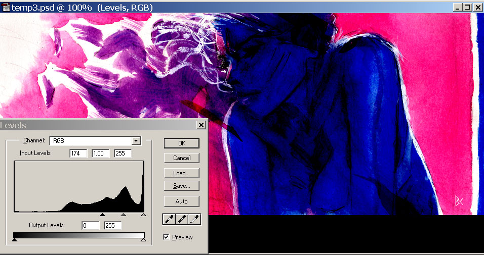
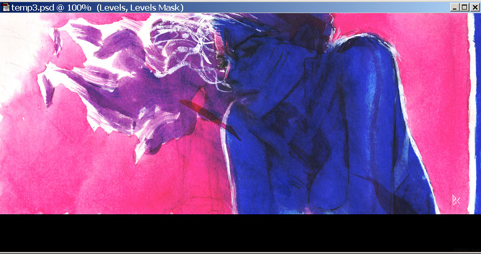
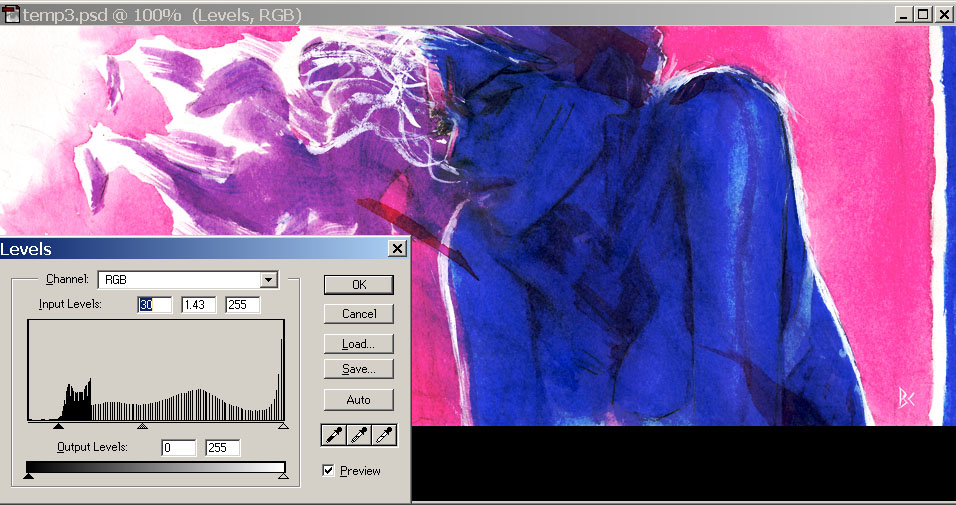


smbhax at 9:24PM, March 24, 2014
Kim: OOh yeah read at your own risk! 8o Thanks guys : D
artdude2002 at 2:12PM, March 24, 2014
Another beautiful page. Nice to see the steps taken toward the final piece.
KimLuster at 10:02AM, March 24, 2014
Well I really did try to read all your author notes, but it started getting too technical on me haha - in any case, I love the finished product!