The art here is more pronounced and striking. A definite vast improvement on this pages previous build.
Maybe if I was re-doing this I'd try to work on continuity between panels. The windows in panel 3 are gigantic in proportion to panel 4.
Perhaps the last panel is a touch barren in terms of background.
The floating book could do with perhaps more emphasis. Perhaps a isometric angle so the viewer can see the book from a different perspective instead of side on. Maybe even a close up of the book flying in the foreground talking to the giant at head level.
However, this is very much stronger in terms of presentation. I like the panel borders with green splatter. Neat touch.
Great stuff.


fladam at 12:58PM, May 31, 2009
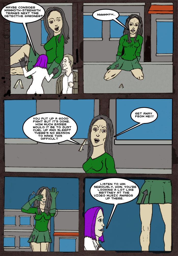
The art here is more pronounced and striking. A definite vast improvement on this pages previous build. Maybe if I was re-doing this I'd try to work on continuity between panels. The windows in panel 3 are gigantic in proportion to panel 4. Perhaps the last panel is a touch barren in terms of background. The floating book could do with perhaps more emphasis. Perhaps a isometric angle so the viewer can see the book from a different perspective instead of side on. Maybe even a close up of the book flying in the foreground talking to the giant at head level. However, this is very much stronger in terms of presentation. I like the panel borders with green splatter. Neat touch. Great stuff.
ParkerFarker at 11:38AM, May 16, 2009
hahahaha, I GET IT!!!!! AAAGGGHHH!!!!! ... sorry for that.