


A Midwinter Nightmare (page 2)
Fitz on Jan. 27, 2008
So, here it is: your weekly dosage of A Bit Creepy! ;) I'm actually enjoying those weekly updates. They keep me focussed, with the story on my mind at all times. Though I can say goodbye to weekends ;) I finished this page at 1am last night. And then went to shave! LOL! Yeah, I had no time to in the past week, due to my artistic duties, so I started looking like a neanderthal. And believe it or not, I actually did it without cutting myself… too much ;) And then, at 1:40 (yes, shaving takes tiiiiime), I went back to mahhhhvel at my work again.
And noticed a typo! LOL!
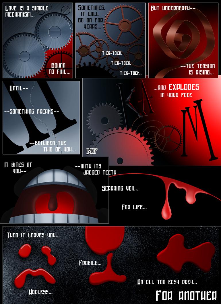
Apart from some minor technical difficulties, the work itself was progressing quite smoothly. Though the amount of it sometimes scared me. Especially planning the layout. And the explosion. But once I made a quick doodle of what it's supposed to look like, it went pretty fast - and actually turned out nicer than I'd originally imagined it (which leads me to thinking I have poor imagination!). I like the gradients in it, especially that bit of salmon-pink - kind of standing out, kind of blending in. But my favorite is the blood. Doesn't look exactly like blood, actually - I was trying to make it look like paint, on purpose, for the impact.
I really enjoyed making this page. It's more “me” than it is noir - less action, more metaphors. But the narrative goes on in the usual mode. I probably come across as a terrible misogyne ;) Naaah :) I love women. Oh, they can drive a guy to the very edge of insanity - and then push him over the edge, with a smile - but can't live without them! :) I've actually been single for some two years now - partly out of caution, partly for practical purposes (more me-time! yaaay!) - but there's always some girls around. There's my Muse, Erica. My life wouldn't be the same without her. We both agree about it ;)
That's it for today, folks :) Next page up next week. I'm actually really excited about this one. I'm probably going to make use of my CAD skills for this one, so it should be fun! Meanwhile, thank you all for stopping by - a big thanks to my regular readers and some friendly lurkers who did say hi last time! See you round, everyone!


abitdark at 10:50AM, Feb. 12, 2008
hmmmmm, my kind of morbid. :)
Coyotejeff at 6:02PM, Feb. 3, 2008
Well, this one is certainly different. Kind of sinister. Is our little mouse buddy going to Explode?
phillip_the_tortoise at 7:45PM, Jan. 30, 2008
Damn thats creepy! soz i havent been commenting lately.. its this damn school!!! And Congrats on the feature!!!!
Fitz at 6:18AM, Jan. 30, 2008
MetalLuigi: I said in a response to DueEast, it's a bit tongue-in-cheek - but then again I did experience some things first-hand, and learned a thing or two the hard way. I've been there. So I feel your pain. Hope this chapter isn't too depressive for you - the upcoming ones should be more comedic :) PinkertonPark: Thank you! Finally the drama queen part of my personality found a creative outlet ;) Outlawstar: Thanks :) I went back and read your previous comments, too. Glad to have you on board and hope to see you here next Monday :) JMT: Yeah I think it would've been more obvious that way - but the thing is, this kind of cogs isn't made of brass, so they had to be metalic blue. It's a strange thing about me - I feel uncomfortable modifying my referrence material, I like to portray it as accurately as I can. And then again, I refuse to copy and paste - which would've been WAY easier and FASTER to do. Go figure!
jmt at 9:06PM, Jan. 29, 2008
upon further investigation... I think if you carried a red element over to the top of the heart shape, or even made the hubs red or something it might be a bit more obivious. but I really like how you use the corner of the frame to form the bottom section. This is very nice work.
Outlawstar at 6:34PM, Jan. 29, 2008
Cracking stuff, cant wait for the nect page.
pinkertonpark at 7:02AM, Jan. 29, 2008
Very cool! Dramatic
MetalLuigi at 3:01AM, Jan. 29, 2008
Beautiful page! I know this has probably been said before, but you're pretty much spot on with how much love can sometimes hurt and leave you vulnerable. I went through a major break-up recently, so I can relate a lot to this. I know it's supposed to be a comedy, but as I commented on the last page for lack of a better term this chapter is DEEP. :)
Fitz at 1:30AM, Jan. 29, 2008
Amy: That's the most entertaining part for me, too - coming up with connections between the visuals and the narrative that give them some additional meaning. Dean Koontz had a big influence on me in a way. He manages to say more about people through symbolic names, for instance - so aside from reading the book itself, I google the names to find referrence. Allen: It's all a bit tongue-in-cheek :) Plus, this is noir - which seems to demand a femme fatale. In real life, I "might" be a bit disillusioned after my own experiences - but of course I've seen it work, and I'm happy for everyone having happy relationships :) It's just that as a writer I allow myself some sarcasm, sometimes - not to mention that in writing the author doesn't always have to share the narrator's views. Trevor: That is a sad face indeed. I always try to make something of ripples, bubbles or other random patches of color - so they're never just random Rorschachs. I described the other two in my reply to Midge. As for the red, it's been there in the green chapter, but it's true, there's waaay more of it in this one. As for the pacing, I'm happy it didn't slow down in this one and I hope to keep it up in the subsequent installments. Walrus: Hmm... Strangely enough, I've managed to avoid being exposed to emo too much, so I know very little about it - other than that they cry a lot ;) Bocaj: Actually the similarity between the uvula (the dangling thing at the back of the mouth) and the bleeding wound was unintentional. The screaming mouth was added last, I came up with that one when I was done with everything else - and only after I drew it did I realize it does resemble the panel next to it. Funny! Dawn: Yeah, that's what I always say: always look on the bright side of life :) And I'm having fun messing with composition in this chapter, especially with overlapping panels. I'm yet to try different shapes of panels. I'd really like to do tall narrow ones. JMT: I'm happy to see you hunting for minutiae this time :) Yeah, the ka-boom is my favorite here. And the "jagged teeth" actually refers partly to the mouth, partly to the cog directly above that line. It was actually supposed to overlap the mouth panel, but it wouldn't have looked good, so I decided against it. Another one that I think nobody noticed was the first panel, in which the cogs and the red background form a heart. Ghostrunner: It's true! Never underestimate the deadly potential of sporks!
ghostrunner at 9:32PM, Jan. 28, 2008
actually that can be said for kitchen appliances too
jmt at 6:41PM, Jan. 28, 2008
great typography, I love the exploding clock parts spelling out the word ka-boom. I totally got the blood spaters (reminded me a little of The watchmen). I wish the little mouth actually had jaggedy teeth.
dgriff13 at 2:04PM, Jan. 28, 2008
yeah! way to look at the bright side! LOL fantastic page. You have quite the eye for composition.
Bocaj at 1:37PM, Jan. 28, 2008
OH... MY... GOD... Every panel is fantastic. The gears, the bent metal, the mouth and the blood. How the blood looks like that thing in the back of the mouth. Actually, when I first glanced at that panel, I thought it was a view from inside the mouth. Then I saw the second drop and noticed it was blood. Again, great page.
Walrus at 12:35PM, Jan. 28, 2008
It's emo heaven!
trevoramueller at 9:03AM, Jan. 28, 2008
Nice blood effects (and I think I see a frowny face in the first part of the last panel, but maybe that's just a rorschach). The colors are very sterile and somewhat spooky. The red is a departure from recent pages, which had a very cold and lonely feel to them. The pacing maintains with the last page, though - building in intensity and making me want to know what happens next! Great stuff!
dueeast at 7:48AM, Jan. 28, 2008
The artwork, coloring and prose are wonderful, but I don't agree with the logic or the point. I've been happily married for 13 years this March 18, and we were engaged for over 2 years before that. And we have 2 kids (aged 12 and 9) It's not easy but it is possible. :)
antcomics at 7:34AM, Jan. 28, 2008
Your comic pages are always so great to look at. I don't feel like I am looking at a comic--I feel like I'm looking at a painting because I always have to go back and study it closely after reading through it...the colors, the atmosphere...so much to take in!!
Fitz at 7:22AM, Jan. 28, 2008
Vickie: That texture actually took a bit to get right, although it's basically a very simple effect. And then I forgot to apply it to the rest of the cogs! LOL! As for the general darkness, I was very careful not to make this page brighter than the previous - a thing that happened in the previous chapter, where each page got steadily brighter. This, however, is noir - so that cannot happen :) Soonmme: Thanks :) Happy to see a new face! RoyceMarie: Thank You :) Now I wonder how I will make the next page even darker :) It'll either be more black or more red. Abt: I scare MYSELF sometimes! Looney Tunes? Maybe... I think the trippiest things I've seen as a child were Disney stuff. Remember the elephants blowing cubical soap bubbles? That must've screwed with my head. And the over-abundance of red must be somehow related to the Batman movies by Joel Shumacher I saw last week. They're NOWHERE near Tim Burton's movies as far as the stories go - but the visuals are pure eye-candy. One post-modern book I've read involved an intercourse between a woman and a plant. So no thank you, I'll stick to the classic, politically correct image of love: man + woman ;) With a pinch of my trademark sarcasm :P The girls know I love them, anyway :) Harry: Thanks! Nepath: Hey, nice seeing you :) Hope you didn't miss the last week's update! Midge: Geographically, I'm between Germany and Russia so I have these images engraved on the inside of my skull. Hammer and sickle! Arbeit macht frei! ;) As for the blood spots, I realized too late that the last one actually does look like a fish, and it does make sense that way - but originally there was supposed to be a different comment to it, which would make it clearer that it's in fact a pointing arrow sign. As for the "fragile" one - it's a wine-glass, a symbol that is put on boxes with delicate stuff in them instead of "FRAGILE" Tantz: Isn't it? :) I just hope my comic won't cause people to dump their significant others or divorce ;)
Tantz_Aerine at 7:09AM, Jan. 28, 2008
How very pessimistic. What happened to not falling for every Tom Dick and Harry? XD
TheMidge28 at 6:40AM, Jan. 28, 2008
as soon as I saw the first three panels with the gears and innards of the clock I thought of those old russian and german industrial posters from way back. I like the blood spots in shapes. The sad for Hapless and the fish for easy prey but what is the center one for Fragile?
Nepath at 5:07AM, Jan. 28, 2008
Nice update. Loving that first panel, really well done!
harryq at 4:16AM, Jan. 28, 2008
Nice.
Abt_Nihil at 2:14AM, Jan. 28, 2008
You're scaring me there... this feels like a morbid postmodern Looney Tunes short. Great work in any case. Great use of lighting and textures. And I don't think you're making a point against women per se - speaking of postmodern, love does not always involve women :-) Seriously though, I've been asking myself the same question time and time again, especially with the opening pages of signifikat's first chapter, and I felt like toning the dialogue down so it wouldn't come across as misogynism. Needless to say, I resisted the temptation - which may also be traced back to a lack of female influence on my life :-D
roycemarie at 12:16AM, Jan. 28, 2008
Wow! Dark indeed. Beautiful page.
soonmme at 11:43PM, Jan. 27, 2008
Lovely as always.