


A Midwinter Nightmare (page 3)
Fitz on Feb. 3, 2008
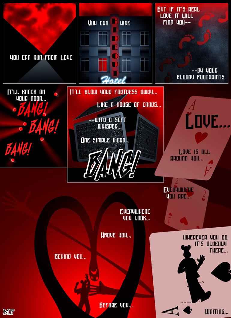
A week has passed - so there it is: another page! Which, by the way, happens to be the 20th page! Woot woot! Go me! ;) The most psychedelic page so far, too! All this red… so strangely… addictive…
I really like all the references to the heart here - especially the less obvious one in the first panel. Actually that was one of the first ideas for this episode that I came up with. Which was five months ago or so! I've been dying to draw it ever since! Talk about patience, huh? I'm also still having fun with the layouts. Nothing really crazy going on - but I like the ace of spades forming a separate panel.
This was a really short rant - I'm sorry if anyone's disappointed ;) But it's almost 1am (AGAIN!) and right now I can almost HEAR my brain swim to and fro, to and fro inside my skull. So, goodnight - and good morning! Thanks to everyone who stuck around - old friends, new readers and friendly lurkers alike :) Glad to have you all onboard! See you next time!


Coyotejeff at 6:52PM, Feb. 14, 2008
Scary
MetalLuigi at 9:58PM, Feb. 12, 2008
In response to what you said in a comment two pages ago, no, you're comic is definitely not depressing me! I think it's really awesome :)
Fitz at 4:10PM, Feb. 11, 2008
Walrus: Thanks! :) Dawn: Yeah this comic is just BEGGING for V-day cards, isn't it? With lots and lots of redness! >:D Tom: Thank you! Now you go draw a new page of Fin! Tantz: Oh if love were only a stalker... It's way more than that... And that's not good... Nepath: I actually change the color theme with every chapter. It's more fun that way - and keeps me focussed and creative. The color theme for the next chapter will be completely different. And yeah I'm proud of that panel, to me it looks more like a spear than a dagger, actually - on which he almost impaled himself. RoyceMarie: Me too! In this chapter, a lot of time goes into coming up with twisted ways of arranging the panels. Stig: Thanks! I read the comments you left on the earlier pages. I'm really happy you got all the way to the current page - and it looks like I'm developing a healthy archive here :) See you tomorrow when the comic updates!
Stig Hemmer at 3:02PM, Feb. 11, 2008
Loved the realistic chapters, love the noir pages. Just love this comic.
roycemarie at 2:05AM, Feb. 6, 2008
I am really enjoying the layouts for this story.
Nepath at 1:37AM, Feb. 6, 2008
nice work again Fitz! It's been a gradual process but you have changed the main colour for this comic quite dramatically. I like the last panel with the heart chaped spade from the card pointing almost dagger like. Great work!
Tantz_Aerine at 5:51AM, Feb. 5, 2008
Very nice mood setting as usual. Love sounds like a stalker. XD Well done.
phillip_the_tortoise at 4:14PM, Feb. 4, 2008
That is awsome! XD
dgriff13 at 2:15PM, Feb. 4, 2008
so when are you gonna come out with "A Bit Cheesy" V-day cards, eh? melts my heart... as if searing molten lava just poured over it. Yum.
Walrus at 1:10PM, Feb. 4, 2008
Amazing...
Fitz at 11:44AM, Feb. 4, 2008
Vickie: The cards took a while to do, actually. I drew the pattern on the back myself, modelling it after an actual card back design. And I helped myself with my CAD software at work to make the house of cards. It made it a LOT easier - though of course I still had to set all the angles and shade the thing myself, since the rendering program is not very good. Crispiest Fortune: Clouds are fun to do. The process consists mostly of changing brush sizes and clicking places until it starts to looks like something ;) Harry: Awww I really love the way you drew him! Very cool! Abt: Glad you think so :) I've actually stopped worrying so much about outdoing myself each time, this was basically supposed to be a chapter simplier art-wise, more focussed on the trippiness - which, in turn, became my main concern. So now I'm basically trying to make it as red as possible ;) In this chapter, I wrote down the rough version of the monologue first. It's what drives the whole story and gives me weird ideas. That's how I came up with the whole card motif - because the line sounded nice. But I applied the text to the page only when everything else was done - and I was really brain dead, so I really had to focus to get it right. So its raw power comes from only the most basic brain functions of the brain being active ;) Locoma: Thanks! :D Amy: Yeah it is a special month for this story - since it's centered around love :) And that neon was loosely based on some actual hotel and motel signs. None of them called Hideout - but some were actually really spooky looking, more so than the actual panel, sometimes! Midge: I'm really proud of the last semi-panel with the ace of spades - how it looks like a spear pointed at Mick's abdomen. And of course its symbolic meaning as the Card of Death. Trevor: If I keep it up... I see myself in some mental institution sooner or later ;) This particular panel is THE trippiest thing I ever did - and I'm loving it! :D Glad my stuff motivates you :) I see immense progress in your work, so it's an honor if some of it is my influence. Thank you! Bocaj: Was any of this subtle? ;) Not with this color scheme, I think! It's all RAW POWER! ;) And I'm really enjoying these pages, myself, the red and blue seem to go so well together. Red's been a nice addition in the previous chapters - and now it's really stealing the show :)
Bocaj at 11:02AM, Feb. 4, 2008
Great page. A bit less subtle than usual, but still, I love it all bundles. Also, I don't think I've said this, but a reason why I am really enjoying this is that red is my favorite color.
trevoramueller at 10:39AM, Feb. 4, 2008
Alright, dude - seriously. If you keep knocking out pages like this homerun on a weekly basis, I'm totoally going to have to up my game to complete. Your pages are fantastic! Your artwork top-notch. Your narration is very literal and metaphoric, and relates well to your imagry. Comics like yours deserve more than a 5 - they deserve a 10! Very well done as always, and be sure to keep up the good work. It'll motivate me to do more with my own stuff! ;)
TheMidge28 at 9:37AM, Feb. 4, 2008
superb use of the playing cards in this layout! so grapgically stimulating and fitting for the dialogue.
antcomics at 7:48AM, Feb. 4, 2008
Very nice imagery, and whatta way to kick off the Valentine's month! Ace stuff! I am especially intrigued by the hotel sign. It just looks so real.
Locoma at 5:11AM, Feb. 4, 2008
:D this is too good
Abt_Nihil at 3:16AM, Feb. 4, 2008
Whoops, it's the sky that's heart-shaped in the first panel :-) Thanks, Crispiest Fortune...
Abt_Nihil at 3:15AM, Feb. 4, 2008
There's a heart in panel 1? An X-ray image perhaps...? Incredible how you're outdoing yourself with every page. This must be one of the most beautifully designed pages I've seen... great choice of fonts too. I love each panel, but if I'd have to chose my favorite it'll probably be the house of cards being blown apart... great sense of frozen movement there. I'm curious as to how you write the monologue... do you do it more on an intuitive level? The art seems meticulously planned, but the text has that like raw intuitive power... not that it doesn't seem very refined too ;-)
harryq at 3:04AM, Feb. 4, 2008
Splendid work, pushing the envelope. Oh, by the way, I have one of your meeces. You know where to look.
Crispiest Fortune at 10:31PM, Feb. 3, 2008
I second the comment on the house of cards falling- it looks great! Love the heart-shaped sky in the first panel as well!
usedbooks at 10:15PM, Feb. 3, 2008
I love the card motif. Lots of fun, and a very good continuation of the color scheme. My favorite panel is the card house falling apart. It looks so cool. :)