
AA Page 27!
ccs1989 on Feb. 22, 2006
Alright, page 27! We're moving along here! This isn't a steller page to look at, but it gets it's job done. The next page is better and will be up on Saturday. Check back then.


ccs1989 on Feb. 22, 2006
Alright, page 27! We're moving along here! This isn't a steller page to look at, but it gets it's job done. The next page is better and will be up on Saturday. Check back then.


Ozoneocean at 6:05PM, Feb. 24, 2006
Perspective is a huge massive great headache pain... Don't worry man, it's scuppered me more than once.
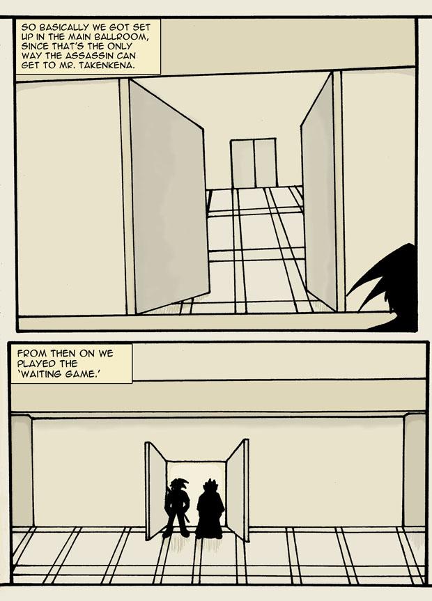
Lukey at 9:27AM, Feb. 24, 2006
I love the perspective in these two panels and the shadowy figures!
Hamorhage at 5:19AM, Feb. 24, 2006
Good work on the indoor backgrounds, I hate doing things like tis....basically I hate drawing straight things, thats why I always draw people :)
SarahN at 7:13PM, Feb. 23, 2006
"Ah, this game is no fun. Let's play Hungry Hungry Hippos." XD
ccs1989 at 12:36PM, Feb. 23, 2006
Eggbert- I see where you're coming from. I copied this from a picture, so I thought that the perspective was correct, but it's not. I totally suck at this perspective thing. I'll try to do better in the future. XO
Mazoo at 10:45AM, Feb. 23, 2006
Well, people have said enough about the perspective, but I agree that this page gets the work done. I agree with Eggbert that you need to add a bit more detail and make the ballroom more ornate. I like the sillhouettes, though. :)
Jakob at 7:18AM, Feb. 23, 2006
Yeah, perspective is a little akward, but other than that it is nice.
Coydog at 11:15PM, Feb. 22, 2006
Combat is long periods of boredom punctuated by sheer terror... at least that's how my military pals put it.
Eggbert at 10:48PM, Feb. 22, 2006
Sorry to whine but, really. If you insist on having enviroments constructed entierly of geometric shapes, could you please, PLEASE draw it in proper perspective? The angle of the lines on the floor is SO WRONG you have to be not trying. The way you've drawn them makes is appear the ground actually slopes downward right past the door in the second panel, and that it slopes upward in the first panel, as opposed to being any kind of flat ground. The fact that it's different in each panel is a dead giveaway you didn't intend to draw a sloped floor. I mean, since the bottom of the open door is intended to be at ground level, shouldn't the lower angle of the door match up with the angle of the lines on the floor? You must see these things. And they're in a ballroom? Where's the color? Or at least some far more varied shades of grey? I personally wouldn't hold any balls in a grey empty box. Just a painting or a light fixture on the wall or something! And the shadows, man. Stop being so timid! I can see, that below the characters and the door, that there is a very very light shadow penciled in. BOLDER. Drop shadows connect your character to the background, they make it seem as if the actually exsist in the enviroment that you've drawn. All that, and they make a page more visually interesting as well, since they add contrast and all that jazz. Please try harder ccs. Sorry for the rant.
Radmetalmonk at 10:27PM, Feb. 22, 2006
playing the waiting game always ends in a couple of........ things
kyupol at 10:26PM, Feb. 22, 2006
perspective getting better... still... push... some... more... though... Like the sillhouetted last panel.
JillyFoo at 10:04PM, Feb. 22, 2006
Waiting: the most necessary and most dull part of combact.