19 - Hooba-what now?
Allan on May 2, 2011
I consider these kinds of updates to be metaphors for how I actually write the strip, but I'll get more into that later.
I'm going to talk about fonts now. Hope you guys like fonts, cuz I'm gunna talk about ‘em.
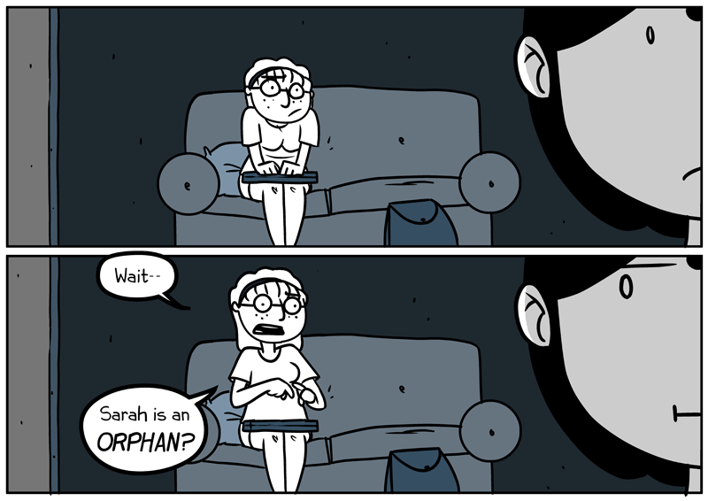
Ever notice how Marvel or DC uses all UPPERCASE FONTS THAT LOOK LIKE THIS? Here on the internet it’s obvious and often strenuous to read all uppercase text (after a while some people tend to get headaches) because we know most of the time our fonts are supposed to be lowercase.
In the olden days, back when comics printed on paper and they used dots of “ink” to color them, comic artists wrote in all uppercase because the bolder letters were easier to see when they were off the presses. That's also why they used so many exclamation marks—because “!” is easier to see than “.”
Anyhow, when your whole comic is written in all uppercase it's almost unnoticeable; your characters won't look like they're shouting unless you embolden, increase the size, or if they emote that way. But at the same time, in my opinion, that limits your freedom of expression and exaggeration.
When you use a font that isn't all caps you get the option of people talking calmly, precisely, and then people FLIPPING THEIR SHIT AND YELLING EVERYTHING. Plus you can embolden that, too, making it even more extreme.
Pay attention to the little details when you're planning your comics. Your readers may not know, but you'll know, and you can always be like “hee hee you readers ain't never gonna catch all dese subtleties in dis bitch.”
And I do apologize for my tardiness. Jobs and jobs and jobs, amirite? Let's hope I can get sommore done soon!


Banes at 9:37AM, June 5, 2011
Very insightful notes regarding lettering...I, too, have noticed your balloon/dialogue placement and how it helps Blue Circus' readability. You inspire to consider that more! What an engaging read this is!
kakuza at 8:46PM, May 7, 2011
No problem. I don't think a lot of people notice the lettering or balloons in comics. I think more people should. It is all part of the page. I especially love when the text/balloons add to the story. A few examples are Alex Toth's lettering, Craig Thompson's and David Mazzucchelli. Allan, I think you are doing a pretty good job of balloon placement and lettering.
Allan at 2:25AM, May 5, 2011
Thank you for the compliment, kakuza, but we've still got time! I'm only at 20 pageswho knows what the future holds!
kakuza at 1:01AM, May 4, 2011
It's kind of weird when such terribly composed comics get featured, yet brilliant one like this one don't. Makes me lose faith in the people of DrunkDuck.
Host Dunkelheit at 12:19PM, May 3, 2011
Now I know. And knowledge is power!
BriansAdventuring at 9:18AM, May 3, 2011
I thoroughly enjoy Stalking the artwork of Allan Wood... That makes me a "Fan" right? That is technically legal stalking. Sweetness.
ElectricType at 3:52AM, May 3, 2011
I like fonts.
eramthgin at 3:49AM, May 3, 2011
And thats what she got from that.