


The Blue Bomber Revealed
IamDave on Sept. 22, 2007
There were some changes made to this comic, but not drastic…those will be in the future.
1. The Yellow Devil's color isn't so much of an eyesore anymore.
2. I'll establish later that Tiesel is human, he makes for a sucky robot as-is…he just wears a mask like that, that's all.
3. Mega-Man's movement is improved in this particular comic.
4. A few minor wording changes.
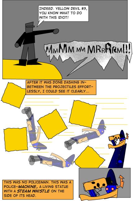
Personally, I think it's best that the machinery aspect of it remains undetailed–this is my style. That, and I don't want making this comic to become a chore…I think it's best if I make the most out of my available endurance. That way, I'll be able to make more of these (and no, it's not just me being lazy…although I AM lazy)
Thanks, guys, for making this comic so successful already in day 2 in terms of hit count.


ShinGen at 11:46PM, Sept. 24, 2007
There we go that's miles better.
IamDave at 8:45PM, Sept. 23, 2007
Thanks shingen. The edits aren't showing up yet, but they will, I think. I'll check in the morning.
ShinGen at 8:39PM, Sept. 23, 2007
Yeah like you said the gradients get irritating. Try cell shading. A lot of people like it and it seems to work for the kind of comic you're going for. But your story is definitely original and I'm happy to not see sprites for once. So over all you have a really solid concept. Just need to work out some kinks.
Rage Nakasa at 8:00PM, Sept. 23, 2007
hehe. nice.
IamDave at 7:57PM, Sept. 23, 2007
Thanks, A.P.C.--since you're the third person to complain about the art, then it's official...this comic is going to get a bit of an overhaul. As you can probably tell, I'm using illustrator, and lazily so. Even without you saying it, I know immediately you're sick of the gradient fills, and that's completely understandable--even I hate them. Thanks again. I'm gonna go check out your comics now...
anonymousposterchild at 7:49PM, Sept. 23, 2007
I've got a love/hate relationship with this comic. On the one hand, you've actually done an original take on megaman, and thats great! I'm really sick of the other megaman comics I see on here, usually variants on the old "Hey, lets make a sprite comic where megaman is retarded!" Instead, you've come up with an original steampunk work, which also plays at my tastes a little there. But this brings me to the main negative point here, which is the art. When you're doign a comic where you have a character that is mostly mechanical, you kind of need the ability to draw mechanical features, which seems to not be conveyed here. You also seem to have a lot of trouble conveying motion. I wasn't able to tell what was going on in the last panel here before reading it. Thats generally not a good thing. Still, this comic has a lot of potential going for it, and I'd like to see you either improve your art, or bring an artist on board to work on the comic.