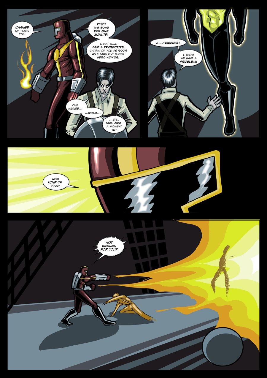
Beautiful page by Nepath, ENERGIZE's creator, as Firebomb lives up to his name. First of two, second Nepath page Friday.
Very Alan Moore-ish Marvelman/Miracleman feel to Energize standing in mid-air by Techie Tim in the second panel–an effortless negating of gravity, of not being bound to the same limitations we are.
By the way, the Doppelganger Gang is still working on its main goal, kidnapping the various Deaths out there in the Multiverse—check out DEATH AND THE FAIRY's special feature, at http://www.drunkduck.com/Death_and_Fairy/index.php?p=793980.
In other news, MAGELLAN was invited to join the Collective of Heroes, a central portal for good superhero webcomics, at http://www.collectiveofheroes.net/. Congrats, Stephen!–Al
@alschroeder & EssayBee - In regards to your explanations....panel 1 makes more sense now as a 'priming/test' panel,. Of course it also is a bit showy to the readers, but I feel that actions must have some internal logic to them, probably as a side effect of being a writer. The fact that he seems to have jumped up in the second panel, and diving knocked over the bomb makes sense. The explanation for why the flame isn't visible actually makes a whole lot of sense, more so than the usual 'full line of flame'. Who knew super-villains followed the laws of physics?
However, in all fairness, Tim's limbs in the last panel still seem odd to me. Still, I am willing to let that slide. Not sure if DD will let me re-rate, but if it doesn't I tried to give the page a 5.
I don't have any problem with the stylisms in the art. It looks very good to me.
I do have a question about one thing though. All the other members of the Doppelganger Gang have had a white lock on their forehead, but Techie Tim doesn't seem to have this. Is this an oversight, or is Tim some kind of exception?
Kiss1989...
Well...looking at it...1) it looks like he's priming his flame thorwers to me, making sure they're in good working order....2) The bomb is the round ball in bottom panel to the right hand side is sliding OFF the rigging, which will have repurcussions in two pages 3) Ever seen a match or a cigarette lighter or a butane flame? Oftentimes close to the source it's blue or transparent, and further out it's red and yellow. Given the background color, I would venture to say the same thing's happening here. 4) It looks more like me an impressionistic sketch of the hands/fingers and feet to me. I didn't get from that the hands were on fire, just that he was close and shielding himself.
Now, obviously the page didn't work for you, and that's legit, and everyone is entitled to their own opinion, especially with art. (Especially with MINE---I feel very outclassed by Dan and some of the others here)
However, I'm with Essaybee---we DO appreciate thoughtful critiques to art. In this particular case, I think it's unwarrented for those particular examples you cited, just on a factual basis. But hey, everybody has likes and dislikes, and that's cool.
I like your take on Firebomb, Nepath. The squared helmet gives the suit a more utilitarian look (which makes sense) and I like highlights you use on the suit.
kriss1989--I understand all of your points, and they all have merit, but if I may offer up these explanations (hope you don't mind, Nepath).
Panel 1--The "dramatic effect" of the flame I think is for the benefit of the readers and helps to underscore exactly how he plans to "take out those hero nitwits."
Panel 2--The way Nepath drew Techie Tim's pose, it looks like he jumped to his feet, so the bomb is off-panel (just below the bottom of the frame).
Panel 4--The flames starting just beyond his hands and Tim's "missing" feet are just stylistic flourishes. I thought the "missing" feet was just Nepath's way of doing a simple heat shimmer effect. Whether you like these flourishes is a matter of opinion, but I don't think they make the action confusing (which would be a problem with a visual story).
That said, I can't speak for the other guys, but I do like thoughtful analysis of either the art or story (such as kriss1989's comment), since it allows an opportunity to either find an area to improve or provide an explanation that may not be immediately obvious.
OK, couple of art/logic errors. Panel 1) Why is he wasting fuel to have the small amount of flame there? For dramatic effect? For who, the guy they hired to plant a bomb? Panel 2) Where did the bomb Tim was working on go? 3) OK, no problems here. 4) So the flame magicly leaps into existance three or four inches from his gauntles, unlike it panel one when they were connected, and Tim is aparently on fire with his hands and legs burned off judging by the jaged nature of where they end and his coloring.


kriss1989 at 7:23PM, Feb. 23, 2011
It didn't. :(
kriss1989 at 7:21PM, Feb. 23, 2011
@alschroeder & EssayBee - In regards to your explanations....panel 1 makes more sense now as a 'priming/test' panel,. Of course it also is a bit showy to the readers, but I feel that actions must have some internal logic to them, probably as a side effect of being a writer. The fact that he seems to have jumped up in the second panel, and diving knocked over the bomb makes sense. The explanation for why the flame isn't visible actually makes a whole lot of sense, more so than the usual 'full line of flame'. Who knew super-villains followed the laws of physics? However, in all fairness, Tim's limbs in the last panel still seem odd to me. Still, I am willing to let that slide. Not sure if DD will let me re-rate, but if it doesn't I tried to give the page a 5.
man in black at 4:27PM, Feb. 23, 2011
Don't think it will end well for Firebomb
Neilsama at 3:24PM, Feb. 23, 2011
You leave Critter out of this! She's a good kitty.
dwrean at 1:56PM, Feb. 23, 2011
yeah, we all know how energize is gonna take this. just like a white cat on a brown couch. no problem for him.
God of War at 11:38AM, Feb. 23, 2011
After Dan's pages, Energize here looks strangely skinny.
Ozmandious at 9:36AM, Feb. 23, 2011
very nice, very artistic. Me likey!
EssayBee at 9:23AM, Feb. 23, 2011
zodo--Firebomb's the Doppleganger; Techie Tim's hired help--hence Firebomb's comment about "paying [Tim] by the hour" a few pages back.
zodo at 8:59AM, Feb. 23, 2011
I don't have any problem with the stylisms in the art. It looks very good to me. I do have a question about one thing though. All the other members of the Doppelganger Gang have had a white lock on their forehead, but Techie Tim doesn't seem to have this. Is this an oversight, or is Tim some kind of exception?
alschroeder at 8:15AM, Feb. 23, 2011
Kiss1989... Well...looking at it...1) it looks like he's priming his flame thorwers to me, making sure they're in good working order....2) The bomb is the round ball in bottom panel to the right hand side is sliding OFF the rigging, which will have repurcussions in two pages 3) Ever seen a match or a cigarette lighter or a butane flame? Oftentimes close to the source it's blue or transparent, and further out it's red and yellow. Given the background color, I would venture to say the same thing's happening here. 4) It looks more like me an impressionistic sketch of the hands/fingers and feet to me. I didn't get from that the hands were on fire, just that he was close and shielding himself. Now, obviously the page didn't work for you, and that's legit, and everyone is entitled to their own opinion, especially with art. (Especially with MINE---I feel very outclassed by Dan and some of the others here) However, I'm with Essaybee---we DO appreciate thoughtful critiques to art. In this particular case, I think it's unwarrented for those particular examples you cited, just on a factual basis. But hey, everybody has likes and dislikes, and that's cool.
EssayBee at 7:29AM, Feb. 23, 2011
I like your take on Firebomb, Nepath. The squared helmet gives the suit a more utilitarian look (which makes sense) and I like highlights you use on the suit. kriss1989--I understand all of your points, and they all have merit, but if I may offer up these explanations (hope you don't mind, Nepath). Panel 1--The "dramatic effect" of the flame I think is for the benefit of the readers and helps to underscore exactly how he plans to "take out those hero nitwits." Panel 2--The way Nepath drew Techie Tim's pose, it looks like he jumped to his feet, so the bomb is off-panel (just below the bottom of the frame). Panel 4--The flames starting just beyond his hands and Tim's "missing" feet are just stylistic flourishes. I thought the "missing" feet was just Nepath's way of doing a simple heat shimmer effect. Whether you like these flourishes is a matter of opinion, but I don't think they make the action confusing (which would be a problem with a visual story). That said, I can't speak for the other guys, but I do like thoughtful analysis of either the art or story (such as kriss1989's comment), since it allows an opportunity to either find an area to improve or provide an explanation that may not be immediately obvious.
Call Me Tom at 7:25AM, Feb. 23, 2011
Burn baby Burn!
Nepath at 6:47AM, Feb. 23, 2011
Hah...I take it your not a fan of the art then. All noted. I will try harder next time .
kriss1989 at 6:27AM, Feb. 23, 2011
OK, couple of art/logic errors. Panel 1) Why is he wasting fuel to have the small amount of flame there? For dramatic effect? For who, the guy they hired to plant a bomb? Panel 2) Where did the bomb Tim was working on go? 3) OK, no problems here. 4) So the flame magicly leaps into existance three or four inches from his gauntles, unlike it panel one when they were connected, and Tim is aparently on fire with his hands and legs burned off judging by the jaged nature of where they end and his coloring.
AzuJOD at 2:55AM, Feb. 23, 2011
Excellent!
jamoecw at 10:20PM, Feb. 22, 2011
just got off watch to find this nice surprise, an update! something tells me fire wasn't the best tool to use in that situation.