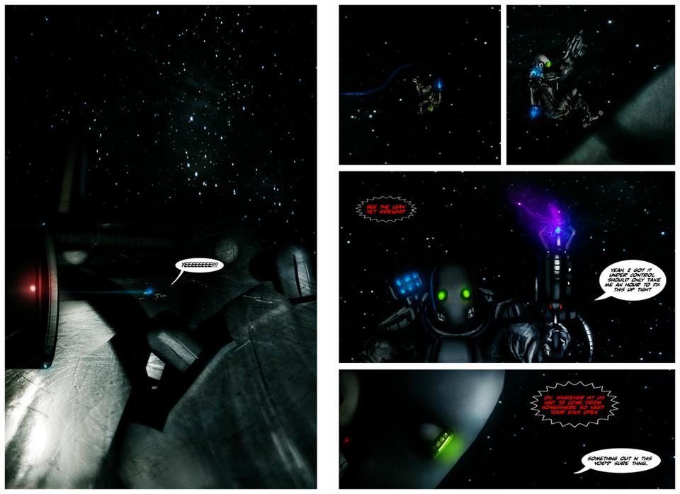
Here's pages 9 and 10. I figure everyone can get an idea of what the previous 2 pages were getting at. Basically him boosting out of the airlock to do a stylish move to the engine to find the leak.
I decided that it would work better at a double upload since it flows better than way and page 9 would be pretty boring.
Yyyyyeeeeeeeeeee!!!!!
:D:D Nice one! I'm loving your pacing on this so far, it's very slow, deliverate and confident, good job, sir chops! :D
The red problem could possibly be fixable by adding some black and / or white to the mix! JPGs always have trouble with pure reds, for some reason.
But yeah, loving this man. His helmet is AWESOME. XD
Thanks everyone, if the red text is blurry make sure and RELOAD the page. I fixed it around 2pm and it shows up fine for me but I think the cache is still giving people the compressed version. ;/
I love it! I can really tell what's going on here - I love p1 on the second page. He's all like "weeee!" XD The red is a little hard to read but it's been sized down and compressed so much for web that it's understandable. Looking good! XD


patrickdevine at 12:16AM, May 29, 2008
Awesome! This story reminds me of Heavy Metal
PIT_FACE at 1:03PM, March 25, 2008
man, this whole thing has a wicked fuckin feel to it. out in the middle of fuckin space,the quiet before the storm, man i realy like this!
dogtopus at 3:21PM, Jan. 15, 2008
Yyyyyeeeeeeeeeee!!!!! :D:D Nice one! I'm loving your pacing on this so far, it's very slow, deliverate and confident, good job, sir chops! :D The red problem could possibly be fixable by adding some black and / or white to the mix! JPGs always have trouble with pure reds, for some reason. But yeah, loving this man. His helmet is AWESOME. XD
priuscomet at 4:37PM, Jan. 13, 2008
The double page upload is great. It's like i'm reading a real comic magazine. plus, it gives us more to chew on. =)
sloo at 4:34PM, Jan. 13, 2008
Thanks everyone, if the red text is blurry make sure and RELOAD the page. I fixed it around 2pm and it shows up fine for me but I think the cache is still giving people the compressed version. ;/
BlueFlame_Studios at 3:53PM, Jan. 13, 2008
The art, as usual is really great. BUT the red text is a bit blurred(though it is still understandable), what are you saving the files as?
alejkhan at 3:00PM, Jan. 13, 2008
Yeah, the red text is a bit blurry, but my god, your coloring floors me every time! That splash page is brilliant.
junoblairb at 10:52AM, Jan. 13, 2008
I love it! I can really tell what's going on here - I love p1 on the second page. He's all like "weeee!" XD The red is a little hard to read but it's been sized down and compressed so much for web that it's understandable. Looking good! XD