


#3
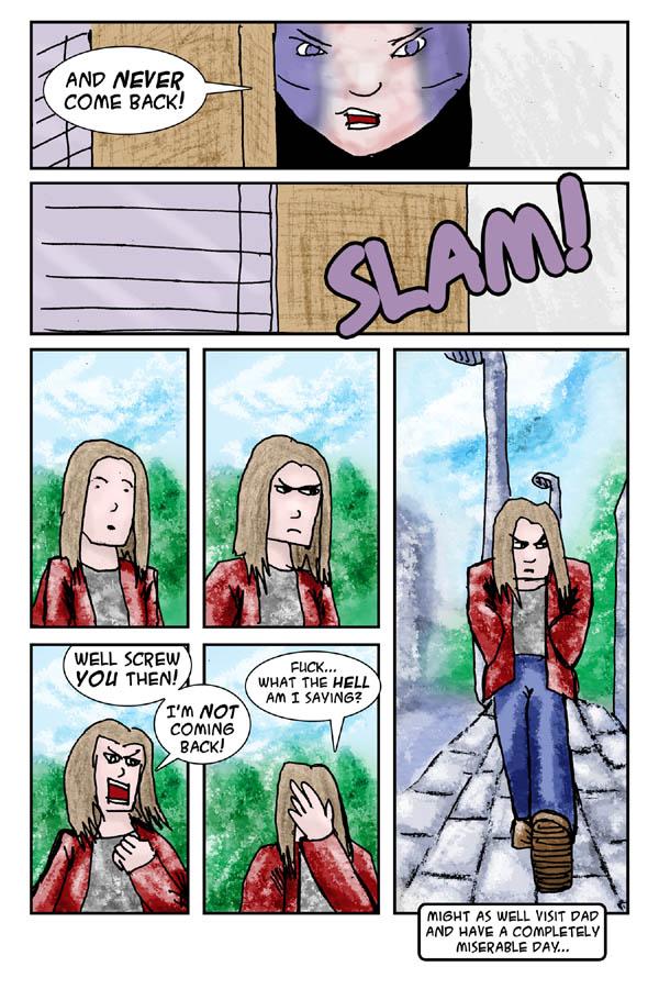
Aurora Borealis on March 6, 2008
The background was colored/painted the same way as the store on the second page. Was thinking about removing the f word from the page, but decided to run with it after few more pages.
The faces are a bit too cartoony and distorted, but I guess it works. I do like the last panel though, perfectly shows his mood AND looks half decent. :)
Next page: March 10th


harkovast at 5:49PM, Dec. 5, 2008
Hmmm, not a very happy start!
DAJB at 9:09AM, March 9, 2008
The trick is not to call it cartoony. Call it "chibi" instead and everyone will think it's an ultra-modern Manga-borrowing! ;-)
Aurora Borealis at 8:50PM, March 7, 2008
Still battling with anatomy. Thanks for the comment. Oh,and colors get better as the pages progress... at least I think they do. :)
D0m at 6:31PM, March 7, 2008
Hm. I like your use of color. And I'd probably try to make the anatomy less cartoony, but that's just me. Keep it up.