


#11
Aurora Borealis on March 25, 2008
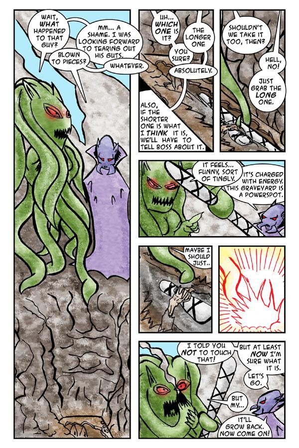
I really like this page. It served as a test for thicker inking, which came out pretty good… but it also took me 4-5 times longer to ink it, as I had to trace over the lines several times. Rather tiresome. Still, I like the layout and the coloring.
Second experiment with colored inks.
As for the inking this way, if I'll find a nice set of black pens of varied thickness… maybe. Or I'll try to achieve it with digital inking, no idea yet.
Next page: March 28th.


parkbenchbook at 5:53PM, March 27, 2008
It looks good. And I would suggest the pens. Many would disagree but I think digital inking is for sprucing up the regular inking. The shadows on the cape feathering out around the creature's head in the first panel are especially stand-out.