Very nice art... what I like about this page is the girl's expressions! It's like an acting movement (not that I think she's acting on him) but in general!
Thanks for the comments and for those who responded to my Forum post:
@ Fitz:
Thanks for noticing the difference, it is not an intentional change in style, but i am relaxing into the comic more. When i started this comic it was the first time i had properly drawn in a long time, so the change has come about as i 'remember' how i used to draw. Hopefully as it goes on it will continue to get better. Thanks for reading.
@ DemonSaintDante:
Thanks for your comments on both comic and Forum. Please stick with me, i am starting to get happier with the comic so it should only get better.
@Vindibudd:
Thanks for appreciating the comic, as of the next page i will either increase the text size or page size. Let me know if it still needs improvement. I find it hard to judge the difference between what i see on my computer and what everyone else will see.
@ D0m:
Thanks for the continued support.
Just as a general response, i was going to post this on the forum thread but did not know if this constitutes 'bumping' or not. Someone commented on the laziness of my art, the lack of backgrounds etc, etc...and they are dead right and im not making excuses for myself but i feel i should explain.
I am 28 years old with 2 infant children and i get about 2 hours a week to do the comic. My intention is to update at least a page a week, so at the moment i am using any tool on the computer to help complete the page, including blur filters and photo backgrounds. The comic in my eyes is improving as i am getting more comfortable and achieving more in the time i have. I fully intend to address everything raised and appreciate all constructive criticism and hopefully as time goes on i will achieve a standard that i am happy with.
Thanks for reading.
This is by far your best page. The comic is pretty good to this point, but could you make the text a point or two larger? It is really difficult to read and I want to continue reading! I love your color, and I would like to see more detail in the background. You have a really nice little thing here. Keep it up! Favorited.
Yup, really good work! The inking's gotten nicer, looks more pro with every page - and so does the shading. And is it just me or does the last page mark a bit of a change of style? Anyways, good work :)


SympleSymon at 6:25PM, Dec. 19, 2007
Sweet page, love the girl's expressions and posture
simonitro at 12:27AM, July 17, 2007
Very nice art... what I like about this page is the girl's expressions! It's like an acting movement (not that I think she's acting on him) but in general!
TheMidge28 at 7:17AM, July 16, 2007
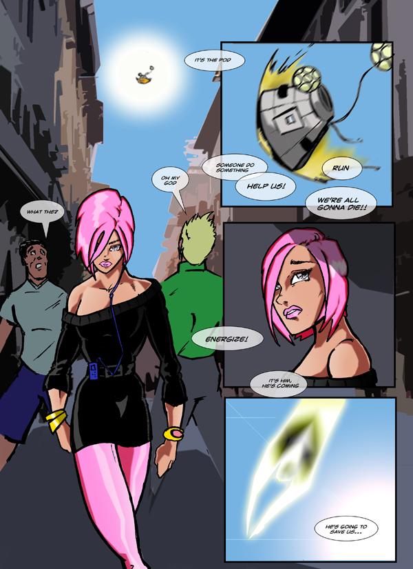
What a bold change color wise especially with all the dark pages previously...I love the look of Energize in the last frame!
Nepath at 3:36AM, July 9, 2007
Thanks for the comments and for those who responded to my Forum post: @ Fitz: Thanks for noticing the difference, it is not an intentional change in style, but i am relaxing into the comic more. When i started this comic it was the first time i had properly drawn in a long time, so the change has come about as i 'remember' how i used to draw. Hopefully as it goes on it will continue to get better. Thanks for reading. @ DemonSaintDante: Thanks for your comments on both comic and Forum. Please stick with me, i am starting to get happier with the comic so it should only get better. @Vindibudd: Thanks for appreciating the comic, as of the next page i will either increase the text size or page size. Let me know if it still needs improvement. I find it hard to judge the difference between what i see on my computer and what everyone else will see. @ D0m: Thanks for the continued support. Just as a general response, i was going to post this on the forum thread but did not know if this constitutes 'bumping' or not. Someone commented on the laziness of my art, the lack of backgrounds etc, etc...and they are dead right and im not making excuses for myself but i feel i should explain. I am 28 years old with 2 infant children and i get about 2 hours a week to do the comic. My intention is to update at least a page a week, so at the moment i am using any tool on the computer to help complete the page, including blur filters and photo backgrounds. The comic in my eyes is improving as i am getting more comfortable and achieving more in the time i have. I fully intend to address everything raised and appreciate all constructive criticism and hopefully as time goes on i will achieve a standard that i am happy with. Thanks for reading.
D0m at 11:28AM, July 7, 2007
Whoah, what'd you do with your inking, Nepath?! You're getting really good! Watch, Energize is gonna be one of the top DD comics someday soon!
Vindibudd at 8:24AM, July 7, 2007
This is by far your best page. The comic is pretty good to this point, but could you make the text a point or two larger? It is really difficult to read and I want to continue reading! I love your color, and I would like to see more detail in the background. You have a really nice little thing here. Keep it up! Favorited.
DemonSaintDante at 7:12AM, July 7, 2007
so far so good
Fitz at 5:15AM, July 7, 2007
Yup, really good work! The inking's gotten nicer, looks more pro with every page - and so does the shading. And is it just me or does the last page mark a bit of a change of style? Anyways, good work :)