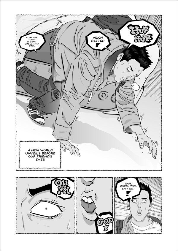
Who the hell is that? Well it's Tony, I just gave him a new haircut, I don't know if it'll be his definitive look yet… I take suggestions…
I've tried some shading on this one, I'm not sure if I'll keep on with this or I'll revert to the old look, please tell me what you think and help me decide! :)
—————————————— DRUNKDUCK AWARDSVOTE: Just click on the link below and input Hello NANO in the comment box. You'll make little Nano smile!
I think the real reason for Tony's haircut was because of a delayed reaction effect from the hat. It takes a minute for his hair to pop into its natural spiky-asian form. But to be honest, I don't think the haircut really suits him. I think the haircut he has previously suite him better.
Also, excellent work on the shading. It looks amazing.
He, he. Once I decide on a look I'll also change the previous pages, so it's not like his chair suddenly changed... new readers won't even notice, only you will know the truth ;)
the shading is GREAT! Stick with it if possible! It only adds to your style, and the characters have more depth and pop off the backgrounds. (erm, like everyone else said)
His hair makes him look a bit anime/manga. Not sure how you'd feel about that comparison. If you're not fond of being lumped in that genre, maybe less "chunky" on the hair. If that makes sense.
;0) Nice update, I'm always happy to see an asterisk next to "Hello Nano" in my favs!
Yeah, I agree, the shading does make it look a lot better. Though your lineart was and still is very skilled, the shading makes things stand out more, and thus it's easier on the readers' eyes. :3 Nice idea.
SHOCK! SUSPENSE!
ACTION?
Thanks, guys!
The truth is at first Tony would never take his hat off. But I finally used that element as a transition to this "new" world, so I just drew him with short hair on the previous pages but didn't really think about his design.
I want to differentiate these two characters more, like silentkitty said. I'm still trying to add more touches like the big front teeth, a little mole besides his mouth...
I love the shading! It really makes things stand out nicely, I hope you decide to stick with it. ^^ The new hairdo is a little startling at first, but I think it helps to differentiate the two a little bit more.


MonkeyMafia at 1:24PM, Sept. 10, 2007
Hello NANO should easily pick up the award for best line art. Really good work
JillyFoo at 5:17PM, Sept. 9, 2007
He's so hot!
GreatScottComix at 10:41PM, Sept. 8, 2007
Been away a bit but as usual... this rocks. Brilliant Scott out
samanime at 8:41PM, Sept. 8, 2007
I agree that the shading definitely is a plus. It really adds depth and makes it even more enjoyable to read.
Hijuda at 6:56PM, Sept. 8, 2007
I think the real reason for Tony's haircut was because of a delayed reaction effect from the hat. It takes a minute for his hair to pop into its natural spiky-asian form. But to be honest, I don't think the haircut really suits him. I think the haircut he has previously suite him better. Also, excellent work on the shading. It looks amazing.
Ozoneocean at 3:28PM, Sept. 8, 2007
My gods! He's Cloud Strife! They're coming to terms with the new gigantisisd world. OMG, they're the same size as Nano now ^_^
ToonmanAZ at 3:02PM, Sept. 8, 2007
Great shading, excellent linework.
FAL at 1:56PM, Sept. 8, 2007
He, he. Once I decide on a look I'll also change the previous pages, so it's not like his chair suddenly changed... new readers won't even notice, only you will know the truth ;)
Avalon comics at 1:09PM, Sept. 8, 2007
DOES THIS BRAVE NEW WORLD HAVE ANYTHING TO DO WITH TONY'S SUDDEN HAIR-CHANGE?! FIND OUT NEXT TIME ON [i]DRAGON BALL Z[/i]!
dgriff13 at 10:17AM, Sept. 8, 2007
the shading is GREAT! Stick with it if possible! It only adds to your style, and the characters have more depth and pop off the backgrounds. (erm, like everyone else said) His hair makes him look a bit anime/manga. Not sure how you'd feel about that comparison. If you're not fond of being lumped in that genre, maybe less "chunky" on the hair. If that makes sense. ;0) Nice update, I'm always happy to see an asterisk next to "Hello Nano" in my favs!
ReincarnatedParano at 9:33AM, Sept. 8, 2007
Yeah, I agree, the shading does make it look a lot better. Though your lineart was and still is very skilled, the shading makes things stand out more, and thus it's easier on the readers' eyes. :3 Nice idea. SHOCK! SUSPENSE! ACTION?
Priest_Revan at 8:08AM, Sept. 8, 2007
It looks awesome.
FAL at 7:33AM, Sept. 8, 2007
Thanks, guys! The truth is at first Tony would never take his hat off. But I finally used that element as a transition to this "new" world, so I just drew him with short hair on the previous pages but didn't really think about his design. I want to differentiate these two characters more, like silentkitty said. I'm still trying to add more touches like the big front teeth, a little mole besides his mouth...
tweebus at 7:16AM, Sept. 8, 2007
I like the shading- it gives it depth. I'm not sure about the haircut though. What caused the change? If it's story related then it's understandable.
silentkitty at 7:05AM, Sept. 8, 2007
I love the shading! It really makes things stand out nicely, I hope you decide to stick with it. ^^ The new hairdo is a little startling at first, but I think it helps to differentiate the two a little bit more.