


Page 34
Kilre on April 19, 2010
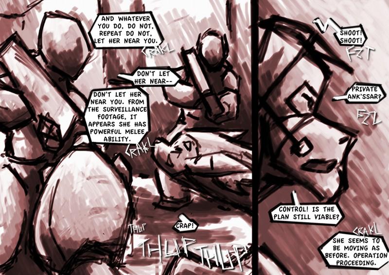
My main beef with this is that the line for the second panel were way too big. I remember that for future pages but for now it's passable. The first panel was an attempt to capture a style similar to a piece I did over last week (see here). It was a faster painting than the linked piece but the concept was the same. I'll continue working in this way to flesh it out.
This page and the previous also seemed too dark in certain areas, which I'll have in mind for future pages.


Kilre at 12:23PM, April 20, 2010
I would have to say so myself, because I'm the artist, but the style doesn't really lend itself well to smaller works where the details are much more important, so a simplification is in order.
JillyFoo at 11:14AM, April 20, 2010
That is a good pic from last week.